
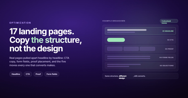
Most landing page examples are useless to you. The pages themselves are usually excellent. The problem is that you're looking at the finished product of someone else's testing without seeing a single test. The page you're admiring is version eleven. You never saw versions one through ten, which is where all the useful information lives.
So here's a different approach. Below are 17 real landing page examples, each one screenshotted at 1440x900 on 6 October 2026 so you can see exactly what a visitor sees before scrolling. I've written down the headline, the CTA copy, the proof elements, the structural move worth copying and the thing you shouldn't copy. Three of them are pages my agency built.
One warning about every roundup of landing page examples, including this one. These pages run constant experiments. Two of the examples below changed their headline between the day I drafted this post and the day I captured the screenshots, which is a useful reminder that you're looking at one frame of a moving picture. Everything here describes 6 October 2026.
The short version: every landing page that converts does five things. It makes one promise, strips every link that competes with the goal, puts proof exactly where doubt happens, reduces the cost of saying yes, and offers precisely one next step. Design is downstream of that. Everything below is just 17 variations on those five moves.
Why copying a great landing page usually backfires
I train five days a week. Hypertrophy program, macros tracked to the gram, the whole obsessive setup. And every few months someone asks me to send them my program.
I always say no, and they always think I'm being precious about it. I'm not. The program is built around my recovery, my weak points, the 2,800 calories I actually eat, and the ten years of training that came before it. Hand that same program to someone three months into lifting and they'll be injured by week five. The program isn't wrong. It's just an answer to a question they haven't asked yet.
Landing pages work the same way. Stripe's homepage converts because Stripe has brand recognition, a developer audience that already wants the product, and an enormous amount of search traffic arriving with intent. Copy Stripe's layout onto your five-month-old B2B service business and you've copied the recovery capacity of someone who has been training for a decade.
The design never transfers. What transfers is the structure, and more specifically the reasoning behind the structure. Why is the form here instead of there? Why two fields instead of six? Why does the testimonial sit directly under the pricing block?
Those decisions transfer. The gradient mesh background does not.
There's a second thing the galleries hide, which is traffic. A page converting at 9% on warm email traffic and a page converting at 2% on cold paid traffic can be the identical page. When you copy a layout, you're inheriting a structure that was tuned for a specific kind of visitor arriving in a specific state of mind. Copy Shopify's free-trial page and point your cold Facebook traffic at it and you'll conclude the page is broken. The page is fine. The traffic has never heard of you, and Shopify's page assumes the visitor already decided to start a store.
Worth knowing before you benchmark yourself against anything: according to Unbounce's conversion benchmark data, the median landing page converts at around 6.6%, and it swings hard by industry. SaaS sits near 3.8% while financial services clears 8%. Search Engine Land's breakdown of that report also found something more useful than any design tip: pages written at a fifth-to-seventh grade reading level converted at 11.1%, while pages written at a college reading level converted at 5.3%.
Read that again. Same traffic, same offers, roughly double the conversion rate, and the variable was vocabulary.
The five moves behind every high converting landing page
Before the examples, the framework. You'll see all five of these recur in every page below, which is the entire point.
1. One promise, stated in the headline
Not your company's mission. Not a category label. One specific thing the visitor gets. Squarespace runs "A website makes it real." Airbnb's host page goes further and fills in your number, rendering "Your home could make $385 on Airbnb" before you have typed anything. Neither sentence requires a glossary.
The test: cover the logo and read the headline. Could it belong to four other companies? Then you've written wallpaper. Keep going.
2. Attention ratio pushed toward 1:1
Attention ratio is the number of things a visitor can click divided by the number of things you want them to click. A page with one goal and thirty links has an attention ratio of 30:1. Every one of those twenty-nine extra links is a door out of the room.
This is the single biggest mechanical difference between a homepage and a landing page, and it's measurable. I ran a script over each page that counts every visible link, button and submit control whose box starts inside a 1440x900 viewport:
clickable elements above the fold, 1440x900, 6 Oct 2026

Shopify /free-trial      3
Notion.com              15
Deel.com                17
ClickUp.com             25
Airbnb /host/homes      31
Stripe.com              41
Shopify's free-trial page strips the navigation down to a logo. Nobody made that call for aesthetic reasons. Every link they deleted was a way out of the page, and the result is a page with one obvious thing to do.
Airbnb and Stripe look terrible by this measure, and the Airbnb number is worth picking apart because it shows the limit of the metric. Most of its 31 are price pins on an embedded map. Those clicks don't take you off the page, they pull you further into the pitch. Stripe's 41 is a different story: full navigation, dropdown menus and a seven-logo carousel, which is normal for a homepage and would be malpractice on a page you're buying traffic for.
So count your own, then ask how many of those clicks lead somewhere that isn't the conversion.
3. Proof placed where doubt happens
Most pages dump logos under the hero and call it social proof. The better pages put proof next to the specific sentence that triggers skepticism. Claim a result, then immediately show who got it. Mention pricing, then immediately show the risk reversal.
Deel does this well. The hero makes a broad claim about hiring anyone anywhere, and sitting right there is a 4.8 out of 5 from more than 15,000 G2 reviews plus a 4.8 from over 8,000 Trustpilot reviews. Two independent third parties, both with volume. That's harder to dismiss than a logo wall.
4. Lower the cost of saying yes
Every conversion has a price, and money is usually the smallest part of it. The real costs are time, risk, effort, and looking stupid in front of your boss.
Squarespace's "No credit card required" removes risk. Shopify's "$1/month" removes money. Stripe's "Sign up with Google" removes typing. monday.com's "No credit card needed, unlimited time on Free plan" removes the fear of a trial clock running out. Same move, four different costs.
5. Exactly one next step
Repeat the same CTA four times down the page if you like. Just don't offer four different CTAs. "Start free trial" and "Book a demo" side by side look generous and actually create a decision the visitor didn't come to make.
Deel looks like an exception and isn't. Its hero offers five choices (hire anywhere, run payroll, secure visas, manage HR, ship equipment), but those are routing tiles, not calls to action. There's still exactly one button on the page: "Book a demo." Routing the visitor and asking the visitor are different jobs, and Deel keeps them separate. If you want to see how badly this plays out at scale, our breakdown of why a website stops generating leads covers the diagnostic order.
Landing page examples built for free-trial signups
Self-serve software, no sales call, credit card optional. These pages live or die on how little effort the first step takes.
Shopify (/free-trial)
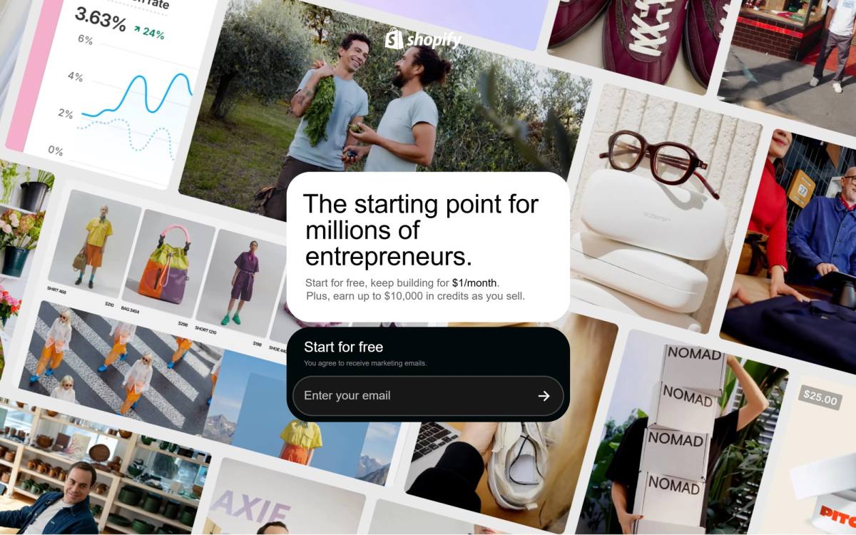
Headline: "The starting point for millions of entrepreneurs." Subhead: "Start for free, keep building for $1/month. Plus, earn up to $10,000 in credits as you sell." One email field, one consent checkbox, one button that says "Start for free."
This is the cleanest example of attention ratio discipline in the whole list. The global navigation is gone. The logo links home and that's the only escape hatch above the fold. Below the hero: a brand logo carousel (Mejuri, Gymshark, Brooklinen, Leesa, Kylie Cosmetics, Crate & Barrel, Monos), then themes, then a sales dashboard mockup, then the credits offer, then the AI assistant, then multi-channel selling, then a NEOM Wellbeing testimonial, then the signup form again, then a four-question FAQ, then a legal-only footer.
Notice the ordering. Proof comes before features. Features come before the second ask. The FAQ sits last because objections are the final thing standing between a reader and a signup.
Steal this: kill your navigation on any page you're paying to send traffic to. Don't steal this: the "$10,000 in credits" headline mechanic. Shopify can absorb that offer. You probably can't, and a discount you can't sustain trains customers to wait for the next one.
monday.com
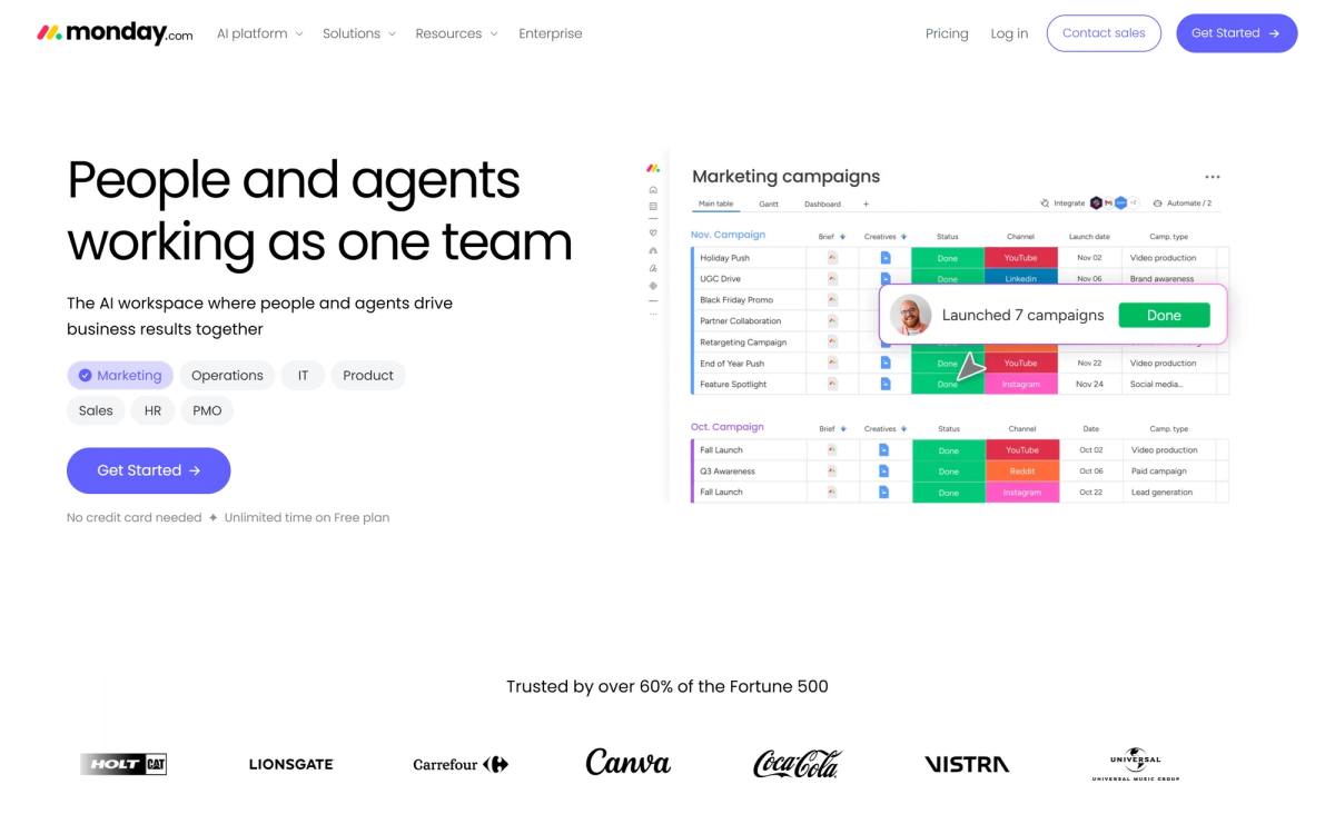
Headline: "People and agents working as one team." Subhead: "The AI workspace where people and agents drive business results together." One button, "Get Started," with "No credit card needed, unlimited time on Free plan" sitting underneath it.
The detail worth copying is the row of role tabs directly under the subhead: Marketing, Operations, IT, Product, Sales, HR, PMO. Pick one and the product screenshot switches to that team's view. It's the same self-identification move Deel makes, and it solves the problem every horizontal tool has, which is that the honest description of the product is too general to excite anybody.
The proof line is the thing to look at: "Trusted by over 60% of the Fortune 500," followed by Canva, Coca-Cola, Universal, Lionsgate, and Carrefour. A percentage of a known set beats a raw count. "60% of the Fortune 500" is a claim you can picture. "Trusted by thousands" is noise.
The headline, though, has a problem that's becoming an epidemic. Strip the logo off "People and agents working as one team" and it could belong to Asana, ClickUp, Notion, Linear, or about forty others shipping the same positioning this year. Notion's hero on the same day read "Where teams and agents Jam together." Everyone pivoted to agents at roughly the same moment, and the result is a category where nobody's headline differentiates anything.
Steal this: social proof expressed as a share of a recognizable group. Don't steal this: the headline. Not because it's badly written, but because it's currently the industry's most crowded sentence.
Squarespace
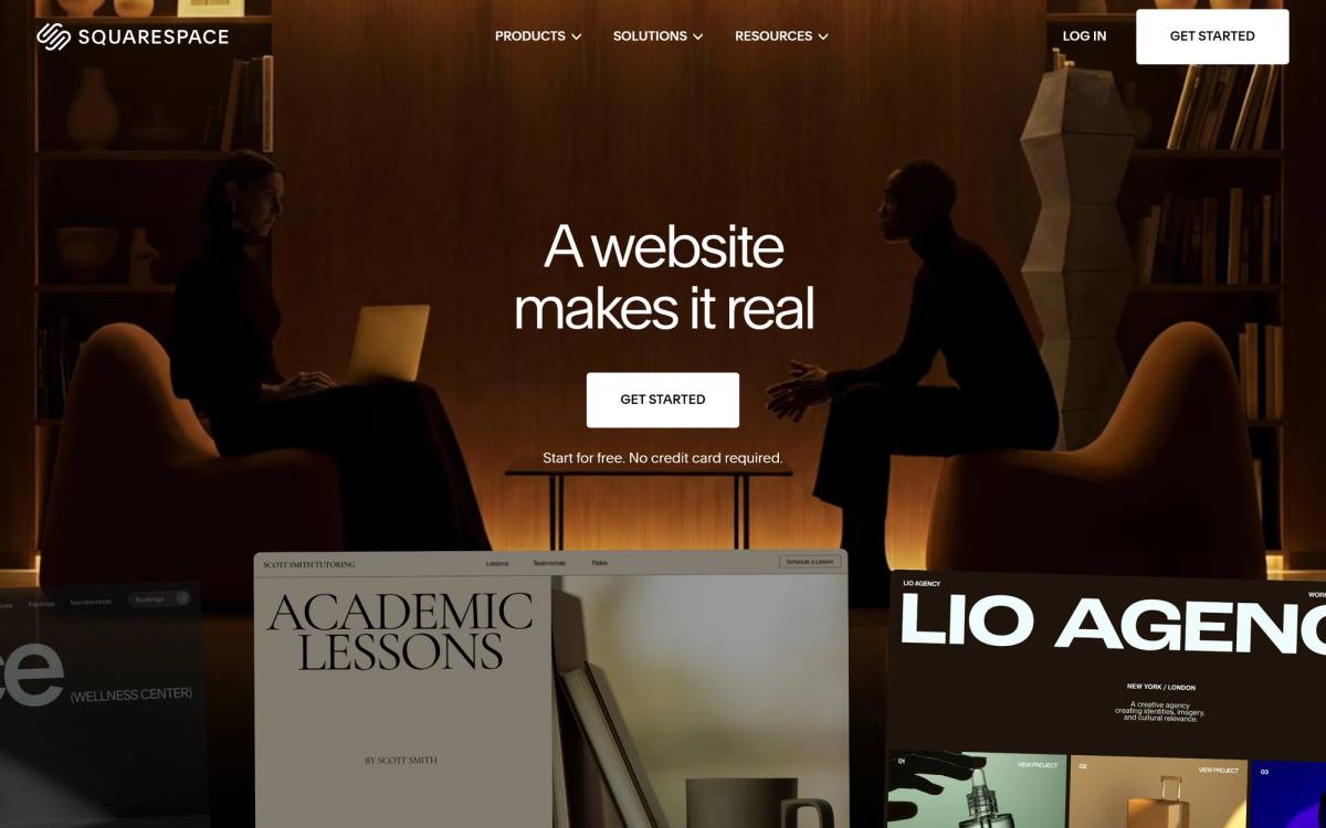
Headline: "A website makes it real." Subhead: "Start for free. No credit card required." Button: "Get Started."
Five words in the headline and it's the best one on this list. The sentence never mentions a website builder. It names the emotional state of the buyer: someone with an idea that doesn't feel legitimate yet. That's a sharper read on the customer than any feature list.
Above the fold there is almost nothing else: the headline, the risk reversal, a "Get Started" button and a rotating showcase of customer sites. The credibility numbers (14 million entrepreneurs served, $36 billion earned by entrepreneurs, 200+ countries) only arrive once you scroll. The second of those is the clever one, because it describes the customer's outcome rather than Squarespace's size.
Holding proof back like that is a bet: the headline is strong enough to buy one more screen of attention. Squarespace can make that bet. A company nobody has heard of cannot.
Steal this: write at least one proof number that describes what customers got, not how big you are. "We've served 400 clients" is about you. "Our clients booked 11,000 consultations last year" is about them.
Notion
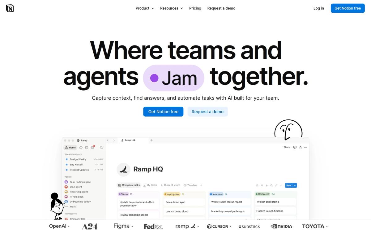
Headline: "Where teams and agents Jam together." Subhead: "Capture context, find answers, and automate tasks with AI built for your team." CTAs: "Get Notion free" and "Request a demo."
That headline is animated. The highlighted word cycles, so the sentence reads "Think together," then "Jam together," then something else depending on when you land. Nice piece of craft, terrible thing to copy, because it means the most important sentence on the page is different for every visitor and you can never say which version earned the signup.
Above the fold Notion runs the full navigation, both CTAs, a product screenshot and a logo rail: OpenAI, A24, Figma, FedEx, Ramp, Cursor, Substack, Nvidia, Toyota. The numbers Notion is known for (100 million users, 62% of the Fortune 100, over half of Y Combinator companies) sit further down the page.
That ordering is deliberate and worth stealing. Logos work instantly, because recognising OpenAI costs the reader nothing. Numbers need a beat of thought. Putting the no-effort proof in the hero and the thinking proof further down matches how people actually read a page they haven't committed to yet.
Steal this: lead with proof that needs no processing, then follow with proof that rewards attention. Don't steal this: the rotating headline word, unless you're willing to give up ever attributing a conversion to a specific sentence.
Mailchimp
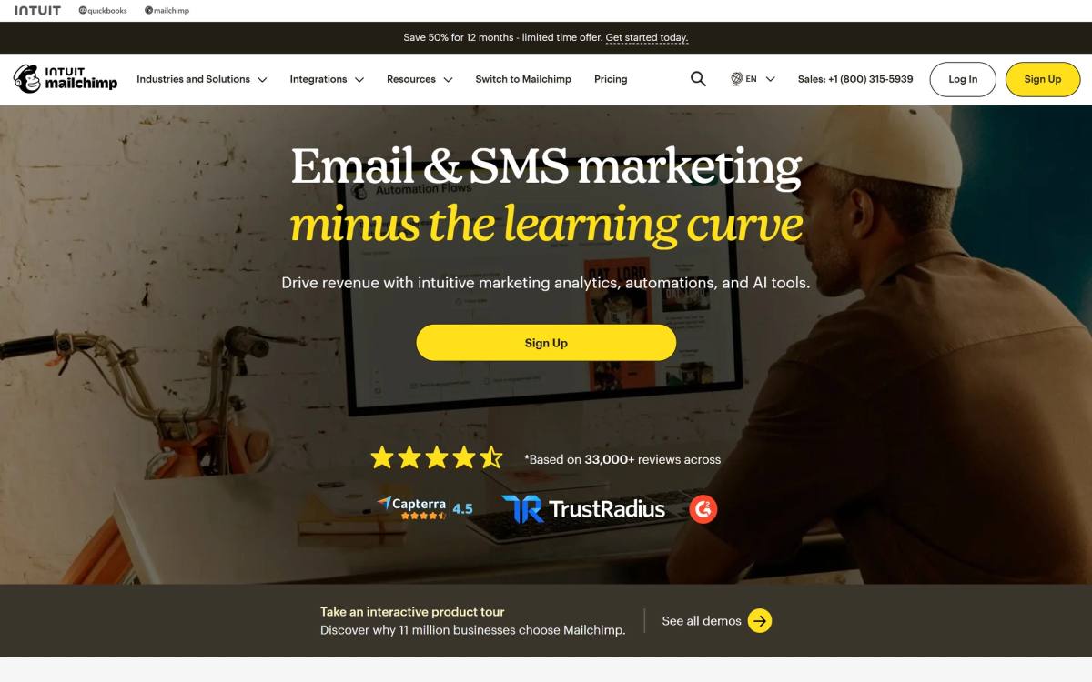
Headline: "Email & SMS marketing minus the learning curve." Subhead: "Drive revenue with intuitive marketing analytics, automations, and AI tools." Button: "Sign Up," with "Save 50% for 12 months, limited time offer" sitting right beside it.
That headline handles an objection before the visitor has finished forming it. Mailchimp isn't claiming to be the most powerful email tool, because they'd lose that argument to Klaviyo and Braze on features. They're claiming to be the one you can actually figure out, which is the real reason a small business owner stalls out: they bought a tool last year, never set it up, and the subscription is still charging them.
The proof is structured well too. Four and a half stars from more than 33,000 reviews across Capterra, TrustRadius, and G2. Three platforms, not one, which makes the rating harder to write off as cherry-picked. Then logos spanning Spotify, Subway, The Onion, and a local realty company, which quietly signals "we work at your size too."
The discount is the risky part. "Save 50% for 12 months" pulls in price shoppers, and price shoppers churn at month thirteen. It works for Mailchimp because their product gets stickier the longer your list lives in it. If your product has low switching costs, a 50% intro discount is renting customers rather than acquiring them.
Steal this: name the fear your category creates instead of claiming to beat your category on power. "Minus the learning curve" is a positioning statement disguised as a feature.
Landing page examples that sell on positioning
These pages aren't trying to win a feature comparison. They're trying to make you feel like the kind of company that uses the product.
Linear
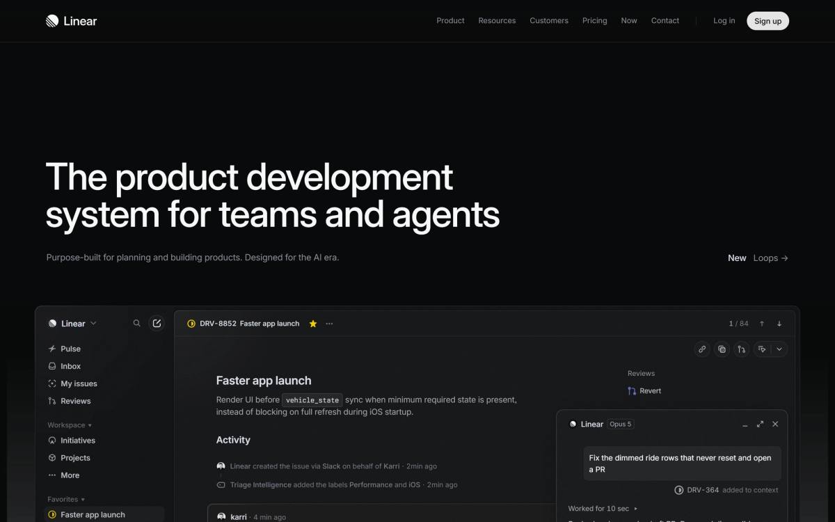
Headline: "The product development system for teams and agents." Subhead: "Purpose-built for planning and building products. Designed for the AI era." Then, immediately, the product itself: a full-bleed screenshot of the Linear interface with Pulse, Inbox, My issues, Reviews, Initiatives and Projects on screen.
There is no social proof above the fold at all. The "over 40,000 product teams" line and the customer quotes come later. Linear is making the most confident bet on this list, which is that the product's appearance is the argument, and that anyone who recognises good software will recognise it in four seconds without being told who else uses it.
Further down, Linear runs a testimonial most B2B companies would have rejected. Gabriel Peal at OpenAI says "You'll probably build a better product, just because of the craft that using Linear infuses on your brain." That's not a quote about time saved or tickets closed. It's a quote about identity, from a name their exact audience respects.
Steal this: when you collect testimonials, ask the question "what changed about how your team works?" instead of "were you happy with the service?" The first question produces usable quotes. The second produces thank-you notes.
Stripe
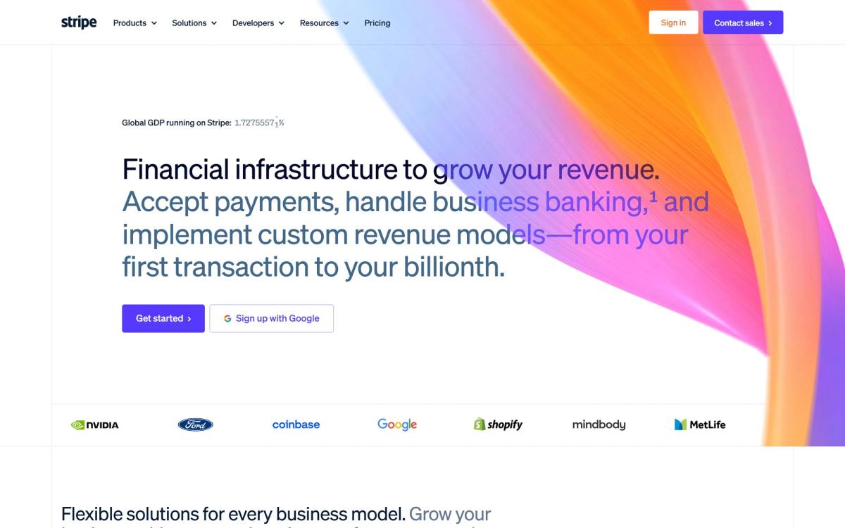
Headline: "Financial infrastructure to grow your revenue." Subhead explains accepting payments, business banking, and custom revenue models. CTAs: "Get started" and "Sign up with Google."
The headline uses the word "infrastructure" on purpose. Stripe could have competed on checkout buttons and payment forms. Instead it claims the layer underneath all of it.
Then, in small grey type directly above the headline, sits the sharpest single proof element I found anywhere in this research: "Global GDP running on Stripe: 1.72755571%", with the trailing digits ticking upward in real time.
Think about what that does. It isn't a claim about Stripe's size, it's a claim about the world's size with Stripe's share of it marked off, and the live counter makes it feel measured rather than asserted. It turns "infrastructure" from a marketing word into an arithmetic statement. The scale numbers Stripe is better known for (135+ currencies, $1.9 trillion in volume, 99.999% uptime) all sit further down, and none of them land as hard.
Under the hero: a logo rail carrying Nvidia, Ford, Coinbase, Google, Shopify, Mindbody and MetLife.
The "Sign up with Google" option next to the main CTA is the quiet detail. For a developer audience that's already signed into Google, it removes the only remaining friction: typing.
Steal this: pick three numbers that each answer a different fear. Four numbers that all answer "we're big" is one number repeated four times.
Framer
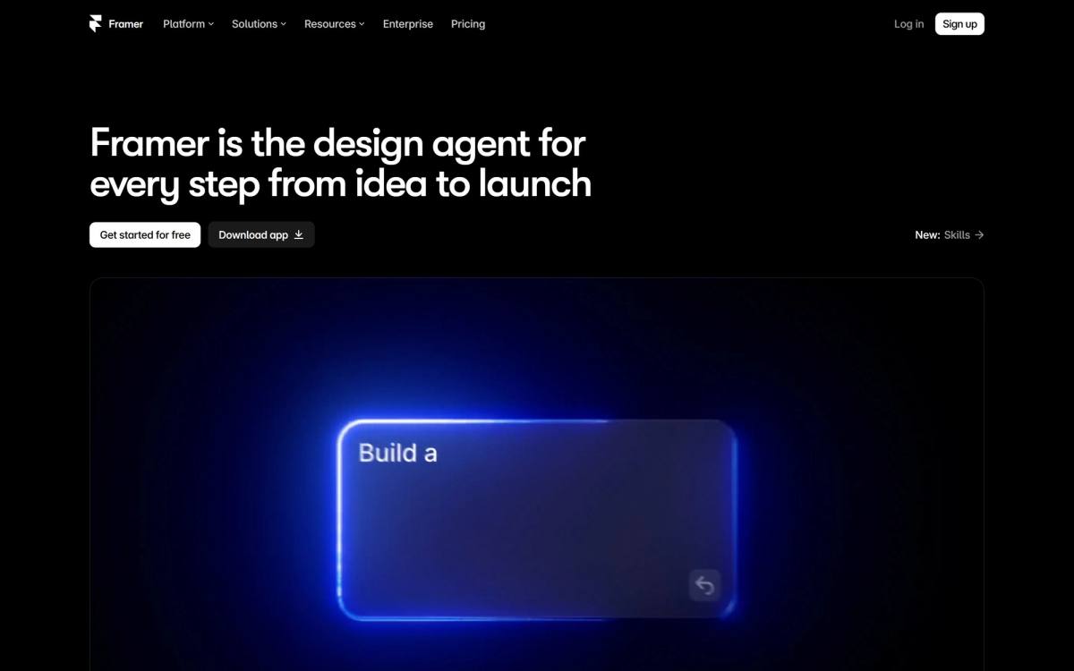
Headline: "Framer is the design agent for every step from idea to launch." CTAs: "Get started for free" and "Download app," with a small "New: Skills" badge.
Above the fold that is genuinely all there is. No subheadline, no customer logos, no numbers. Framer gives the headline the whole screen and lets an animated canvas do the arguing, which is the most aggressive version of Linear's bet.
Scroll once and the page does name the fear properly: "Keep each change editable, with hosting, security, analytics, CMS, and SEO built in." Anyone who has used an AI site builder knows the trap, which is that you get a decent first draft and then you can't change anything. That sentence is the most persuasive line on the page and it is one full screen below where a hesitant visitor decides whether to keep scrolling.
The customer logos (Miro, Perplexity, Mixpanel, Zapier) sit further down still. If you want the broader comparison, we covered the tradeoffs in Framer vs Webflow.
Steal this: write one line that names the thing your buyer got burned by last time. Don't steal this: burying it on the second screen. Framer has the brand strength to make you scroll. Assume you don't.
Webflow
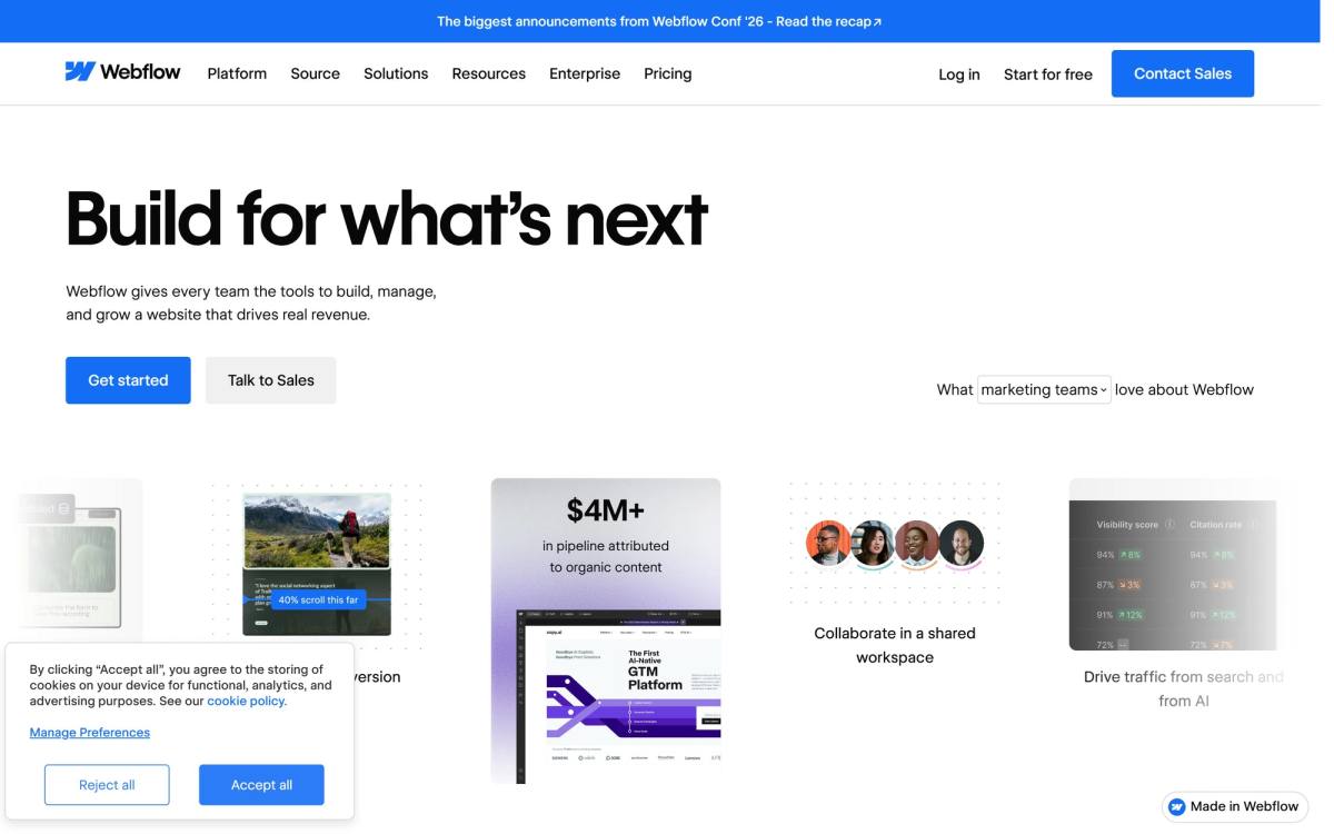
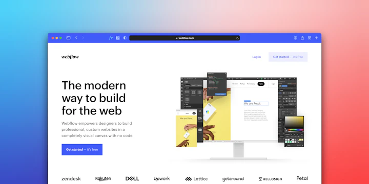
Headline: "Build for what's next." Subhead: "Webflow gives every team the tools to build, manage, and grow a website that drives real revenue." CTAs: "Get started" and "Talk to Sales."
The headline is vague. The subhead rescues it with four words that matter: "drives real revenue." Webflow spent years being known as a designer tool and that reputation got it stuck in the design department, where budgets are small and buying decisions get overruled. Pointing the subhead at revenue is a repositioning move aimed at the person who actually signs enterprise contracts.
The proof follows the same logic. Instead of showing pretty sites, Webflow leads with pipeline numbers: a Copy.ai case study citing $4 million in attributed pipeline and an ABM story citing $200 million. For a CMO evaluating a CMS, those are the only two numbers that matter.
Then the page splits into audience lanes further down: a section for marketers, one for designers, one for engineers, one for agencies. That's how you serve four buyers without writing four vague headlines.
Steal this: one headline for the economic buyer, then separate sections for each role that influences the decision. Don't steal this: "Build for what's next." It's a sentence that means nothing without the subhead carrying it.
Figma
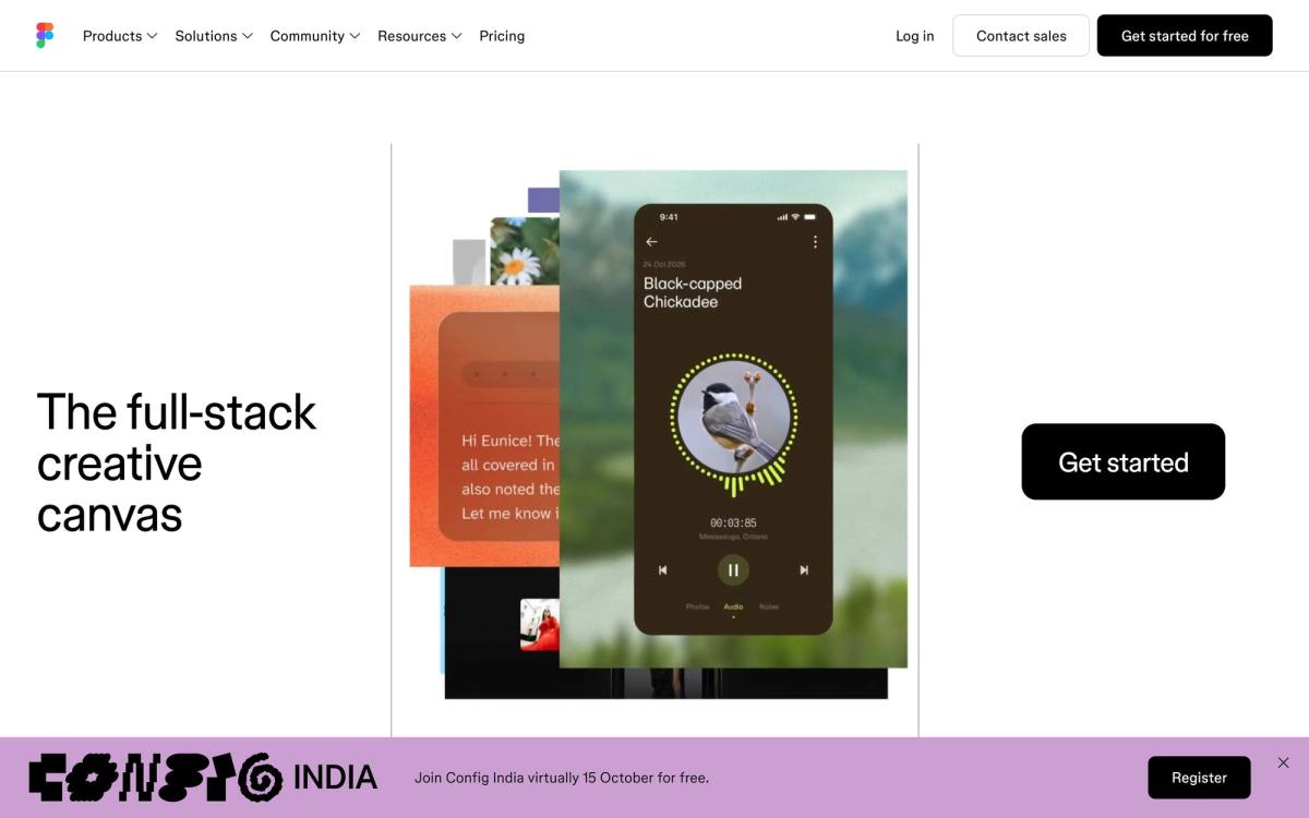
Headline: "The full-stack creative canvas." CTA: "Get started," repeated as "Get started for free" in the navigation.
Five words, a product animation, a button. No subhead above the fold, no proof, and a Config India event bar pinned along the bottom edge.
Keep scrolling and you reach the line that does more work than any other sentence in this research: "95% of the Fortune 500 uses Figma," footnoted "based on data from March 2025," with a logo carousel behind it carrying Airbnb, Microsoft, Netflix, Stripe, GitHub, Duolingo and The New York Times.
Ninety-five percent. There is no counterargument to that. The figure works because it's a share of a specific, countable, prestigious group, which makes it checkable and therefore believable. Compare it to Zapier's "3.39M+ MCP tool calls completed," a far bigger number that lands softer because nobody has any intuition for what a million tool calls means.
Dating the claim costs nothing and buys a surprising amount of trust, because a number with a date attached reads like something a finance team signed off on.
Steal this: express proof as a share of a group your buyer recognises, and put the date on it. "9 of the 12 largest accounting firms in Ontario" beats "hundreds of accounting clients," even though the second number is bigger.
Landing page examples for demo requests and lead gen
Longer sales cycle, human on the other end, higher stakes per conversion. The structure shifts toward reducing perceived risk.
Deel
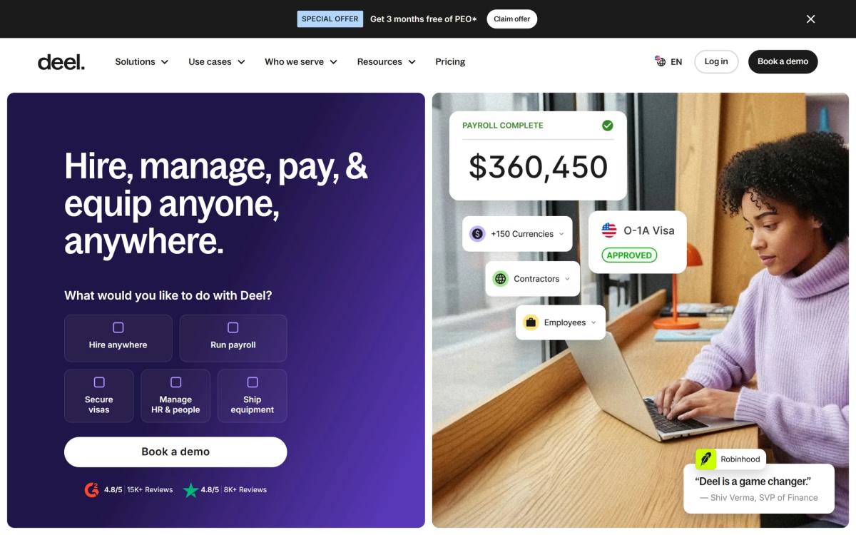
Headline: "Hire, manage, pay, & equip anyone, anywhere." Subhead: "What would you like to do with Deel?" followed by five tiles: hire anywhere, run payroll, secure visas, manage HR and people, ship equipment. One button underneath: "Book a demo."
That subhead is doing something unusual. Rather than explaining the product, it asks the visitor to self-identify. Deel sells to companies with wildly different jobs to be done, so routing beats describing.
The proof is the most complete above-the-fold stack on this list, and all of it is visible without scrolling: G2 at 4.8 out of 5 from 15,000+ reviews, Trustpilot at 4.8 from 8,000+ reviews, and a Robinhood testimonial attributed to Shiv Verma, SVP of Finance. The bigger metrics (150+ countries, $20 billion in payroll processed, a 90+ NPS) come later.
For a product where the downside of a bad choice is a compliance problem in a country you've never visited, that volume of proof reads as proportional rather than excessive.
Steal this: scale your proof to the consequence of being wrong. A $29/month tool needs a testimonial. A product that touches payroll in 150 countries needs a wall.
Airbnb (/host/homes)
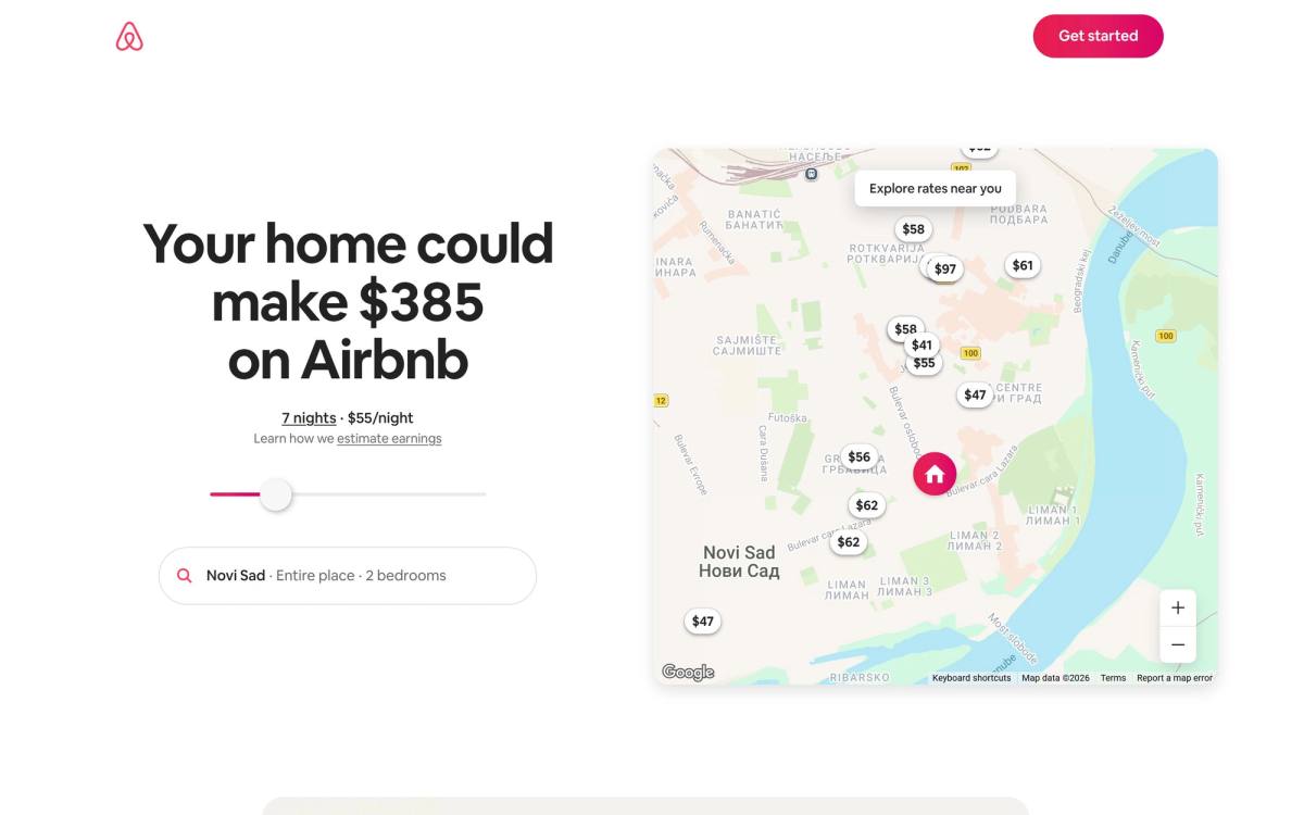
Headline, as it rendered for me: "Your home could make $385 on Airbnb." Underneath it, "7 nights, $55/night," a slider, a location field already filled in with my own city, a "Learn how we estimate earnings" link, and a "Get started" button. Beside it, a map of my town covered in nightly rates.
Read that headline again. The dollar figure is generated, not written. Airbnb geolocated me, estimated what a two-bedroom place nearby earns, and put the result in the biggest type on the page before I had typed anything. Move the slider and the headline rewrites itself.
This is the best page on the list and it is barely a page. The promise is personal and specific, and the very next element lets you test it against your own situation.
Interactive elements usually hurt landing pages because they add work. This one helps because the work is the persuasion. Nothing Airbnb could write would be as convincing as a figure you generated yourself.
The page then closes objections in order: easy setup, no cost to start, damage and liability protection through AirCover, guest verification and reviews, co-host options if you don't want to do the work, and an eight-question FAQ at the bottom. Every one of those sections answers a reason a homeowner would say no.
Steal this: if your offer's value depends on the visitor's own numbers (savings, revenue, hours, cost per lead), build a calculator and put it above the fold. A result someone produced themselves outperforms a result you claimed.
Two landing pages that changed while I was writing this
I drafted the notes for this post, then came back a few days later to capture the screenshots. Two of the seventeen had rewritten their heroes in between.
That is not a complaint. It is the single most useful thing in this post, so I left both in rather than quietly swapping them for stabler examples.
ClickUp
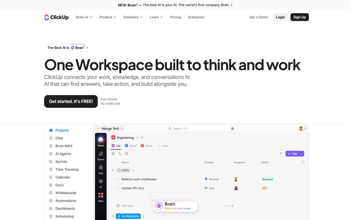
When I first looked, ClickUp led with "Software to replace all software," followed by a subhead that read like six separate sentences fighting over one slot: "Save money. All Apps, AI, Projects, Chat + 20 more. Save time. All humans working together with perfect context. Create infinite productivity."
On 6 October the headline is "One Workspace built to think and work," and the subhead is a single clean sentence: "ClickUp connects your work, knowledge, and conversations to AI that can find answers, take action, and build alongside you."
That is a straight upgrade in coherence, and a real loss in nerve. "Software to replace all software" was a position. You could disagree with it, which is exactly what made it memorable. "One Workspace built to think and work" is accurate, readable and almost impossible to care about. Clarity and distinctiveness pull in opposite directions more often than anyone admits, and most committees resolve the tension the same way ClickUp just did.
What hasn't changed: no social proof above the fold, which remains strange for a company this size, and a feature rail that lists twelve products (Projects, Chat, Brain MAX, AI Agents, Sprints, Time Tracking, Calendar, Docs, Whiteboards, Automations, Dashboards, Scheduling) just below the hero, before you've been given a reason to want any single one.
The lesson: when you tidy a headline, check whether you removed the confusion or removed the argument. They are not the same edit.
Zapier
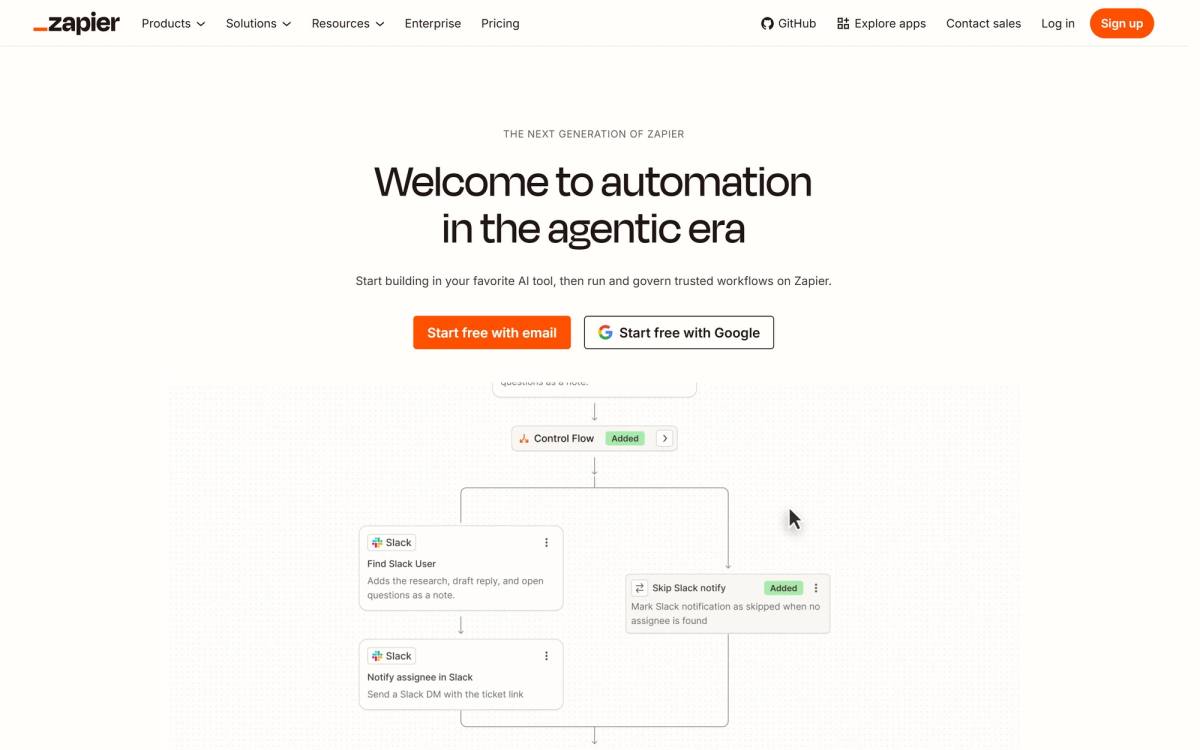
Zapier's hero now reads "Smarter workflows. Smaller bills." The subhead: "Not all work needs the most powerful AI model. With Zapier's automation platform, you can use AI when you need it, and skip it when you don't."
In a category where every competitor is shouting about capability, Zapier is selling restraint. That subhead names a cost anxiety that anyone running AI workloads in 2026 already feels, and it does it in the one place that gets read.
Three numbers sit directly under the buttons, each answering a different question: 450K+ agents built (is anyone really using this), 9,000+ app integrations with governed access (does it connect my stack), 3.39M+ MCP tool calls completed (does it work at volume). Below those, a row showing which tools you can build with (Claude, Claude Code, ChatGPT, Cursor, OpenClaw), then SOC 2 Type II and GDPR compliance badges, then a logo wall with Cursor, Samsung, Okta, Mastercard, Dropbox, Shopify and Nvidia.
Two CTAs, "Start free with email" and "Start free with Google," which looks like it breaks the one-next-step rule and doesn't. They are the same action with two different amounts of typing.
The lesson: the strongest headline in a hyped category is usually the one pointing at the bill. Everyone else is selling what the technology can do. Almost nobody is selling what it costs you to run it.
Three landing pages we built, including the call I got wrong
Easy to critique other people's work. Here's ours, including the parts that needed fixing.
Comment Compass: a SaaS page that was missing its middle

The page now leads with "Comment Tracking, Beyond Your Own Channel" and a subhead that does the actual explaining: "Monitor every comment about you across YouTube, even when it's not your video." Two buttons, "Try For Free" and "View Demo."
The original had the two ends of the argument and nothing in between. Product name at the top, pricing at the bottom, and a gap in the middle where the reason to care should have been. Messaging was unclear, hierarchy was weak, and social proof was close to nonexistent.
We rebuilt it around a problem, solution, benefits sequence, which sounds obvious until you count how many SaaS pages skip straight to features. Then we added testimonials and case studies for trust, an interactive pricing calculator so visitors could price their own usage, and repeated the CTA down the page instead of parking it once in the hero.
Design and Webflow build took about three weeks. The page scored 100 on SEO and 90+ on accessibility, which matters more than it sounds like it does, since the structure that helps screen readers is the same structure that helps skimmers. The full writeup is in the Comment Compass case study.
The pricing calculator was the thing I argued against. I thought it added a step. I was wrong: it turned out to be the element people engaged with most, because it let them stop reading our claims and start checking their own math.
Seerlabs: the AI-generated page problem
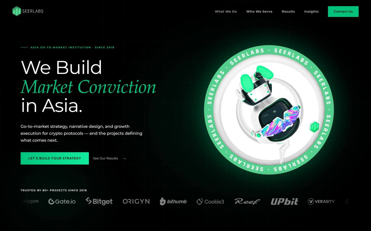
The page now opens with "We Build Market Conviction in Asia." and a subhead that says precisely who it is for: "Go-to-market strategy, narrative design, and growth execution for crypto protocols, and the projects defining what comes next." The button reads "Let's build your strategy."
What Seerlabs came to us with was a site an AI builder had produced. It looked fine. Modern spacing, decent type, nothing visibly broken.
It also said nothing. The hero made a generic claim, the sections followed a template order rather than an argument, and there was no point on the page where a visitor would think "this is for me specifically." That's the characteristic failure of generated pages: competent surface, no structural reasoning underneath. There's nothing to fix because there was never a decision to disagree with.
The rebuild was mostly messaging and structure rather than visual design. Same approach we describe in how to redesign a website without losing what works: figure out what the page is arguing before you decide what it looks like.
Set Studio: a landing page shipped on a deadline
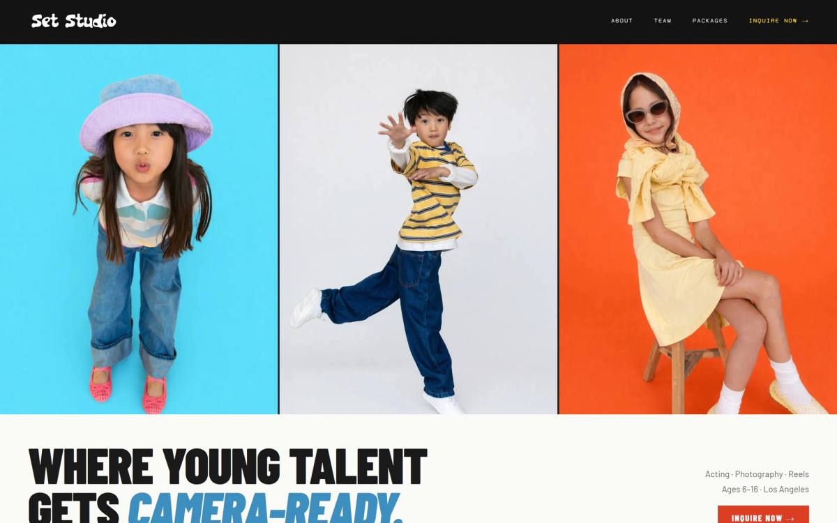
Set Studio needed a landing page faster than a proper discovery process allows. Tight deadline, modeling industry, and the scope included SEO and answer-engine optimization on top of the build. The hero that came out of it is one line: "Where young talent gets camera-ready." Four nav items, one of which is "Inquire now."
That headline passes the swap test, which is more than most of the software pages above manage. No other studio can paste it onto their site, because it names both the customer (young talent) and the outcome (camera-ready) in six words.
What we cut: custom illustration, scroll animation, and a second round of design revisions. What we didn't cut: the structural five moves from earlier in this post, semantic HTML, and the metadata. Under time pressure the instinct is to protect the visual polish and skip the structure, which is exactly backwards. Polish is the cheapest thing to add later. Structure is the thing you'd have to rebuild the page to change.
That tradeoff comes up on nearly every deadline project, and clients almost always want it the other way around, because animation is visible in a review call and heading hierarchy isn't. The argument I use now: we can add a scroll animation in an afternoon six weeks from now, and nobody will notice it wasn't always there. If the page is arguing the wrong thing, fixing that means writing a new page.
The five headline patterns these 17 pages use
I lined the headlines up next to each other and they sort into five patterns. Three work. Two are what you end up with when the room can't agree.
| Pattern | What it does | Examples | Verdict |
|---|---|---|---|
| Direct outcome | States what the visitor gets, in their words | Airbnb, Stripe, Deel | Strongest |
| Objection removal | Names the thing that stopped them last time | Mailchimp, Zapier, Framer (subhead) | Strong |
| Bold position | Takes a stance competitors can't repeat | Squarespace, Shopify, Set Studio | Strong, risky |
| Category claim | Declares what kind of product this is | Linear, Figma, Notion, monday.com, ClickUp | Only works with brand |
| Vague aspiration | Sounds like progress, commits to nothing | Webflow, Framer | Avoid |
The category claim pattern is the trap, and it's the one most companies fall into because it feels safe. "The product development system for teams" works for Linear because 40,000 teams already know the name and the sentence just confirms what they came for. Write the same shape of sentence for a company nobody knows and you've used your most valuable real estate to tell a stranger which shelf you'd sit on in a store they've never visited.
If you have no brand recognition, you get the direct outcome pattern or the objection removal pattern. That's the whole menu. Squarespace's "A website makes it real" works without brand help because it's about the reader, not the product. Linear's headline would not survive the same test, and Linear doesn't need it to.
Webflow's "Build for what's next" is the clearest case of the last pattern. It's aspiration with no object, the kind of line that survives a committee precisely because nobody can object to it, and the subhead has to do all the real work. Framer's headline has the same problem wearing more words.
One pattern I expected to find and didn't: the question headline. Not one of these 17 pages opens with a question. Questions invite an answer, and "no" is always an available answer.
Your mobile landing page is the real landing page
Every page above was analyzed on desktop, which is how almost every roundup of landing page examples gets written and also why those roundups quietly mislead you. Google indexes the mobile version of your page. Most of your paid traffic arrives on a phone. The desktop layout you spent three weeks on is, for a majority of visitors, a layout that nobody will ever see.
Mobile changes the math on all five structural moves:
- The fold gets brutal. After the browser chrome, you've got roughly 500 pixels of vertical space. A headline, a subhead, and a button fills it. Add a logo rail and the button is gone.
- Attention ratio looks better and behaves worse. Collapsing the nav into a hamburger drops your visible link count, which feels like a win. It isn't. The links are still there, one tap away, and the tap target is in the easiest place for a thumb to reach.
- Proof stacks instead of sitting side by side. Deel fits two review scores and a named testimonial beside its hero on desktop. On a phone that same proof becomes three more screens of scrolling, which is usually where it gets cut and why mobile heroes end up with none.
- Forms get expensive. Every field is a keyboard appearing, the viewport resizing, and the button vanishing below the keyboard. This is why "Sign up with Google" converts so well on mobile and why Stripe and monday.com both offer it.
- Sliders beat typing. Airbnb's earnings calculator uses a slider, which is a thumb gesture. The same tool built with a number input would get abandoned.
The practical test takes two minutes. Open your page on an actual phone, not a browser's responsive mode, and screenshot the first view without scrolling. Then ask: does this screenshot contain one promise and one button? If it contains a logo, a cookie banner, a chat bubble, and half a headline, you've found your conversion problem and it has nothing to do with your copy.
The chat bubble deserves a special mention. On desktop it sits politely in a corner. On a 390-pixel-wide screen it covers your CTA. I've seen that single element account for a double-digit drop in mobile conversions, and it's always installed by someone who only ever checked it on a laptop. More of these patterns are collected in our writeup on bad UX and what causes it.
Types of landing pages, and which structure fits which
"Landing page" covers at least six different jobs, and the structure should change with the job. Picking the wrong type is the most common reason a well-designed page underperforms.
| Type | Goal | Form fields | Nav | Example above |
|---|---|---|---|---|
| Free trial / signup | Account created | 1 to 2 | Stripped | Shopify /free-trial |
| Lead capture | Contact details | 2 to 4 | Stripped | Deel (routed path) |
| Demo request | Qualified meeting | 4 to 7 | Stripped | Deel |
| Click-through | Move to checkout | 0 | Stripped | Airbnb /host/homes |
| Homepage as landing page | Multiple paths | 0 to 1 | Full | Notion, Stripe, Linear |
| Long-form sales page | Purchase | 0 to 2 | Stripped | Shopify below fold |
Two rules come out of that table. First, form length should match what you're asking for: a demo request can justify seven fields because the visitor understands they're booking time with a human, while a free trial asking for seven fields is just hostile. Second, keep your navigation only if the page has to serve several different visitor types at once. Paid traffic arriving with one specific intent doesn't need a menu, it needs a decision.
One more distinction people get wrong. A homepage and a landing page have different jobs, and treating your homepage as your paid-traffic destination is why cost per acquisition looks the way it does. A homepage orients. A landing page converts. Our landing page checklist walks through the build order if you're starting from scratch.
How to copy a landing page example without wrecking your conversion rate
You've got 17 examples. Here's the process for using them instead of just admiring them.
- Name the one action first. Before you look at any example, write down the single thing a visitor should do. If you can't do this in one sentence, the page isn't the problem.
- Pick examples that share your conversion type, not your industry. A dentist booking appointments has more to learn from Airbnb's host page than from another dentist's site, because the mechanics are the same: estimate value, reduce risk, book.
- Write down the structure, not the design. For each example, list the sections in order and what job each one does. You should end up with an outline, not a mood board.
- Count your attention ratio. Open your current page and count every clickable element above the fold. With one conversion goal, that count is your ratio. Most sites sit past 20:1 and have never once checked.
- Map proof to objections. Write the four reasons someone hesitates. Find one piece of evidence per reason. Place each piece next to the sentence that triggers it, not in a logo strip.
- Rewrite the headline until it fails the swap test. If a competitor could paste your headline onto their page without anyone noticing, keep going.
- Cut one cost of saying yes. Remove a form field, add a no-credit-card line, offer a social login, or shorten the commitment. One per round so you know what moved.
- Ship it, then test it. Your version one is a hypothesis. The examples in this post are other people's version elevens.
That last step is where most of this falls apart. People treat the launch as the finish line, then wonder in six months why the page they copied from Stripe isn't performing like Stripe's. The copying was never the strategy. The testing is. If you're on Webflow, our guide to A/B testing in Webflow covers which tools are worth it and when you have enough traffic to bother.
And if your page already gets traffic but not conversions, run a CRO audit before you redesign anything. The diagnosis is cheaper than the rebuild, and about half the time the answer isn't on the page at all. It's in the mismatch between what the ad promised and what the page delivered.
Score your own page against all 17
Go open your landing page in another tab and mark each row honestly. Anything under 5 out of 7 and you have a structural problem that no amount of design will fix.
| Check | Pass condition |
|---|---|
| One promise | A competitor couldn't paste your headline onto their page |
| Attention ratio | Under 5:1 above the fold on paid traffic |
| Proof placement | Evidence sits beside the claim it supports |
| Proof variety | At least three types: rating, number, named quote, logo |
| Cost reduction | At least one explicit risk, money, or effort reducer |
| Single next step | One CTA action repeated, not several competing ones |
| Reading level | Body copy reads at seventh grade or below |
That last row is the one everybody skips and it's the one with published numbers attached. Paste your copy into any readability checker. If it comes back at college level, you're leaving conversions on the table for the privilege of sounding smart.
Two of these rows are also accessibility checks wearing different clothes. Clear heading structure and plain language help screen readers and skimmers identically, which is a recurring theme in Nielsen Norman Group's research on how people read on the web: they don't read, they scan for the thing they came for. Build the page so scanning works and reading becomes optional.
Landing page examples FAQ
What is a landing page?
A landing page is a standalone page built around one action, with most or all navigation removed so visitors have a single obvious next step. The difference from a homepage is purpose rather than design: a homepage helps people orient and choose between several paths, while a landing page is built to convert the specific traffic you sent to it.
What makes a good landing page?
A good landing page makes one specific promise in the headline, keeps the number of clickable elements close to the number of goals, places proof next to the claims that trigger doubt, reduces the time or risk or effort of saying yes, and offers exactly one next step. Design quality matters, but it ranks below all five of those structural decisions.
What is a good landing page conversion rate?
Unbounce's benchmark data puts the median landing page conversion rate near 6.6%, with SaaS closer to 3.8% and financial services above 8%. Treat those as rough context rather than targets, since traffic source changes everything: email traffic converts around 19% on average while cold paid traffic converts far lower.
How many landing pages should I have?
One per offer and audience combination, not one per campaign. If you run three ad groups selling the same thing to the same buyer, they can share a page. If you're selling the same service to dentists and to law firms, those need separate pages, because the proof and the objections are different even when the service is identical.
What are the main types of landing pages?
The six common ones are free-trial signup, lead capture, demo request, click-through, homepage used as a landing page, and long-form sales page. The type determines your form length and whether you keep navigation, so pick the type before you pick a template.
Should a landing page have navigation?
Remove it on any page receiving paid traffic or traffic from a specific campaign, since every extra link is a way out. Keep it on a homepage or on organic pages where visitors arrive with unclear intent and genuinely need to explore before converting.
How long should a landing page be?
Long enough to answer every objection that would stop a purchase, and no longer. Low-risk offers like a free trial often convert on a short page, while high-consideration purchases need length to handle the objections, which is why Shopify's free-trial page runs through ten sections before the footer.
Do landing pages help SEO?
They can, but only if they're indexable, built with proper heading structure, and targeting a query someone actually types. A stripped-down paid-traffic page with thin copy and no internal links won't rank, and that's fine because it wasn't built to. If you want one page doing both jobs, our guide to landing page SEO covers how to rank and convert on the same page.
Pick one page. Count the links above the fold, read the headline out loud, and ask whether a competitor could have written it. That's twenty minutes of work and it'll tell you more than another afternoon scrolling through landing page galleries. The examples are only useful once you know what you're looking for, and now you do.
Comments