
A landing page checklist is a structured list of elements, from headline clarity to page speed to CTA placement, that you check before publishing to make sure your page actually converts visitors instead of just looking pretty in a Figma mockup.
Most checklists you'll find online have 50, 80, even 100 items. That's not a checklist. That's a novel. And nobody reads it before launching a page because they're already behind deadline and their boss wants the campaign live yesterday.
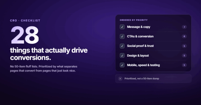
So here's the version I actually use. 28 items, grouped by what matters most. If you nail the first ten, you'll beat 80% of landing pages on the internet. The rest is refinement.

Messaging and Copy (The Part Most People Rush)
I've reviewed hundreds of landing pages at this point. The pattern is always the same: gorgeous design, terrible messaging. The headline says nothing. The subheadline says the same nothing in more words. And the CTA says "Learn More" like that's supposed to make someone excited.
Copy is where conversions live or die. Design is the frame. Copy is the painting.
1. Your headline answers "what do you do and for whom?"
If a stranger lands on your page and can't answer those two questions within three seconds of reading your headline, you've lost them. Not because they're impatient. Because there are 40 other tabs competing for their attention.
Bad: "Empowering Teams to Achieve More Together"
Good: "Project management for remote marketing teams"
The first one could sell anything from toothbrushes to enterprise SaaS. The second one tells you exactly what it is, who it's for, and whether you should keep reading.
2. Your subheadline adds the "why you" differentiator
The headline gets attention. The subheadline earns the scroll. This is where you say what makes you different from every other option. Not "best in class" or "industry-leading." The actual mechanism that makes you worth choosing.
3. You're writing to one specific person
A landing page that tries to speak to everyone speaks to no one. Before you write a single word, know who's reading this. What's their job title? What keeps them up at night? What have they already tried that didn't work?
I built three landing pages for three different niches once, each one speaking to a single type of buyer. The conversion rate difference between those targeted pages and the generic "we serve all businesses" version? About 3x. Turns out people respond when you describe their exact problem back to them.
4. Benefits come before features
Nobody cares that your platform has "real-time collaboration" until they understand it means they'll stop losing work in email threads. Lead with the outcome. Mention the feature as proof.
5. Your copy is scannable
Walls of text don't convert. People scan landing pages in an F-pattern. Short paragraphs. Bold the key phrases (sparingly). If someone scrolls the entire page in three seconds, they should still catch the main argument from headings and bold text alone.
Call to Action (The Moment of Truth)
Your CTA is the one thing you're asking someone to do. One thing. Not three buttons that say different things. Not a contact form AND a chat widget AND a phone number AND a "download our whitepaper" link all competing for attention.
6. One page, one goal
Every element on the page either moves someone toward the CTA or it's a distraction. Navigation bars? Distraction. Footer links? Distraction. Sidebar widgets? You get the idea.
The landing pages that convert best strip everything down to a single path: read, understand, click.
7. Your CTA button text describes the outcome, not the action
"Submit" is not a CTA. Neither is "Send" or "Click Here." Those describe what the button does mechanically. A good CTA tells people what they'll get.
"Get my free audit" beats "Submit." "Start my trial" beats "Sign up." "See pricing" beats "Learn more." Tell people what's on the other side of the click.
8. The button is visually unmissable
Contrasting color from the rest of the page. Big enough to tap on mobile without precision. Above the fold at least once. Repeated after your strongest proof section. If someone has to hunt for your CTA, your design failed at its primary job.
9. You've reduced friction in your form
Every additional form field costs you conversions. Name and email is the sweet spot for lead gen. If you absolutely need the phone number, make it optional and explain why you're asking. If you need ten fields, you've got a sales process problem, not a form problem.
Social Proof and Trust (Why Should Anyone Believe You?)
You can have the best headline, the clearest CTA, and the most beautiful design on the internet. None of it matters if the visitor doesn't trust you enough to take action. Social proof isn't a nice-to-have section. It's structural.
10. You have testimonials from people like your target audience
A testimonial from a Fortune 500 CEO doesn't help if you're selling to startups. Match your proof to your audience. Names, titles, photos, specific results. "Increased our conversion rate by 40%" hits differently than "Great product, highly recommend!"
11. You show logos or numbers that create "oh, they're legit" moments
Client logos, user counts, revenue processed, years in business. Something that signals this isn't your first week. If you're new and don't have big logos, use specific metrics instead. "Helped 47 SaaS companies redesign their onboarding" works even without recognizable names.
12. Your proof is placed before the CTA, not after
The visitor needs to believe you before they'll click. Social proof after the CTA is like showing references after someone already left the interview. Stack your best testimonial or stat right above your primary button. That's the moment they're deciding. Give them the push.
13. You address the primary objection
Every audience has one. "Is this going to be expensive?" "Will this take forever to set up?" "What if it doesn't work?" Find the main reason people hesitate and kill it directly on the page. Money-back guarantee, setup time promise, free trial with no credit card. Whatever neutralizes the fear.
Design and UX (The Container, Not the Content)
Design serves the message. Not the other way around. I've seen stunning landing pages that convert at 0.3% and ugly ones that convert at 8%. The difference is always whether the design guides the eye toward the goal or just looks nice in a portfolio.
14. Visual hierarchy points to your CTA
Size, color, whitespace, and placement create a path. The reader's eye should flow naturally from headline to value prop to proof to CTA. If you need to add arrows pointing at your button, your hierarchy failed.
15. You've killed the navigation bar
On a landing page, navigation is an exit ramp. Every link that isn't your CTA is an invitation to leave without converting. Remove it. If someone needs your main site, they can type the URL. This page has one job.
16. White space is doing the heavy lifting
Cramped pages feel desperate. White space gives the eye room to rest and the brain room to process. It also makes your CTA stand out because there's nothing crowding it. If your page feels "busy," you probably have too many elements, not too little space.
17. Your hero section communicates value in under 5 seconds
Above the fold is premium real estate. The combination of headline, subheadline, and hero image (or video) should tell the full story in a glance. If the visitor needs to scroll to understand what you're offering, you've buried the lead.
Mobile Optimization (More Than "It Fits")
Over half your traffic is probably on mobile. Responsive design isn't enough. The page needs to be designed for mobile first and adapted for desktop, not the other way around. I once built a custom animation system for a client's homepage that looked incredible on desktop. Nobody on mobile ever saw it. They bounced before the page finished loading. That's when I stopped designing for my own internet connection.
18. Buttons are thumb-friendly (minimum 48px)
If someone needs surgeon's precision to tap your CTA on a phone, you'll lose conversions. Make buttons big. Make the tap target generous. This isn't about aesthetics. It's about physics.
19. Forms work on mobile without zooming
Input fields need to be at least 16px font size on iOS, or the browser auto-zooms and breaks the layout. Label placement matters. Inline validation matters. Auto-fill attributes matter. Every tiny friction point on mobile costs you more than on desktop because the user is probably doing three things at once.
20. Content reflows intelligently, not just smaller
Responsive doesn't mean "desktop layout but tinier." Your two-column section might need to become a single column with reordered elements. Your hero image might need cropping. Your testimonial carousel might need to become a stack. Think about the mobile experience as its own design, not a shrunk desktop.
Page Speed (The Silent Conversion Killer)
Every second of load time costs you roughly 7% of conversions. That's not my number. That's from Google's own research. And most landing pages are drowning in uncompressed images, render-blocking scripts, and analytics tags that fire before the content paints.
21. Page loads in under 3 seconds on mobile
Test on a real device with a throttled connection, not on your office WiFi. If your site feels slow, you're losing people before they even see your headline. Use WebPageTest or Google's PageSpeed Insights. Aim for a Largest Contentful Paint under 2.5 seconds.
22. Images are compressed and properly sized
WebP format. Compressed under 200KB each. Served at the actual display size, not a 4000px image scaled down in CSS. Lazy load anything below the fold. This alone usually saves 2-3 seconds on image-heavy pages.
23. No render-blocking resources above the fold
If your page waits for three JavaScript files and two font requests before painting anything, your user sees a blank screen for two seconds. Defer non-critical scripts. Preload your primary font. Inline your critical CSS if you have to. The first paint should happen fast, everything else can load after.
SEO and Discoverability
Not every landing page needs organic traffic. Paid campaigns send people directly. But if your landing page can also rank for relevant keywords, you're getting free traffic on top of paid. That's a compounding advantage in your marketing strategy.
24. Meta title and description are written for humans who scan search results
Your meta title isn't just for Google. It's the first impression in the SERP. Include your primary keyword near the front, keep it under 60 characters, and make it specific enough that someone knows what they're getting. The meta description is your ad copy for organic search. 120-150 characters of benefit + specificity.
25. The page has a logical heading structure
One H1 with your primary keyword. H2s for major sections. H3s for subsections. This isn't just for SEO. It's for accessibility and scannability. Screen readers use heading hierarchy. So do people deciding whether to read your page.
26. You have message match between ad and landing page
If your Google Ad says "Free SEO audit for ecommerce sites" and your landing page headline says "Welcome to Our Digital Marketing Agency," you just broke the promise that got the click. The keyword, the offer, and the specificity from the ad need to appear on the landing page within the first two seconds. Message mismatch is one of the biggest reasons landing pages underperform despite decent traffic.
Testing and Iteration (The Part Nobody Does)
Everyone builds the page. Almost nobody tests it after launch. You've done 90% of the work. The last 10% is where the actual conversion gains hide.
27. You're tracking the right conversion event
Not page views. Not scroll depth. The actual conversion event: form submit, button click, purchase complete. Set up your analytics before launch, not after. Tag Manager, conversion pixels, whatever your stack uses. If you can't measure it, you can't improve it.
28. You have a plan for A/B testing within 2 weeks of launch
Your first version is a hypothesis, not a finished product. Plan your first test before you launch. Test one element at a time. Headline usually has the biggest impact, so start there. Then CTA text. Then social proof placement. Small changes, measured properly, compound into serious conversion improvements over time.
Bonus: Optimizing for AI and Answer Engines
This is the section the other checklists miss. Search is changing. AI overviews, featured snippets, and answer engines are pulling content directly from pages and serving it without a click. If your landing page also functions as educational content (and the good ones do), structuring it for AI citation is a free traffic multiplier.
Answer questions directly in your copy. Use clear question-and-answer formatting in your FAQ section. Structure your content with proper headings and concise answers in the first sentence after each heading. This doesn't change how you write for humans. It just means you're also writing in a way that machines can parse and cite.
Think of it this way: a well-structured landing page that clearly answers "what makes a good landing page" in its opening paragraph might get pulled into an AI overview. That's visibility you didn't pay for and can't buy through ads.
The Priority Order (What to Fix First)
If you're staring at this list and feeling overwhelmed, here's how I'd prioritize:
- Fix your headline. If people don't understand what you do in three seconds, nothing else matters.
- Fix your CTA. One clear action, one button, outcome-focused text.
- Add social proof above the CTA. Real testimonials with real names.
- Kill the navigation and distractions.
- Check mobile. Actually pull it up on your phone.
- Check speed. Run PageSpeed Insights.
- Then worry about everything else.
The first four items take an afternoon. They'll move the needle more than spending three weeks perfecting your color palette.
I once spent two weeks building a landing page with parallax scrolling, custom micro-interactions, and a video background that auto-played on loop. Conversion rate: 1.2%. I stripped it back to a headline, three bullet points, a testimonial, and a button. Conversion rate: 4.7%. Turns out nobody cares about your scroll animations when they're trying to decide whether to give you their email address.
Frequently Asked Questions
What is the most important element of a landing page?
The headline. 80% of visitors read the headline and only 20% read the rest. If your headline doesn't immediately communicate what you offer and who it's for, no amount of great design below it will save your conversion rate. Get the headline right first, then optimize everything else.
How many CTAs should a landing page have?
One CTA repeated multiple times. Not multiple different CTAs competing for attention. Place the same button after your hero section, after your strongest proof, and at the bottom of the page. Same offer, same button text, same destination. Repetition isn't redundancy here. It's giving people the opportunity to convert at the moment they're convinced.
Should I remove navigation from my landing page?
Yes. Always. A landing page has one job: convert the visitor. Every link that isn't your CTA is a leak in your funnel. Studies consistently show that removing navigation increases landing page conversions by 20-30%. If people need your full site, they'll find it. This page has a different job.
What's a good conversion rate for a landing page?
The average across industries is around 2-5%. Top performers hit 10%+. But "good" depends entirely on your traffic quality, offer, and industry. A page converting at 3% from cold paid traffic is performing differently than one at 3% from warm email traffic. Focus on improving your own baseline rather than chasing someone else's number.
How long should a landing page be?
As long as it needs to be to address every objection and build enough trust for the ask. Free newsletter signup? Short page, minimal proof. Enterprise software demo? Longer page with multiple proof sections, feature breakdowns, and an FAQ. Match length to decision complexity. If people need to think about it, give them more to think with.
Do landing pages need SEO?
If you're running paid campaigns exclusively, technical SEO matters (speed, mobile-friendliness) but keyword targeting doesn't. If you want the page to also attract organic traffic, then yes, a solid SEO foundation gives you free traffic alongside your paid spend. It's compounding vs. renting. Both work. Compounding works better over time.
What's message match and why does it matter?
Message match means the words in your ad match the words on your landing page. If your ad promises "free website audit for law firms" and your page headline says "Digital Marketing Solutions," you broke the visitor's expectation. They clicked expecting something specific. You gave them something generic. That disconnect kills conversions faster than slow load times or bad design.
How do I test my landing page after launch?
A/B test one element at a time. Start with your headline (biggest impact), then your CTA text, then your social proof placement. Use a tool that splits traffic evenly and let each test run until you reach statistical significance (usually 200+ conversions per variant). Don't change multiple things at once or you won't know what worked.
Comments