
We've run speed audits on a dozens marketing sites by now, and the surprising part is how little variety there is in what's wrong. The same five things occur almost always. None of them are exotic. All of them are fixable in an afternoon.
This is the checklist we actually run, in order. Work top to bottom and you'll fix most of your load time before you reach the clever stuff. Each item has the same shape: the symptom you'll see in a report, and the fix we'd ship.
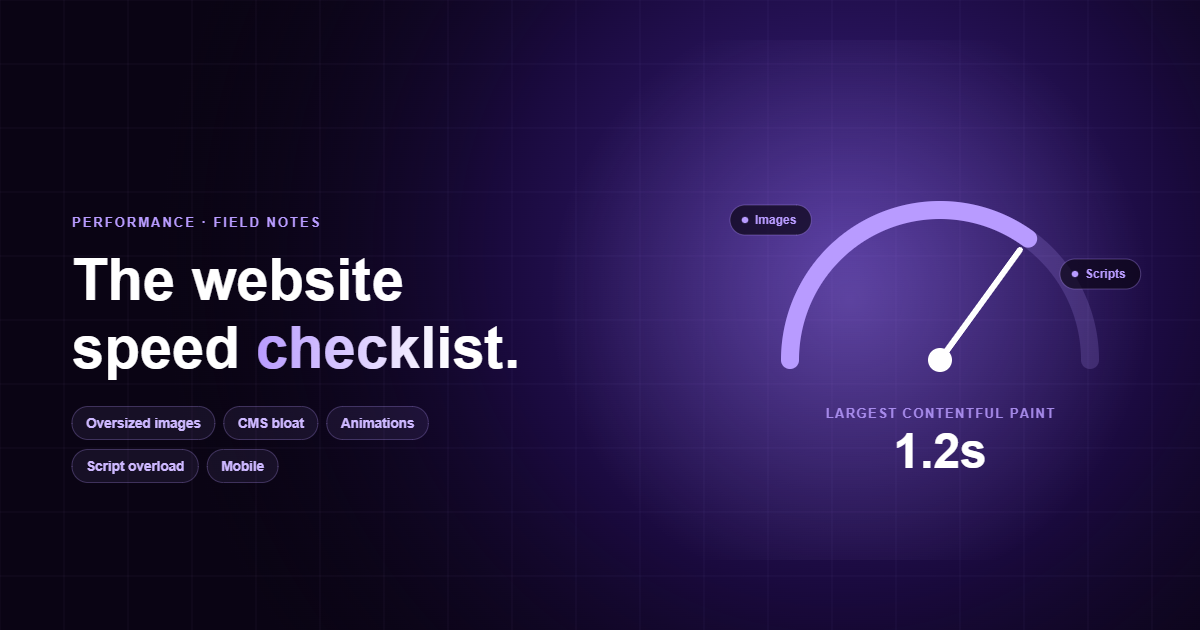
One ground rule first: measure before you touch anything. Open PageSpeed Insights or run Lighthouse on a real page, and write down your Largest Contentful Paint (LCP) and Total Blocking Time (TBT). You can't tell what moved the needle if you never wrote down where the needle started.
Speed isn't a vanity metric.
Every additional second of load time costs you conversions and more on mobile than anyone expects. Slower pages also rank worse, because Core Web Vitals are a ranking input, and they get crawled less often. So this is not just speed optimization or some test, it affects ranking and conversion.
Oversized images.
This is number one for a reason, it's the single biggest payload on most pages, and it's almost always avoidable. A 3000px hero exported straight from Figma at full quality can be 4MB on its own. The browser then has to download, decode, and paint it before your LCP even registers. And for developer this is easiest to skip, as optimizing is the work client doensn't see at first.
One thing teams get backwards: never lazy-load the image that is your LCP element. Lazy-loading the hero delays the exact paint Google is timing. Lazy-load everything below it instead.
Another easy hack in Webflow is that you can optimize images with a single click, so use it.
CMS bloat (Webflow too).
Visual builders are wonderful until the generated DOM gets away from you. Webflow, WordPress with a page-builder, Wix, they all tend to ship deeply nested div soup, a stylesheet for every interaction you've ever added, and jQuery you forgot was loading. The page works; it's just using a hundred kilobytes of CSS to render a single button.
We're not anti-Webflow, most our clients ship on it. The trap is treating the builder as if weight is free. It isn't. Every component you drop in carries CSS and sometimes JS, and the platform won't tree-shake it for you. Budget your DOM like you budget your images.
A fast site isn't one with clever tricks. It's one where nothing unnecessary ever loaded in the first place.
Too many animations.
Scroll-triggered reveals, parallax, a library that watches every element entering the viewport. Each one is cheap alone and brutal in aggregate. The cost shows up as jank: the main thread is so busy recalculating layout that scrolling stutters and taps feel laggy.
transform and opacity (they skip layout). Cut animation libraries you're using for one fade. Respect prefers-reduced-motion. Cap concurrent animations.Most of the time we are just fading elements and moving them up and down, you don't need new JS library for that.
Script overload.
Open your tag manager and count. Analytics, a heat-mapper, a chat widget, two A/B tools, a cookie banner, three pixels. Each one is a render-blocking request and a chunk of main-thread parse time, and most of them have no business loading before the user has seen anything.
defer or async to non-critical scripts. Load chat widgets and heat-mappers on interaction, not on load. Self-host fonts. Delete the tools nobody reads the dashboards for.Half of these scripts are requests from marketing team couple years ago when they run a test or tracked performance. Regular checks with marketing team on which campaigns are still relevant can solve this problem in 90% of cases.
Mobile nobody actually tested.
Most of your traffic is on a mid-range phone on a flaky connection, and most of your QA happens on a fast laptop on office wifi. That gap is where slow sites hide. The desktop build feels instant; the mobile build ships the same giant hero, the same scripts, and a layout that reflows three times before it settles.
srcset.The cheapest win in this whole list is usually here: add width and height to every image and reserve space for embeds. Layout shift is the jankiest thing a mobile visitor feels, and it's pure markup discipline to fix.
What we'd do first.
If you only have an afternoon, do these three, in this order: compress and right-size the hero image, defer every non-critical script, and add explicit dimensions to all your images. Those three will improve LCP, TBT, and CLS which Google respect the most. And these doesn't require any design changes.
Then re-run Lighthouse and compare against the numbers you wrote down at the start. Just a second of improvement can be 50% of speed increase on your site. Easy win.