
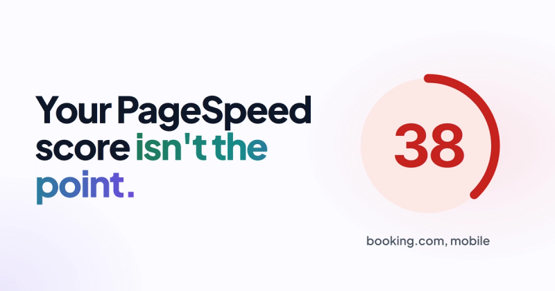
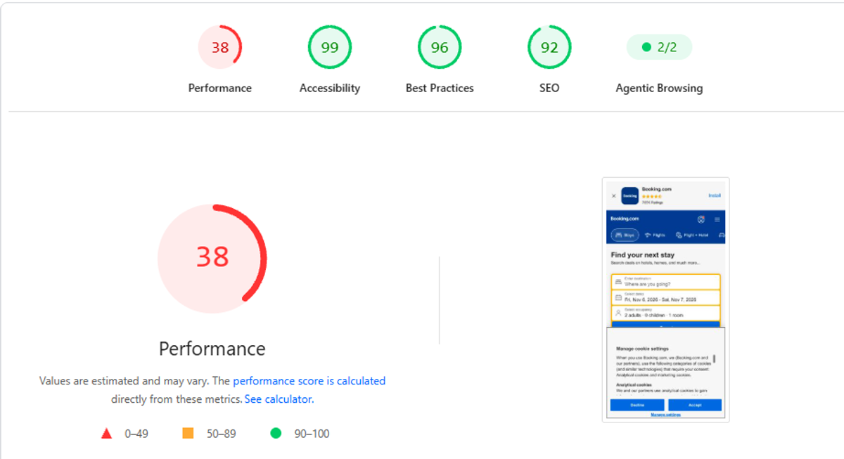
Booking.com scores 38 out of 100 on Google's own mobile speed test. Similarweb ranks it among the 50 most visited websites on the planet. If PageSpeed were the thing that decides whether a website works, one of those two facts would have to be wrong.
Neither is. A good company website analysis methodology starts where most analyses never look: what is this website supposed to do for the business? Name that one job first. Then check whether the message, the calls to action and the proof on the page all push toward it. Speed, SEO scores and heatmaps come last, as a way to find what's broken, not to decide whether the site is any good.
That order sounds obvious written down. It's the opposite of how nearly every website analysis guide on page one of Google is built, and it took me an embarrassingly long time to start working that way myself.
I used to judge websites by how they looked
For years my analysis of a website was basically a vibe check. Is it modern? Are the graphics good? Does the scroll feel smooth? If yes, good website. I never asked the boring question: what is this thing actually supposed to do, and does it do it?
Then AI website builders showed up. They could produce gorgeous layouts and animations in minutes, the kind of thing that used to take a designer a week. I honestly thought web designers were done.
They weren't, and the reason taught me more than any audit tool. I started clicking through those beautiful AI sites properly, the way a customer would. Most of them had no strategy behind them at all. No clear business goal. No path that helped you read the content, trust the company or get to a purchase. They looked like a million dollars and had no idea what they were for.
Here's the analogy I use now. A website is a salesperson who works 24 hours a day. Judging it by its looks is like hiring a salesperson because of the suit. The suit matters a bit (nobody trusts a salesperson in a stained shirt), but you'd never hire one without hearing the pitch. Most website analysis checks the suit, takes the salesperson's blood pressure, and never once listens to what they say to customers.
We tested 39 top-ranking business websites. Only one passed the speed test
Booking.com could just be an outlier. A giant brand with so much authority that nothing else matters. So I wanted to know how normal it is for a website to fail the technical checks and still win.
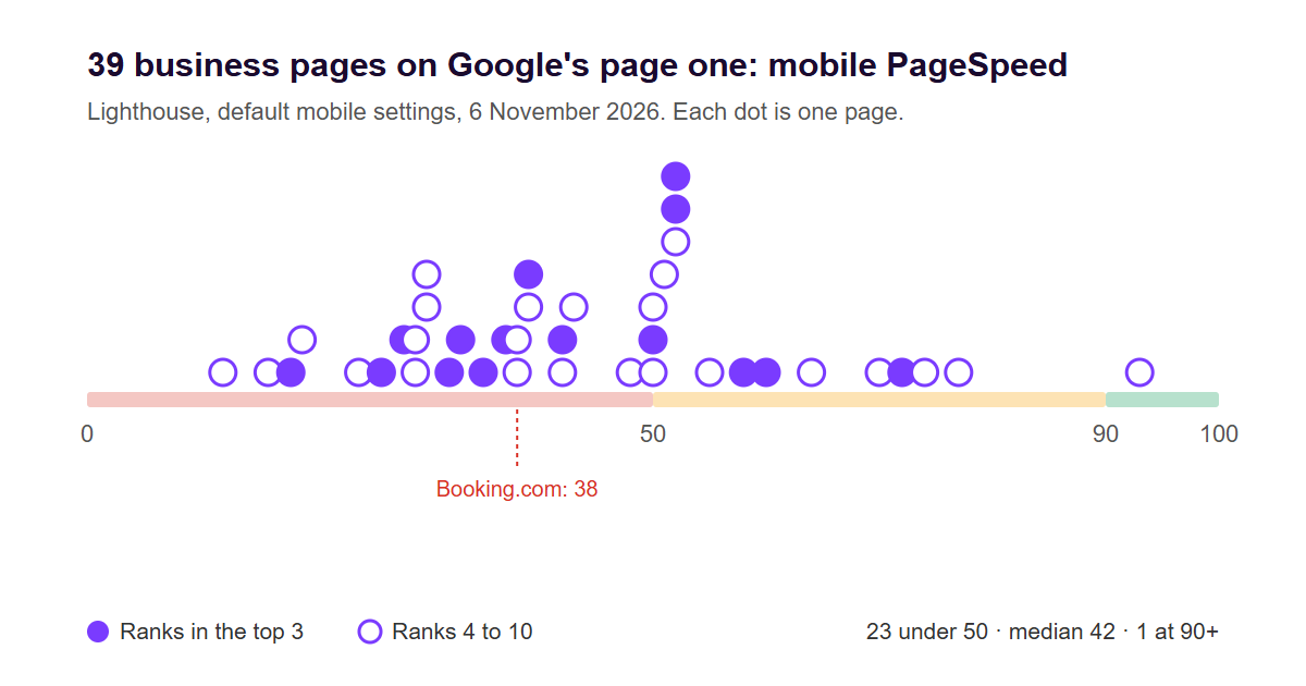
On 6 November 2026 we searched Google (US settings) for 13 commercial service keywords that real businesses fight over, things like "accounting firm", "pest control company", "managed IT services", "payroll services" and "digital marketing agency". From the first page of each, we took every result that was a company page selling that service, and skipped directories, how-to articles, manufacturer guides, Wikipedia, government pages, Reddit and YouTube. Then we ran each page through Lighthouse, the same lab test that powers PageSpeed Insights, on its default mobile settings. Seven pages blocked the automated test and were left out (which took four keywords out of the table entirely), leaving 39 pages.
| Keyword | Pages tested | Median mobile score | Lowest | Highest |
|---|---|---|---|---|
| Accounting firm | 7 | 37 | 28 | 52 |
| Payroll services | 7 | 35 | 19 | 50 |
| Digital marketing agency | 6 | 39 | 12 | 72 |
| Commercial cleaning services | 6 | 61 | 42 | 93 |
| Web design agency | 4 | 49 | 42 | 60 |
| Pest control company | 3 | 24 | 18 | 39 |
| Bookkeeping services | 3 | 32 | 30 | 52 |
| Managed IT services | 2 | 54 | 50 | 58 |
| Dental implants | 1 | 74 | 74 | 74 |
| All 39 pages | 39 | 42 | 12 | 93 |
One page out of 39 scored 90 or above, the range PageSpeed colours green. Twenty-three scored under 50, deep in the red. The median was 42, four points above Booking.com.
Being on top didn't help. Of the 15 pages ranking in the top three for their keyword, nine scored under 50. PwC (28) and BDO (37) held the first two spots for "accounting firm". Orkin was number one for "pest control company" with an 18. ADP ranked first for "payroll services" with a 35. The single green page, a Jan-Pro franchise page at 93, sat in eighth place.
Before anyone emails me: this doesn't mean speed is irrelevant. It's one Lighthouse run per page, on a small sample, and a Lighthouse score is a lab simulation of a slowish phone, not what real visitors experience. Big brands also have authority most small companies don't. But Google says the same thing in plain words on its page experience documentation: "Google Search always seeks to show the most relevant content, even if the page experience is sub-par." The same page adds that good scores in Search Console or third-party tools don't guarantee top rankings.
So the score is the salesperson's blood pressure. Worth knowing. Terrible as the main reason to hire or fire them.
I see this constantly. Websites with poor performance and audit scores that would make an SEO consultant cry, sitting on great traffic and strong domain authority. Meanwhile someone else is polishing a 98 PageSpeed score on a site that nobody visits and nobody buys from.
The methodology: three questions, in this order
When I open a company's website for the first time, I'm looking for three signals. The order matters, because each one only makes sense once you've answered the one before it.
1. What is this website's job?
Every business website has one main job, and it's usually one of these:
| The job | Who it's for | What the site has to prove |
|---|---|---|
| Build a reputation | A new firm, a founder going out alone, a company entering a market | "We're real, we're good, and people like you already trust us" |
| Maintain a reputation | Established firms people check before a meeting or a deal | "We're still the company you heard about, and we're current" |
| Turn visitors into leads | Service businesses, agencies, B2B | "This is your problem, we fix it, here's the next step" |
| Sell | Online stores, SaaS with self-serve signup | "This is the right product, and buying it is easy" |
Write the job down in one sentence before you look at anything else. If the company can't tell you what it is, you've already found the biggest problem, and no tool would have shown it to you.
Most of the top-ranking guides on website analysis do have a "define your goal" step. Read it closely, though, and it means the goal of the analysis: find why rankings dropped, why carts get abandoned. That's useful, but it's a different question. You can analyse cart abandonment perfectly on a website that shouldn't be selling online in the first place.
2. Do the message and the CTA push toward that job?
Now read the homepage like a stranger. The headline, the first paragraph, the main button. Do they all point at the job you wrote down?
A reputation website for a consulting firm needs a headline that says who they help and why they're credible. A lead generation website needs the visitor's problem in the headline and one obvious next step. When the headline talks about "innovative solutions", the button says "Learn more", and the job is "get booked calls", the three of them are pulling in different directions. The salesperson is wearing a great suit and talking about the weather.
Things I check here:
- Can you tell what the company does and who for within five seconds of landing, without scrolling?
- Is there one primary call to action, and does it match the job? "Book a call" for leads, "Buy" for sales. A reputation site can get away with a softer one.
- Count the competing buttons above the fold. Four equal options is a menu, not a pitch.
- Does every service page end with the same next step as the homepage, or does each page invent its own?
Most problems I find live here, and they're a messaging problem that gets mistaken for a design problem. If this is where your site falls apart, our post on why a website isn't generating leads goes deeper on that gap.
3. Is the website alive?
This is the signal nobody's checklist has, and it's the one I trust most. Has anyone put real effort into making this website feel like actual people work there?
I look for real photos instead of stock, real people with names and faces (the founder, the team, the person you'll actually talk to), real partners and clients shown by name, employees, and testimonials from people you could look up. A website that is alive has fingerprints all over it. A dead one has a stock handshake photo, a "trusted by industry leaders" line with no logos, and three five-star quotes from "John D."
Visitors notice this faster than they notice a slow image. Stock photos and anonymous praise are exactly what an AI-generated website gives you for free, which is why they now count for nothing. The things you can't fake in five minutes are the things that build trust.
If the salesperson can't name a single customer they've worked with, it doesn't matter how good the suit is.
4. Only now: the technical pass
With the job, the message and the proof figured out, the technical tools finally have something to be useful for. Run PageSpeed Insights, open Search Console, check what's indexed, look at analytics. But read them against the job.
A lead generation site with a 45 performance score and a contact form that breaks on iPhone has one urgent problem, and it's not the score. A reputation site that loads a little slowly but has no "Contact" link in the menu has a bigger problem than its Largest Contentful Paint. Fix what's broken for the job, not what a tool coloured red. Our website audit checklist covers the technical side properly once you get here.
A quick warning if you're reading analytics for the first time in a while: bounce rate isn't what it used to be. In GA4, bounce rate is the share of sessions that weren't engaged, meaning they lasted under 10 seconds, had no key event and only one page view. Several of the website analysis guides ranking right now still describe it the old Universal Analytics way, as "left after viewing one page". Same name, different number.
The red flag that's worse than any low score
The single most common problem I find isn't slow loading or missing meta tags. It's no strategy at all. Content gets added because someone thought a page about it should exist, sections pile up, and the visitor is left to guess what they're supposed to do. The website isn't selling anything. It's a digital postcard: nice picture, "we exist", see you never.
A recruiting firm in New York that places data and AI specialists came to me with exactly this. They'd already worked out the diagnosis themselves: the website had no goal and no growth strategy.
I didn't show them a new design. I analysed their homepage and showed them what actually matters on a website that grows: it brings in visitors and turns those visitors into clients, instead of sitting there being looked at.
They offered me a two-year contract. Not because I'd found something clever in their PageSpeed report, but because I wasn't trying to sell them a new shiny toy. They wanted someone working on the stuff design agencies usually don't offer, and they saw it as a competitive advantage, because as far as they could tell none of their competitors were putting any effort into growing their websites at all.
That last part is the opportunity for most companies. In a lot of industries the bar is a postcard. A website that knows its job clears it easily.
The 15-minute website analysis worksheet
Here's the whole method as something you can run on your own site this afternoon. Open your homepage on your phone, not your laptop, and answer these in order. Write the answers down; the ones you can't answer are the findings.
- The job. In one sentence, what is this website for: reputation, leads or sales? If two people at your company give different answers, stop here. That's the finding.
- Five-second test. Show the homepage to someone outside the business for five seconds. Can they say what you do and who for?
- The headline. Does it serve the job, or could it sit on any competitor's site unchanged?
- The main button. Is there one, is it visible without scrolling, and does it lead to the action that matches the job?
- The path. Click it. Count the steps from homepage to finished enquiry or purchase. Anything past three needs a reason.
- Signs of life. Count the real things: named people, real photos, client or partner names, testimonials with full names. Zero is a dead website.
- Freshness. When was something last added or changed? A blog that stopped in 2023 tells visitors the company might have too.
- The technical floor. Run PageSpeed Insights and check Search Console for pages that aren't indexed. Note what's broken, not what's merely orange.
If you get through all eight and still can't tell where the website is leaking, that's what our free homepage teardown is for. I'll go through it in the same order and tell you what I'd fix first.
Why most website analysis guides start in the wrong place
Look at who writes the guides ranking for this topic and the order makes sense. Almost all of them are analytics and heatmap tool companies, and the rest are conversion agencies. Their methodology starts with traffic data, session recordings and audit scores, because that's what they sell. Nothing wrong with the tools. I use several of them.
But a tool can only measure the website you have. It can't tell you the website is trying to do the wrong job, that the headline is aimed at the wrong buyer, or that there isn't a single real human on the About page. Those are judgement calls, and they decide whether the numbers the tools report are worth improving at all.
So the method is the same whether you're analysing your own site, a competitor's, or a prospect's before a sales call. It's also the backbone of any real website strategy: goal first, message second, proof third, tools last.
FAQ
What is a company website analysis?
It's a structured review of whether a company's website does its business job, whether that's building trust, generating leads or selling. A good one covers the goal, the messaging and calls to action, the trust signals, and then the technical health (speed, SEO, analytics). The order matters: technical findings only make sense once you know what the site is for.
What's the difference between website analysis and website analytics?
Website analytics is the data: visits, sources, engagement, conversions, usually from GA4. Website analysis is the judgement you make using that data plus everything the data can't show, like whether the headline makes sense or the site has any real proof. Analytics tells you what happened; analysis tells you why and what to change.
Does a low PageSpeed score hurt my rankings?
It can play a part, but less than most people fear. Google's documentation says it will show the most relevant content even when page experience is sub-par, and in our test of 39 business pages on Google's first page, 23 scored below 50 on mobile and only one reached 90. Fix genuine problems like pages that take 10 seconds to show anything, but don't let a score outrank relevance and trust on your to-do list.
How long does a website analysis take?
The first pass in this article takes about 15 minutes for a homepage, and it finds most of the big problems. A full analysis of a company site, including service pages, analytics and Search Console, usually takes a few hours to a couple of days, depending on how many pages and how much data there is.
How often should you analyse your website?
Do the quick goal, message and proof check every time the business changes: a new service, a new target customer, a price change. Look at the technical side and analytics monthly or quarterly. A website that was right two years ago can be doing the wrong job today without a single error showing up.
Can AI analyse my website for me?
AI tools are good at the mechanical parts: summarising a page, spotting missing meta tags, flagging slow assets. They're weak at the part that matters most, judging whether the website's job is right for your business and whether the proof is believable to your buyers. Use them for the checklist, not for the verdict.
Listen to the pitch
Next time you look at a website, yours or anyone's, ignore the suit for the first five minutes. Ask what it's there to do, listen to what it says, and check whether it can name a single real customer. If it passes those, then go and check its blood pressure.
Most websites fail before you ever open PageSpeed. The good news is that the fixes for those failures don't need a redesign. They need someone to decide what the website's job is.
Comments