
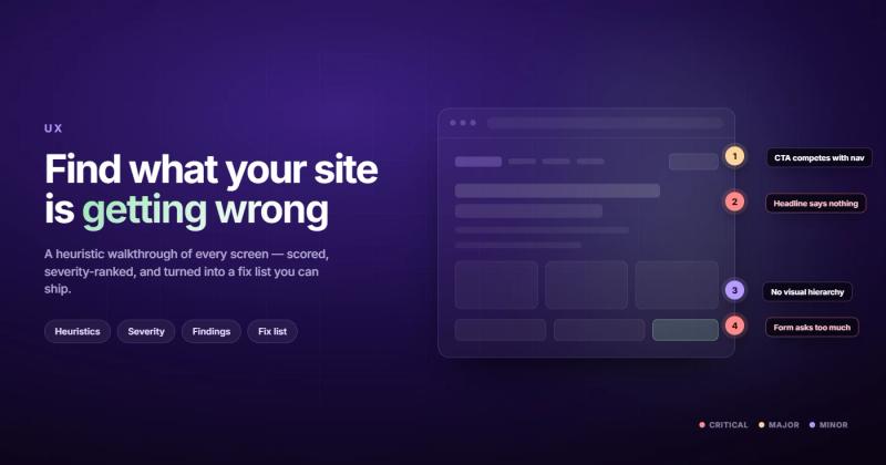
A UX audit is a structured review of your website or app that identifies where users get stuck, confused, or leave. It's not a redesign. It's not user testing. It's an expert looking at what you've already built and telling you where the friction lives.
If your site has decent traffic but conversions are flat, or if users keep dropping off at the same point in your funnel, a UX audit tells you why. Not with guesses. With evidence.
Most businesses skip this step entirely. They jump straight to "let's redesign everything" because it feels like progress. It's not. It's expensive guessing. A user experience audit gives you the diagnosis before you write the prescription.
What Is a UX Audit, Really?
A UX audit is when someone with experience in usability evaluates your digital product against established heuristics, your own analytics data, and real user behavior patterns. The goal is to find the gaps between what you intended and what actually happens when people use your site.
Think of it like this. You built a restaurant. The kitchen works. The menu looks good. But people keep leaving after reading the specials board. A UX audit is hiring someone to sit in the dining room and watch what actually happens. Maybe the specials board is behind a pillar. Maybe the font is too small. Maybe people can't figure out where to sit.
The output is a prioritized list of problems and recommendations. Not a new design. Not a prototype. A document that says "here's what's broken, here's how badly it's broken, and here's what to fix first."
This is different from usability testing. In usability testing, you watch real users try to complete tasks. In a UX audit, an expert evaluates the interface using Nielsen's heuristics and other frameworks, combined with your analytics data. Both are valuable. They answer different questions.
When You Actually Need One (and When You Don't)
Every article about UX audits tells you when to do one. Here's what nobody mentions: there are times when a UX audit is a waste of money.
You need a UX audit when:
- Your traffic is stable or growing, but conversion rates are declining or flat
- Users consistently abandon specific pages or steps in your funnel
- You're planning a redesign and want to know what to keep vs what to fix
- Support tickets keep mentioning the same friction points
- You've made incremental changes for months and nothing moved the needle
You don't need a UX audit when:
- Your site barely has traffic (fix your SEO first)
- You launched last week (give it time to collect data)
- You already know the problem but haven't fixed it (stop auditing, start doing)
- Your product is fundamentally wrong for the market (that's a strategy problem, not a UX problem)
I worked on a client project where they wanted a full UX audit of their marketing site. Two hours in, I realized the real issue: their value proposition was buried on page three. No amount of button color testing fixes a messaging problem. That's a strategy problem disguised as a UX problem.
The most expensive audit is one that tells you things you already knew. Before spending money on a formal review, open Google Analytics and look at your top exit pages. Check your conversion funnel. Read your support tickets. If the pattern is obvious, skip the audit and fix the obvious thing first.
The UX Audit Checklist: What to Actually Evaluate
A proper website usability audit covers more ground than most people expect. Here's the full checklist, broken into the areas that matter most.
Navigation and Information Architecture
Can users find what they're looking for within three clicks? Is the menu structure logical to someone who's never seen your site? Are labels clear, or do they use internal jargon? Check whether the search function returns useful results. Test the mobile menu specifically, because most desktop-designed navigation falls apart on smaller screens.
Page Layout and Visual Hierarchy
Does the most important content get the most visual weight? Can users tell what's clickable versus what's decorative? Is there a clear visual path from headline to CTA? Check for consistent spacing, alignment, and typography. Inconsistency creates cognitive load, even when users can't articulate why something feels "off."
Forms and Input Fields
Forms are where conversions die. Check every form on the site. Are labels above or beside inputs? Are error messages specific ("Email must include @") or vague ("Invalid input")? Does the form save progress? How many fields are actually necessary? Every field you remove increases completion rates. That's not theory. That's data from Baymard Institute.
Content Clarity and Readability
Read every key page as if you've never heard of the company. Does the headline explain what the business does? Can you identify the target audience within five seconds? Is the writing at an appropriate reading level? Walls of text without subheadings, bullets, or visual breaks aren't a content problem. They're a usability problem.
Performance and Loading
A page that takes four seconds to load on mobile has lost half its visitors before they see anything. Check Core Web Vitals. Check largest contentful paint. Check interaction to next paint. Performance isn't separate from UX. Performance IS UX. Your site might feel slow for reasons that have nothing to do with your server.
Accessibility
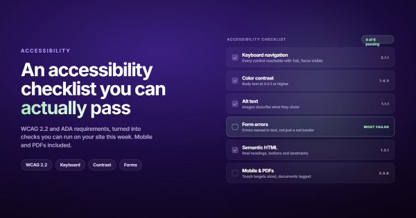
Run an accessibility check. Can keyboard-only users navigate the site? Do images have alt text? Is color contrast sufficient? Are form inputs properly labeled? Accessibility issues are usability issues. If 15% of your visitors can't use your site properly, that's not a niche concern. That's a conversion leak.
Mobile Experience
Don't check mobile as an afterthought. For most sites, mobile is 60-70% of traffic. Test touch targets (minimum 48x48 pixels). Test text readability without zooming. Test forms with a thumb. Test whether CTAs are visible without scrolling. A site that works on desktop and breaks on mobile isn't "mostly working." It's failing for the majority of visitors.
How to Do a UX Audit: Step by Step
The process I use takes two to three weeks for a typical site. Faster than that and you're cutting corners. Slower than that and you're overthinking it.
Step 1: Define the Scope
You can't audit everything at once. Pick the flows that matter most to the business. For an e-commerce site, that's the path from product page to checkout. For a SaaS product, that's signup to first value moment. For a B2B SaaS site, that's landing page to demo request.
Write down 3-5 specific user goals you're evaluating. "Improve the website" isn't a scope. "Understand why 68% of users drop off between pricing page and signup form" is a scope.
Step 2: Gather the Data
Before you look at a single screen, pull the numbers. You need:
- Google Analytics: top pages, exit rates, bounce rates, conversion funnels
- Heatmaps if available (Hotjar, Microsoft Clarity)
- Session recordings of real users
- Support tickets and common complaints
- Any previous user research or surveys
Data first. Opinions second. The data tells you where to look. Your expertise tells you why it's happening.
Step 3: Heuristic Evaluation
Walk through each user flow and evaluate against Nielsen's 10 usability heuristics. These have been the standard for thirty years because they work. Visibility of system status. Match between system and real world. User control and freedom. Consistency. Error prevention. Recognition over recall. Flexibility. Aesthetic and minimalist design. Error recovery. Help and documentation.
For each issue you find, note three things: what the problem is, how severe it is (cosmetic, minor, major, catastrophic), and where it occurs. Screenshots help enormously here.
Step 4: Competitive Benchmarking
Look at how your top 3-5 competitors handle the same user flows. Not to copy them. To understand what users in your market already expect. If every competitor puts pricing on the main navigation and you've buried it three clicks deep, that's a friction point because it violates learned behavior.
Step 5: Synthesize and Prioritize
This is where most audits either become useful or become shelfware. Every finding needs to go into a prioritization matrix. I use effort vs impact: what's the easiest thing to fix that will move the biggest number?
| Priority | Impact | Effort | Example |
|---|---|---|---|
| Fix now | High | Low | CTA button invisible on mobile |
| Plan next | High | High | Restructure checkout flow |
| Quick win | Low | Low | Fix typo on pricing page |
| Backlog | Low | High | Rebuild search functionality |
Step 6: Build the Report
Your audit report should be readable by someone who isn't a designer. That means screenshots with annotations, clear language, and specific recommendations. "Improve the navigation" is useless. "Move the pricing link from the footer to the main navigation bar, as 34% of users search for pricing within 10 seconds of landing" is useful.
A good UX audit template includes an executive summary (one page, for the CEO), a findings overview organized by severity, and detailed recommendations with mockups or wireframes where helpful.
UX Audit vs Usability Testing: Pick the Right One
People confuse these constantly. Here's the difference.
A UX audit is expert-driven. One or two experienced evaluators review the product against heuristics and data. It's faster, cheaper, and doesn't require recruiting participants. It catches about 80% of usability issues.
Usability testing is user-driven. Real people attempt real tasks while you observe. It reveals things experts miss, especially around mental models and expectations. It takes longer and costs more.
Start with an audit. Fix the obvious problems. Then do usability testing to catch what the audit missed. Running usability tests on a site full of known problems is like asking people to taste your food before you've finished cooking it. Fix the basics first.
What a UX Audit Actually Costs
Pricing varies wildly, and most of the variation is justified.
A freelancer doing a focused audit of 5-10 key pages will charge $1,000-3,000. An agency doing a full-scope audit with competitive analysis, accessibility review, and a detailed report will charge $5,000-15,000. Enterprise-level audits with multiple product lines can hit $25,000+.
The question isn't "how much does it cost?" The question is "what's the cost of not knowing?" If your site gets 50,000 visitors a month and converts at 1.5%, a UX audit that helps you reach 2% means 250 additional conversions per month. If each conversion is worth $200, that's $50,000 in monthly revenue from a one-time investment.
The return on investment for UX improvements is well-documented. Forrester Research has cited figures suggesting every dollar invested in UX returns between $2 and $100, depending on the context and methodology.
Can You Do a UX Audit Yourself?
Yes, with caveats.
You can absolutely run through the CRO audit checklist yourself. You can check your analytics, walk through your own flows, and find obvious problems. Many of the highest-impact issues are things you'll spot in an afternoon: broken links, confusing labels, missing CTAs, forms that ask for too much.
What you can't do yourself is see your product with fresh eyes. You know where everything is because you built it. You unconsciously skip over friction because your brain fills in the gaps. That's not a skill problem. It's a proximity problem.
My recommendation: do the self-audit first. Fix everything you find. Then bring in someone external for the things you're too close to see. That way you're paying an expert for genuine insight, not for telling you that your contact form is broken.
What You Should Get Back From a UX Audit
If someone hands you a UX audit that's just a PDF of screenshots with red circles, ask for your money back. A proper audit delivers:
- Executive summary: one page, plain language, top 5 findings
- Prioritized issue list with severity ratings (critical, major, minor, cosmetic)
- Annotated screenshots showing each problem in context
- Specific recommendations, not vague "improve this" suggestions
- A prioritization matrix mapping effort against impact
- Competitive comparison showing how peers handle the same flows
Some auditors also deliver user personas, journey maps, or wireframe suggestions. These are nice-to-haves, not essentials. The core value is the prioritized list of what's wrong and what to do about it.
A UX audit template that doesn't include prioritization is just a complaint list. Prioritization is what turns findings into a plan you can actually execute. Your design team needs to know what to fix this week versus what goes into the next sprint.
Mistakes That Kill a UX Audit's Value
I've seen UX audits go wrong in predictable ways. Here are the ones that waste the most time and money.
Auditing without data. If you skip the analytics step and go straight to heuristic evaluation, you're just listing your personal opinions about someone else's design choices. Data is what separates a UX audit from a design review.
Boiling the ocean. Trying to audit every page, every flow, every edge case. Pick the flows that drive revenue. Audit those thoroughly. A focused audit of 10 pages beats a surface-level scan of 200.
Recommendations without context. Telling someone to "simplify the checkout" isn't a recommendation. Telling them "remove the account creation step during checkout, which causes 23% drop-off based on your funnel data, and move registration to post-purchase" is a recommendation.
Ignoring mobile. I still see audits done entirely on desktop. In 2026. With mobile accounting for the majority of web traffic globally. If your auditor didn't test on a phone, they missed most of the experience.
No follow-through. An audit that sits in a Google Drive folder helps nobody. The audit itself is worth zero. The changes you make because of it are worth everything. Build implementation into the timeline from the start.
Tools That Make UX Audits Easier
You don't need expensive software to run a user experience audit. Here's what actually helps:
Analytics: Google Analytics 4 for traffic patterns and funnels. It's free and it's enough for most audits.
Heatmaps and recordings: Microsoft Clarity is free and surprisingly good. Hotjar is the paid standard. Both show you where users click, scroll, and rage-click.
Accessibility: axe DevTools (free browser extension) catches most WCAG violations. WAVE is another solid free option.
Performance: Google PageSpeed Insights and Lighthouse. Both free, both built into Chrome DevTools. If your SEO is suffering, performance problems are often the culprit.
Documentation: Notion, Google Docs, or even a spreadsheet. The tool matters less than the structure. Screenshot everything, annotate clearly, and organize by severity.
Frequently Asked Questions
How long does a UX audit take?
Two to four weeks for a typical website or app. A focused audit of specific flows (like checkout or onboarding) can be done in one week. Enterprise products with multiple user types take longer, sometimes six to eight weeks.
What's the difference between a UX audit and a website audit?
A website audit covers technical SEO, performance, security, and content. A UX audit focuses specifically on how users interact with the interface. There's overlap in areas like performance and mobile responsiveness, but a UX audit goes deeper into usability, information architecture, and conversion paths. A thorough SEO checklist covers some of the same ground from a different angle.
Do I need a UX professional to conduct one?
For a basic self-audit using checklists and your own analytics, no. For a thorough audit that catches non-obvious issues and provides expert recommendations, yes. The value of an experienced auditor is pattern recognition. They've seen hundreds of sites and they know which problems correlate with which symptoms.
How often should I run a UX audit?
Once a year for most businesses. After any major redesign or platform migration. When metrics change significantly without an obvious cause. Don't audit quarterly unless you're a high-traffic e-commerce site where small conversion improvements mean large revenue changes.
Can a UX audit improve my SEO?
Indirectly, yes. Google measures user engagement signals like bounce rate, time on page, and pogo-sticking (when users click a search result, immediately go back, and click a different one). A site with better usability keeps users longer and reduces those negative signals. Plus, many UX improvements (faster loading, better mobile experience, clearer content structure) are direct ranking factors.
What's the ROI of a UX audit?
It depends entirely on what you do with the findings. The audit itself generates zero ROI. The changes you implement generate the return. For sites with meaningful traffic, even small conversion improvements (0.5-1%) can represent significant revenue. A $5,000 audit that leads to changes producing $50,000 in additional annual revenue is a 10x return, but only if you actually implement the recommendations.
Comments