
Your website gets traffic. People land on the page, scroll around, maybe read a headline. Then they leave. No form filled. No call booked. No sale. You're watching visitors walk through the door and walk right back out.
Website conversion is the percentage of visitors who take the action you actually want them to take. That could be filling out a contact form, signing up for a trial, buying a product, or booking a call. The formula is simple: (conversions / total visitors) x 100. If 1,000 people visit your site and 30 fill out your form, that's a 3% conversion rate.
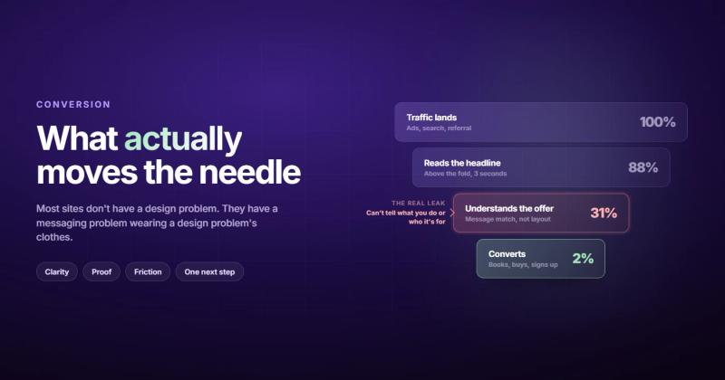
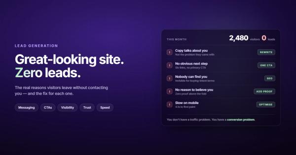
The average website converts at about 2.3%. The good ones hit 3.5-5%. The great ones push past 5%. But here's what those numbers don't tell you: most websites aren't converting poorly because of bad design. They're converting poorly because of bad messaging. The visitors aren't confused by the layout. They're confused by what you're actually offering.
I'm going to walk you through what actually moves the needle on website conversion optimization, based on what I've seen building and fixing sites for years. Not theory. Not "best practice" lists copied from other "best practice" lists. What actually works.
The Real Reason Your Website Isn't Converting
Most companies that come to us with a "conversion problem" actually have a messaging problem wearing a design disguise.
They'll say: "We need a redesign. Our site looks outdated." Then you look at their analytics and the bounce rate is 70%+ on every page. People aren't leaving because the site looks bad. People are leaving because they can't figure out what the company does in the first two seconds.
I once spent two weeks helping a client redesign their homepage. New colors, new typography, beautiful animations. Conversions didn't move. Not even a little. Then we rewrote the headline from "Innovative Solutions for Modern Businesses" to "We Build Custom Inventory Software for Warehouses." Conversions went up 34% in the first month. The design was never the problem.
This is why I always start with a question that makes people uncomfortable: what does your homepage say you do? Not what you think it says. What it actually communicates to someone who has never heard of you and gives you about three seconds of attention.
If your answer includes words like "solutions," "synergy," "empower," or "leverage" without any specifics, that's your conversion problem right there.
The Two-Second Test That Predicts Your Conversion Rate
Open your website. Show it to someone who's never seen it. After two seconds, cover the screen. Ask them three questions:
- What does this company do?
- Who is it for?
- What should I do next?
If they can't answer all three, your site is leaking conversions. It doesn't matter how pretty it is.
Your value proposition needs to do three things above the fold: say what you offer, say who you help, and tell them what to do next. That's it. Not your company history. Not your mission statement. Not a stock photo of people shaking hands.
Look at your homepage right now. Is there a single, clear call to action above the fold? Or are there six different links competing for attention? Every additional choice you give visitors reduces the chance they'll pick any of them. This is Hick's Law, and it applies to websites just as much as it applies to restaurant menus.
Page Speed Is Silently Killing Your Conversions
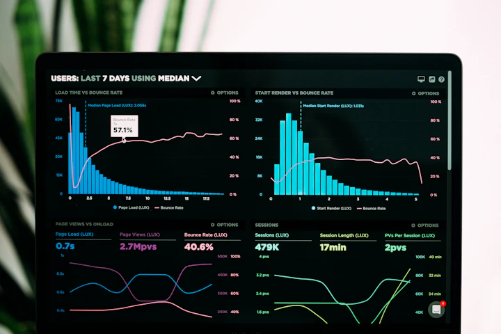
A one-second delay in page load time reduces conversions by 7%. That's not a theory. That's from years of data across thousands of sites.
Your visitors have the attention span of someone scrolling through their phone on a lunch break. Because that's literally what they're doing. If your page takes more than three seconds to load, you've already lost a third of them. They didn't even see your beautiful hero section or your clever headline. They saw a loading spinner and hit the back button.
The usual culprits:
- Uncompressed images (that 4MB hero photo needs to be under 200KB)
- Too many third-party scripts (do you really need 12 tracking pixels?)
- Render-blocking CSS and JavaScript
- No CDN, serving everything from a single server location
Open your Chrome DevTools, go to the Network tab, throttle to "Slow 3G," and reload your site. That's what a good chunk of your mobile visitors actually experience. If it makes you wince, you've got work to do.
Your CTAs Are Probably Too Clever
"Get Started on Your Journey." "Discover the Possibilities." "Experience the Difference."
None of these tell me what happens when I click the button. Will I get a phone call? An email? A free consultation? A 14-day trial? A salesperson calling me every day for a month?
The calls to action that convert best are boring. Embarrassingly boring.
"Book a Free 15-Minute Call." "Get a Quote in 24 Hours." "Start Your Free Trial." "Download the Checklist."
Specific. Clear. No mystery about what happens next. People don't click CTAs because they're inspired. They click because they know exactly what they're getting and they want it.
Place your primary CTA above the fold, and then repeat it after every major section. Not as decoration. Because different people reach the "yes" moment at different points in the page. Someone skimming might be ready after reading the headline. Someone cautious might need to read three case studies first. Both should be able to convert without scrolling to find a button.
Social Proof: Where You Put It Matters More Than Having It
Everyone knows you need testimonials. Almost nobody puts them in the right place.
Social proof works when it appears at the moment of doubt. That's right next to the CTA, right next to the pricing, right next to the form. Not stuffed into a testimonials page that nobody visits.
The hierarchy of proof, from weakest to strongest:
- Star ratings with no context
- Written testimonials with names
- Testimonials with names, photos, and company names
- Video testimonials
- Case studies with actual numbers ("increased conversions by 40%")
If you're a B2B company, client logos near your CTA do more heavy lifting than you'd expect. Not because logos are impressive, but because they answer the unspoken question: "Has anyone I've heard of actually trusted these people?"
For case studies that show real results, look at how we present ours. Numbers. Context. Outcomes. Not vague claims about "transforming digital presence."
Mobile Isn't "Smaller Desktop." Stop Treating It Like One.
Mobile traffic converts at roughly half the rate of desktop. For most sites, that's 1.8% vs 3.1%. And yet mobile makes up 60-70% of your traffic.
Do the math. If your mobile conversion rate is 1.5% and your desktop rate is 3.5%, and 65% of your traffic is mobile, then most of your revenue potential is sitting in your worst-performing experience.
The problem isn't responsiveness. Most sites are technically responsive. The problem is that the mobile experience is an afterthought. Forms designed for desktop keyboards. CTAs that require precise tapping. Pop-ups that cover the entire screen. Text so small it might as well not be there.
Fix these things:
- Make touch targets at least 48x48 pixels (your thumbs are bigger than you think)
- Reduce form fields to the absolute minimum on mobile
- Make your phone number clickable (sounds obvious; check yours right now)
- Kill any pop-up that covers more than 30% of the mobile screen
I check every site on my phone before anything else. If I can't fill out the contact form with one thumb while holding a coffee in the other hand, something needs to change.
Forms: Every Field You Add Costs You Conversions
There's a direct, measurable relationship between the number of form fields and your conversion rate. Every field you add drops conversions by roughly 4-7%. A 10-field form converts at less than half the rate of a 4-field form.
Ask yourself: do you actually need the company name right now? Do you need their phone number before the first conversation? Do you need their budget range, timeline, and shoe size before you'll even reply?
Here's a good rule: only ask for what you need to take the next step. If the next step is booking a call, you need a name, an email, and maybe a one-line description of what they need. Everything else can wait until the actual conversation.
| Form Fields | Typical Conversion Rate | What You Actually Need |
|---|---|---|
| 3-4 fields | 5-8% | Name, email, brief message |
| 5-7 fields | 3-5% | Adding phone, company name |
| 8-10 fields | 1-3% | Budget, timeline, multiple dropdowns |
| 10+ fields | Under 1% | Basically a job application |
If you're running a landing page for lead generation, three fields is the sweet spot. Name, email, and one qualifying question. That's it.
CRO and SEO: Two Sides of the Same Coin
Here's something most conversion guides skip entirely: your SEO and your CRO are deeply connected, and ignoring either one makes the other weaker.
Google measures user behavior signals. If people click your search result and immediately bounce back to the search results, Google notices. That's a conversion problem that becomes an SEO problem. Your page didn't give them what they expected.
The connection works in both directions. Good CRO means people stay longer, engage more, and click through to other pages. These signals tell Google that your content satisfies search intent. Which means better rankings. Which means more traffic. Which means more conversions. It's a flywheel, and most businesses treat SEO and CRO as separate projects run by separate teams.
When you align your SEO strategy with your conversion goals, you stop optimizing for vanity traffic and start optimizing for traffic that actually converts. Ten thousand visitors who don't convert are worth less than a thousand visitors who do.
Measure Before You Change Anything
The fastest way to waste money on website conversion optimization is to start "fixing" things before you know what's broken.
Before you touch anything, set up proper tracking. At a minimum:
- Google Analytics 4 with conversion events (form submissions, button clicks, phone calls)
- A heatmap tool like Hotjar or Microsoft Clarity (Clarity is free)
- Google Search Console to see which queries bring traffic
Once you have data, look at three things:
Where are people dropping off? Check your funnel. If 80% of visitors see the homepage but only 10% reach the contact page, the problem is somewhere between those two points. That's where you focus.
What pages have the highest exit rates? Those are the pages that are failing to hold attention or provide a clear next step.
Which traffic sources convert best? You might discover that your paid ads bring visitors who bounce, while your organic traffic converts at 5%. That's not a website problem. That's a targeting problem. Fix your ad targeting before you redesign the landing page.
Run the diagnostics before prescribing the cure. I've seen companies spend $50,000 on a redesign when the real issue was a broken form on mobile that would have cost $200 to fix.
A Framework That Actually Works
If I had to convert website traffic into sales starting from scratch, I'd do it in this order:
- Fix your headline. Make it say what you do, who you help, and what happens next. Takes an hour.
- Fix your page speed. Compress images, remove unused scripts, add a CDN. Takes a day.
- Fix your forms. Reduce to 3-4 fields. Add one clear CTA. Takes an hour.
- Fix your mobile experience. Test on an actual phone (not browser dev tools). Takes a day.
- Add social proof next to every CTA. Takes a couple of hours.
- Set up analytics and wait two weeks for data.
- Look at what the data says and fix the biggest drop-off point.
- Repeat step 7 forever.
That's it. No $50,000 redesign. No six-month "digital transformation" project. Just systematic fixes to the things that actually affect whether someone fills out your form or hits the back button. The best website strategy isn't the most expensive one. It's the one that fixes the actual bottleneck.
Frequently Asked Questions
What is a good website conversion rate?
For most industries, 2-5% is average and anything above 5% is strong. B2B lead generation sites typically see 2-5% on form submissions. E-commerce sites average 2.5-3.5%. Service businesses with focused landing pages can hit 5-10%. But "good" depends on what you're counting as a conversion and where your traffic comes from. Paid traffic from cold audiences converts lower than organic traffic from people actively searching for what you offer.
Why is my website not converting visitors into customers?
Nine times out of ten, it's a messaging problem. Your visitors can't quickly understand what you do, who it's for, and what they should do next. The second most common cause is page speed. The third is asking for too much information in your forms. Start by running the two-second test on your homepage and checking your mobile load time.
How do I calculate my website's conversion rate?
Divide the number of conversions by the total number of visitors, then multiply by 100. If 50 people out of 2,000 visitors fill out your contact form, your conversion rate is 2.5%. Set up conversion tracking in Google Analytics 4 so you don't have to calculate this manually.
Does page speed really affect conversions?
Yes, and the data is clear: a one-second delay in load time drops conversions by roughly 7%. On mobile (where most of your traffic probably comes from), the impact is even larger. If your site takes more than three seconds to load, you're losing about a third of your visitors before they see anything.
What's the difference between CRO and SEO?
SEO gets people to your site. CRO turns those people into leads or customers. They're connected because Google tracks how users interact with your site after clicking a search result. If visitors bounce immediately, Google interprets that as a bad result and your rankings drop. Good CRO improves your SEO by sending positive engagement signals back to Google.
How many form fields should I have for maximum conversions?
Three to four fields is the sweet spot for most lead generation forms: name, email, and one qualifying question. Every additional field reduces conversions by 4-7%. Only ask for information you need to take the next step. You can learn everything else during the actual conversation.
Comments