
Most accounting firm websites look like they were designed by someone who has never had to convince a stranger to trust them with their money. Blues and grays. A stock photo of a woman reviewing paperwork at a mahogany desk. "We provide exceptional accounting services to businesses of all sizes." Another firm, another forgettable site.
Here's the thing: you can do better. And it starts by realizing this isn't primarily a design problem.
Good accounting website design means building a site that converts visitors into clients, one that answers the questions your prospects are actually asking, shows them why you're different from the other 47 CPA firms in their city, and makes the next step obvious. Structure and messaging come first. Design comes last.
This guide covers what your firm's website actually needs, and what most CPA website templates quietly get wrong.
Why Accounting Websites Are Different
People hire accountants the same way they choose doctors. You're trusting them with your financial data, your business compliance, and decisions that could seriously go wrong if handled poorly. The bar for trust is completely different from hiring someone to design a logo or build a bookshelf.
When someone lands on your site, they're not asking "can these people do accounting?" They already assume you can. The real question is: "Should I trust these specific people with my business finances?" Your website has about 8 seconds to start answering that.
This changes everything about what your site needs to do. It's not about looking impressive. It's about looking reliable, specific, and like you actually understand the problems your clients face.
A dental practice website and a law firm website have the same challenge. But CPA firms tend to ignore it, defaulting to generic templates that look professional in a vague, interchangeable way. Which is exactly what every competitor is doing.
The Messaging Problem Nobody Talks About
"Nobody has ever hired my agency because we use Webflow instead of WordPress. They hired us because we promised to solve a specific problem. Stop leading with your tech stack and start leading with the outcome."
The same applies to accounting firms. Clients don't hire you because you're a CPA. They hire you because you specifically help their type of business stop overpaying taxes, clean up their books before a funding round, or survive an audit without losing sleep.
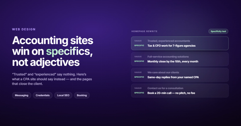
Look at almost any accounting firm homepage and you'll find some version of: "Trusted. Experienced. Dedicated." Three adjectives that mean nothing because every firm says them. They're not wrong, they're just not useful to someone trying to decide whether to call you.
The firms whose websites actually generate leads lead with specificity. "We work exclusively with real estate investors in the Southeast." "We help e-commerce brands reconcile Shopify and QuickBooks." "Tax strategy for small law firms." That's a headline a prospect reads and thinks: this is for me.
Before you design anything, answer these three questions in plain English:
- Who exactly do you serve? (Industry, size, geography)
- What specific problem do you solve for them?
- What happens if they don't solve that problem?
Your homepage headline should contain the answers to at least two of those. If it doesn't, no amount of good design will save your conversion rate. This is covered in more depth in our guide on building a website strategy that actually works, but for accounting firms, the niche specificity point matters more than almost anything else.
Essential Pages Every Accounting Website Needs
A lot of accounting firms try to do too much with one page, or spread their services across a confusing menu. Here's the minimum viable structure that actually serves your prospects:
Homepage
This is where your niche and value proposition live. Within 5 seconds of arriving, visitors should know who you serve, what you do for them, and what to do next. One clear CTA (book a call, get a quote, call us). Not three competing ones.
Services Pages
One page per service, not a giant list on a single page. If you do tax preparation, bookkeeping, CFO advisory, and payroll, each gets its own page. This matters for SEO and for visitors who only need one thing. A person searching "QuickBooks cleanup service" doesn't want to read about your estate planning services first.
About / Team Page
This is where accounting firms lose the most leads. A generic "we've been serving clients since 1998" paragraph isn't enough. People want to know who they're actually working with. Real photos. Real bios with credentials. Your CPA license, your specific expertise, where you studied. The messier and more human this page is, the better it converts.
If you have a team, show all of them. Names and faces reduce the perceived risk of picking up the phone.
Industries Served
If you specialize, say so with a dedicated page. "We work with restaurants, retail, and e-commerce businesses" tells a restaurant owner they're in the right place. It also helps with local SEO when people search for "accountant for restaurants" or "CPA for e-commerce."
Blog / Resources
Not every firm needs a blog. But if you're trying to rank on Google and reach clients who are searching for answers before they're ready to hire someone, regular content is how you show up. A post answering "how much should I pay myself as an S-corp owner?" is worth more than five years of LinkedIn posts for most small accounting firms.
Contact Page
Keep it simple. A form, a phone number, your address (important for local SEO), and your hours. Some firms also link their booking calendar directly here. Reduce the friction between "I'm interested" and "I reached out."
Design Principles That Build Trust (Not Just Look Good)

Design choices in accounting signal competence in the same way that a doctor's office signals competence through cleanliness. You don't expect marble floors. You expect things to be in order.
Color
Blues and dark greens dominate accounting for a reason: they convey stability and trust. Navy, forest green, charcoal, and deep teal all work. What kills trust: bright oranges, flashy gradients, or anything that looks like it belongs on a startup landing page. Your prospects aren't looking for exciting. They're looking for dependable.
White space is your friend. Dense, cluttered layouts feel stressful, the opposite of what you want someone feeling when they're about to hand you their financials.
Typography
Serif fonts (like Georgia, Merriweather, or Playfair Display) work well for accounting because they carry authority associations. Clean sans-serif fonts like Inter or DM Sans work equally well when paired with good spacing. What doesn't work: anything decorative, anything smaller than 16px body text, or more than two font families on the page.
Photography
Real photos of your actual team outperform stock photos every time. I know that sounds obvious. Most firms still use stock photos. If you can only afford one professional photoshoot, get headshots of every person on your team and a few photos of your actual office. Real faces build trust in a way that a Getty Image of "smiling businesspeople in a conference room" never will.
If you need stock photos in the meantime, choose ones that feel documentary rather than staged. People at desks working, not people pointing at charts with forced smiles.
Social Proof
Testimonials belong on your homepage and on your services pages, not buried in a separate "reviews" tab. Name, photo, company type, and a specific result ("they saved us $22,000 in our first year") beat vague quotes every single time. BrightLocal's research consistently shows that reviews with specific details convert 2-3x better than generic praise.
If you have Google reviews, display your star rating prominently. Most accounting firms have strong review profiles and don't display them anywhere on their website. That's a missed opportunity.
The CPA Template Trap
There are dozens of companies selling accounting-specific website packages. Some charge $50/month for a template that looks professional enough. The problem isn't that they look bad. The problem is that they look like everyone else's site.
Template platforms are optimized for one thing: getting a site up fast. They're not optimized for your specific niche, your specific location, or your specific offer. The messaging is generic because it has to work for every accounting firm everywhere. Which means it works well for none of them.
The result is that your site looks exactly like your competitor's site (same layout, often literally the same template) and the prospect has no reason to choose you over them except price.
This is the core argument for custom accounting website design. Not because custom sites look better (though they usually do), but because they're built around your specific positioning. Your niche. Your team. Your city. Your story. That specificity is what converts.
Looking for inspiration before you build? We put together a companion piece with real websites for accountants worth studying, with notes on what each one does well.
Conversion Elements That Actually Work
You can have beautiful design and great messaging and still have a site that doesn't generate leads. Here's where most accounting websites fall short:
Your CTA Has to Be Specific
"Contact us" is not a CTA. Neither is "Learn more." A real CTA tells the visitor exactly what happens next: "Book a 30-minute strategy call," "Get a free tax review," "Request a quote." Specific beats vague every time.
Put your primary CTA above the fold on every page. Not just the homepage: every page. Someone who lands on your "Small Business Bookkeeping" service page from Google is already interested. Don't make them scroll to find out how to hire you.
Phone Number in the Header
This sounds obvious but you'd be surprised. Your phone number should be in the top right corner of every page, clickable on mobile. A significant chunk of accounting searches happen on mobile, and those users want to call. Make it instant.
Calendar Booking Integration
Calendly, Cal.com, or your accounting software's built-in scheduling beats a contact form for one reason: it removes the follow-up step. When someone fills out a contact form, there's a gap while you respond, and leads go cold. When they book directly on your calendar, the next step is already locked in.
Trust Badges and Credentials
Your CPA license, AICPA membership, QuickBooks ProAdvisor certification, state bar membership for tax attorneys, display these prominently. They're not just credentials; they're trust anchors. A prospect who doesn't know accounting from bookkeeping sees "AICPA Member" and feels better about calling. AICPA membership in particular carries weight with small business owners.
Client Portal Link
If you use a client portal (most modern accounting firms do), link to it in your navigation. It serves two purposes: it reminds potential clients that your firm is organized and tech-savvy, and it tells your existing clients you thought about them when building the site.
Struggling to figure out why your current site isn't converting? A proper CRO audit will usually surface 3-5 specific friction points you can fix without a full redesign.
Getting Found: SEO for Accounting Firms
Most accounting clients start with a Google search. "CPA near me," "accountant for freelancers [city]," "small business bookkeeping [state]." If you're not showing up for these, your website is a brochure with no distribution.
Local SEO Is Non-Negotiable
Your Google Business Profile (formerly Google My Business) is as important as your website for local searches. It should have complete information, consistent NAP (name, address, phone) matching your website, photos, and active review management. The local pack that appears above the organic results on most "accountant near me" searches is driven by your Google Business Profile, not your website.
On your website, your address and phone number should appear in plain HTML text (not an image, not hidden in JavaScript) so Google can read and index it. This is one of the most common technical failures I see on accounting firm websites built on older platforms.
Service + Location Pages
If you serve multiple cities or counties, create a dedicated page for each significant location. "Tax preparation in [City]" with local-specific content performs far better than a generic services page that mentions geography once in passing.
Target Question-Based Keywords
Your potential clients are searching for answers before they're searching for services. "How much should I pay myself as an S-corp?" "Do I need a CPA or a bookkeeper?" "What's the difference between a sole proprietorship and LLC for taxes?" A blog that answers these questions consistently builds authority and organic traffic over 12-18 months. It's slow, but it compounds. Paid ads stop the moment you stop paying. Good SEO keeps running.
For a broader overview of where to start, our SEO checklist covers the technical and content fundamentals worth getting right first.
Choosing the Right Platform
You have more options than you probably realize, and the right choice depends on how much control you want versus how much maintenance you're willing to do.
| Platform | Best For | Tradeoff |
|---|---|---|
| Webflow | Custom design, strong SEO, growing firms | Needs a developer to build, lower ongoing cost |
| WordPress | Maximum flexibility, large plugin ecosystem | Requires active maintenance, security updates |
| Squarespace | Quickest start, cleanest default templates | Limited customization, generic look |
| CPA-specific platforms (Build Your Firm, etc.) | Industry-specific features, fast setup | Looks like every other firm using the same template |
| Wix | Total DIY control without coding | SEO limitations, hard to scale cleanly |
The short version: if you want a site that looks like your firm specifically, and you're planning to grow, Webflow or WordPress with a custom design is worth the upfront investment. If you need something up in 48 hours and differentiation isn't your priority yet, the CPA-specific platforms work fine.
The mistake most firms make is choosing based on cost alone. A $50/month template that doesn't convert is more expensive than a custom site that pays for itself in two new clients.
FAQ: Accounting Website Design
What should a CPA website include?
At minimum: a clear homepage with your niche and a CTA, individual service pages, an about/team page with real photos and credentials, a contact page with your phone and address, and your Google Business Profile linked or referenced. Testimonials and a client portal link are high-value additions.
How much does accounting website design cost?
It ranges widely. CPA-specific template platforms run $50-150/month. A custom WordPress or Squarespace site built by a freelancer typically costs $2,000-8,000 upfront. A custom Webflow site from a design agency ranges from $5,000-20,000+ depending on scope. The question worth asking isn't "what's the cheapest option?" but "what does a single new client worth per year?" For most accounting firms, the math makes custom design look very affordable.
What makes a good accounting firm website?
Specificity. The firms whose websites work best are the ones that make a prospect think "this is exactly for me." That means a clear niche, real team photos, specific credentials, and testimonials with actual numbers. Design matters, but it amplifies good messaging: it can't substitute for it.
Does my accounting firm actually need a website?
If you want to grow beyond referrals, yes. Referrals are great and you should keep building them. But a website works 24/7, captures people researching before they're ready to call, and gives referred prospects a place to verify you're legitimate before they reach out. A firm with no website loses a meaningful percentage of potential clients who can't find them online.
How do I make my accounting website stand out?
Pick a niche and state it clearly. "Accountant for freelancers and creative professionals" stands out. "Accounting services for businesses of all sizes" does not. Specificity creates connection, and connection creates clients. The narrower your focus sounds on the website, the more the right clients trust you.
What colors work best for CPA website design?
Blues, navies, and deep greens dominate the industry for good reason: they signal stability and trust. Dark charcoals work for a more modern feel. Avoid anything that looks flashy or startup-y. Your clients aren't looking for exciting. They want someone dependable.
Should an accounting firm have a blog?
If you have the capacity to publish consistently (even once a month), yes. A blog that answers questions your clients are already Googling builds organic traffic over time and positions you as an expert. If you can only do it sporadically, don't bother: an abandoned blog with three posts from 2021 looks worse than no blog at all.
How long does it take to build an accounting website?
A template from a CPA platform: 1-3 days. A custom WordPress or Squarespace build: 3-6 weeks. A custom Webflow site with strategy, design, and development: 6-10 weeks typically. The bottleneck is almost always content: your team bios, service descriptions, and testimonials take longer to gather than the actual build time.
Your accounting website isn't just a brochure. It's the first thing a potential client sees, often before they ever speak to you, and it tells them everything about how you run your business. A generic template says "I prioritized saving $100/month over making a good first impression." A well-built, specific, clearly-messaged site says "I take this seriously."
If you're ready to build something that actually reflects your firm's positioning, take a look at our web design service, or start with our B2B web design guide to understand the broader principles before you talk to anyone.
Comments