
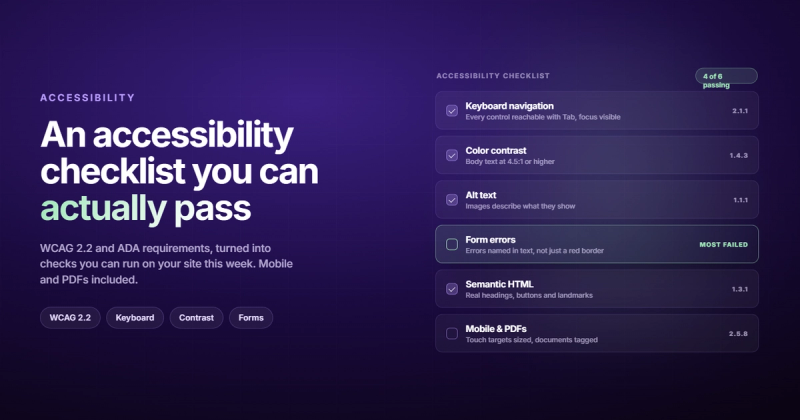
Thousands of ADA accessibility lawsuits are filed against websites every year. The sites getting sued aren't operated by bad people; they're operated by teams who never ran a proper website accessibility checklist. And "we didn't know" is exactly as effective a legal defense as it sounds.
Here's the direct answer: a website accessibility checklist is a structured set of technical and design requirements your site needs to meet so people with disabilities can use it. The enforced standard in 2026 is WCAG 2.2 Level AA. That's what courts reference, and it's what your dev team should be building against.
But let's be honest about why most teams don't have one: accessibility feels abstract until it isn't. You build something, it looks fine, it works for everyone you tested it with. The problem is you tested it with yourself.
The WHO estimates 1.3 billion people live with some form of disability. That includes permanent conditions like blindness or motor impairment, but also temporary ones: a broken wrist, bright sunlight on a phone screen, using a site on a slow 3G connection from a train. Accessibility isn't a niche concern. It's table stakes for reaching your full audience.
This checklist covers WCAG 2.2 Level AA across every major category, plus a testing section that goes past the "just run Lighthouse" advice everyone gives and actually nobody follows.
WCAG 2.2: The Standard That Actually Counts
WCAG stands for Web Content Accessibility Guidelines. It's published by the W3C, it's organized around four principles (Perceivable, Operable, Understandable, Robust), and it comes in three conformance levels: A, AA, and AAA.
Level A is the floor. Basic stuff: images have alt text, videos have captions, pages work with a keyboard. You need this as a minimum.
Level AA is the target. This is what the Department of Justice requires for compliance with the ADA, and what most international equivalents reference. Color contrast ratios, error identification in forms, visible focus indicators. This is the standard you're actually being held to in court.
Level AAA is aspirational. Sign language for videos, reading level adjustments, context-sensitive help. Good to aim for where it makes sense, but you're unlikely to achieve it across an entire site.
WCAG 2.2 specifically introduced several updates over 2.1, including stricter focus appearance requirements, minimum touch target sizes, and new criteria around redundant entry (not asking users to fill in information they already provided). If your team is still checking against WCAG 2.1 checklists from 2019, you're working from an outdated rulebook.
You can find the full official WCAG 2.2 quick reference on the W3C site. Bookmark it. It's dense, but it's the source of truth.
The Keyboard Navigation Tests Nobody Runs
Unplug your mouse. Now try to use your site.
Tab through every interactive element. Can you reach everything? Can you tell where you are? Can you get out of any component you tab into? If any of those answers is "no," you've got a Level A failure.
Here's what the keyboard navigation section of your accessibility checklist should cover:
- Every link, button, form field, and custom component is reachable with Tab
- Tab order follows the visual reading order (left to right, top to bottom)
- No keyboard traps: once a user tabs into something (like a modal), Tab or Escape gets them out
- A visible, obvious focus indicator exists for every interactive element (not just the default browser outline)
- A "skip to main content" link appears as the first focusable element on every page
- Any functionality that requires drag-and-drop has a keyboard alternative (new in WCAG 2.2)
The focus indicator one trips up more design teams than anything else. It's very common to see outline: none in CSS stylesheets because the default blue ring "looks ugly." The fix isn't to remove it; it's to design a better one. WCAG 2.2 now specifies a minimum focus appearance: the focused component needs enough contrast against its unfocused state that it's actually visible.
If you're not sure what keyboard accessibility looks like in practice, the WebAIM WCAG checklist breaks down each criterion with specific pass/fail examples. It's much more readable than the official spec.
Color Contrast is Where Most Sites Quietly Fail
Here's the ratio most designers know: 4.5:1 for regular text against its background. And here's what most of them forget: that only applies to text under 18pt (or 14pt bold). Large text (18pt and above) only needs 3:1.
The other thing most teams miss is that contrast requirements apply to interactive states too. Your grey placeholder text in an input field. Your disabled button. Your link when it's been visited. Every text state needs to meet the threshold.
Visual design checks for your ada compliance website checklist:
- Normal body text has at least 4.5:1 contrast ratio against its background
- Large text (18pt+) has at least 3:1 contrast ratio
- UI components (buttons, form borders, focus rings) have at least 3:1 contrast against adjacent colors
- Information is never communicated by color alone (errors, required fields, status indicators must also have text or icons)
- Text can be resized to 200% without content overflowing or disappearing
- Text spacing can be adjusted (line height, letter spacing, word spacing) without breaking layout
The "color alone" rule catches a lot of form validation designs. Red border on the error input is fine, but only if there's also an error message. The color itself can't be the only signal. Some of your users genuinely can't see that it turned red.
Checking contrast manually for every element is tedious. There are better ways to do it. More on that in the testing section.
Alt Text, Captions, and the 15 Seconds That Matter
Alt text is probably the most well-known accessibility requirement, and also one of the most badly implemented. The goal isn't to add some text to the alt attribute and move on. It's to make the image make sense to someone who can't see it.
There are different types of images, and they need different treatment:
- Informative images (screenshots, product photos, charts): need alt text that describes what the image shows. "Chart showing 45% revenue increase in Q3" is better than "Revenue chart."
- Decorative images (background patterns, divider lines, purely aesthetic visuals): should have
alt=""so screen readers skip them entirely. Not missing alt text. An explicitly empty alt attribute. - Linked images: when an image is wrapped in a link, the alt text describes the destination, not the image. "Visit our pricing page" not "Purple button graphic."
- Complex images like graphs or infographics need a text alternative in the page body, not just a short alt attribute.
For video content, the ada compliant website checklist requires:
- Captions for all spoken content (not auto-generated, edited for accuracy)
- Audio descriptions for visually important content that isn't spoken
- Transcripts for prerecorded audio-only content
- A way to pause or stop any auto-playing media
The audio description one catches people off guard. If your product demo video shows someone clicking around an interface without narrating what they're clicking, a blind user gets almost nothing from it. Either narrate the visual action or provide a text alternative.
Semantic HTML and ARIA (Use Both. Carefully.)
Screen readers don't see your layout. They read the underlying document structure. That means your heading hierarchy, your landmark regions, your button and link semantics: all of it matters.
Semantic HTML checks:
- There's exactly one
<h1>per page (the page title) - Headings use a logical hierarchy:
<h2>sections break into<h3>subsections, no skipping levels - Page uses semantic landmarks:
<header>,<nav>,<main>,<aside>,<footer> - The
langattribute on the<html>element correctly identifies the page language - Links describe their destination. No "click here" or "read more" anchor text
- Buttons trigger actions. Links navigate to pages. Don't use one for the other.
ARIA (Accessible Rich Internet Applications) is for situations where native HTML isn't enough: custom dropdowns, date pickers, tabs, accordions. The rule is: don't use ARIA when HTML already does the job. A <button> element with a label is better than a <div> with role="button" and aria-label. Semantic HTML is always the first choice.
Where ARIA is necessary, the key attributes to check:
- Dynamic content uses
aria-liveregions to announce changes to screen readers - Custom interactive widgets have the correct role, name, and state attributes
- Elements hidden from sighted users (decorative) use
aria-hidden="true" - Every form input has either a visible
<label>or anaria-label
This is also where a proper UX audit overlaps with accessibility. Screen reader usability reveals navigation patterns that sighted users never notice but affect everyone's experience of the underlying structure.
Forms Are Where Accessibility Goes to Die
I spent months building a practice management system for Irish GP clinics. Every form had consequences: patient prescriptions, drug interaction checks, allergy flags. One missing label on a dosage input wasn't a UX inconvenience. It was a liability.
Forms are the part of the site where most accessibility failures cluster. Here's the full ada compliant website checklist for forms:
- Every input field has a visible, associated
<label>(not just placeholder text) - Required fields are marked with text, not just an asterisk that goes unexplained
- Error messages are specific and helpful. "Email is invalid" beats "Error in field 3."
- Errors are identified in text, not just by turning the border red
- When an error occurs, focus is moved to the error message or the problematic field
- Autocomplete attributes are set for personal data fields (name, email, address, phone)
- Users aren't asked to re-enter information they've already provided (new in WCAG 2.2)
- Timeout warnings give users at least 20 seconds to respond, or the option to extend
The placeholder-as-label problem is everywhere. Placeholder text disappears when you start typing, which means users with cognitive disabilities can't see what the field is for mid-entry. A visible label above the input takes three extra lines of CSS. Use it.
If you want to go deeper on how form accessibility connects to conversion rates, the UX audit guide covers the business case in more detail. Good accessibility and good conversion optimization are more aligned than most teams realize.

Two Things Most Accessibility Guides Skip
The standard checklist categories are well covered in most guides. These two come up less often but fail real audits regularly.
Mobile Accessibility
WCAG 2.2 added a minimum touch target size requirement: 24x24 CSS pixels as an absolute minimum, with 44x44 as the practical target. Those tiny icon-only buttons in mobile navs? The ones stacked three pixels apart? Those fail.
Mobile-specific checks beyond touch targets:
- Pinch zoom is not disabled (
user-scalable=noin the viewport meta tag is a WCAG failure) - Content doesn't require a specific orientation to function (unless it's genuinely necessary, like a piano keyboard)
- Swiping interfaces have single-pointer alternatives (keyboard, tap, button)
- Text and UI elements scale correctly when device display size settings are increased
PDFs and Documents
If you host PDFs (brochures, reports, whitepapers, application forms), they need to be accessible too. An inaccessible PDF on an otherwise-compliant site is still a legal exposure. PDF accessibility checks include: proper document structure with tagged headings, meaningful reading order, alt text for images, form fields that are labeled and fillable. If a PDF was exported from a design tool like Figma or InDesign without accessibility settings, it almost certainly fails.
The ADA.gov website has specific federal guidance on web accessibility requirements that covers both web content and downloadable documents.
Testing Past "Just Run Lighthouse"
Here's the problem with automated accessibility testing: it catches about 30% of actual issues. Automated tools are excellent at finding contrast failures, missing alt text, and obvious HTML structure problems. They can't tell you if your keyboard navigation flow makes sense, if your error messages are understandable, or if your screen reader output is coherent.
You need both automated and manual testing.
Automated Tools
| Tool | Type | What It Catches Well |
|---|---|---|
| WAVE (WebAIM) | Browser extension | Missing labels, contrast, structure, ARIA |
| Axe DevTools | Browser extension / CI integration | WCAG violations with specific rule references |
| Google Lighthouse | Built into Chrome DevTools | Quick overview, good for initial pass |
| Colour Contrast Analyser | Desktop app | Precise contrast ratio testing for any color combination |
| Accessibility Insights | Browser extension (Microsoft) | Guided manual testing checklists alongside automated checks |
Start with Axe DevTools in your browser. It integrates cleanly into Chrome and Firefox DevTools, and the free version catches most Level A and AA violations. WAVE is better for visual teams because it overlays icons directly on the page.
Manual Testing You Actually Need to Do
Run through these manually on your most important pages:
- Keyboard-only session: unplug the mouse, navigate through the full page task by task
- Screen reader: NVDA (Windows, free) or VoiceOver (Mac/iOS, built in): listen to your page without looking at it
- 200% zoom: open Chrome, zoom to 200%, scroll through the page looking for overflow or missing content
- Disable CSS: see the raw document structure and reading order your screen reader actually gets
- High contrast mode: Windows high contrast setting: does your UI still make sense?
The screen reader test is the one most developers avoid because it feels unfamiliar. NVDA is free, takes ten minutes to install, and will show you things about your site's structure that no automated tool can surface. The first time you listen to your navigation read aloud as "link link link link link," you'll understand why anchor text matters.
If you're doing a full technical review, this fits well alongside a technical SEO audit. The semantic HTML and structured data checks overlap significantly, and running both at the same time is efficient.
Making Accessibility Stick in Your Workflow
Running a one-time audit and fixing issues is the wrong way to think about this. Accessibility regresses. New features get added, old components get tweaked, a designer removes focus styles because "they don't fit the new brand." A year later you're back to where you started.
The teams that stay compliant treat accessibility like they treat security: not as a project, but as a process.
Practically, that means:
- Add Axe or similar to your CI pipeline so accessibility violations fail the build (same way a lint error would)
- Include an accessibility section in every design review, not just before launch
- Add keyboard and screen reader spot checks to your QA sign-off process
- Assign someone ownership of the WCAG conformance standard, not just "everyone's responsibility"
- Run a full audit every six months, or after any major redesign
This connects directly to long-term user experience basics. Accessibility is one component of building for all your users, not just the ones who work the same way you do.
"I once reviewed a site where the designer had removed all focus indicators because the blue ring 'clashed with the color palette.' Nobody had caught it because nobody tests with a keyboard. That single decision made the entire site unusable for anyone navigating without a mouse (about 7% of users)."
The business case is straightforward. You're expanding your reachable audience. You're reducing legal exposure. You're improving your SEO (semantic HTML, proper heading structure, and descriptive link text are also on-page SEO wins). And you're building something that works better for everyone, including sighted users on keyboards, power users, and anyone who's had an arm injury.
Frequently Asked Questions
What is the minimum color contrast ratio for WCAG compliance?
WCAG 2.2 Level AA requires a 4.5:1 contrast ratio for normal text (under 18pt) against its background. Large text (18pt or larger, 14pt if bold) only requires 3:1. UI components and graphical elements like button borders and chart lines need at least 3:1 against adjacent colors.
How do I check if my website is ADA compliant?
Start with the WAVE browser extension or Axe DevTools for an automated scan. These catch the most common WCAG violations quickly. Then run manual tests: navigate with keyboard only, test with a screen reader like NVDA or VoiceOver, and zoom to 200%. Automated tools catch roughly 30% of real issues, so manual testing is necessary for anything beyond a baseline check.
What is the difference between WCAG 2.1 and WCAG 2.2?
WCAG 2.2 added nine new success criteria to 2.1, including minimum focus appearance (focus indicators must be visually distinct), minimum touch target size (24x24 CSS pixels), dragging movement alternatives (keyboard-accessible alternatives for swipe and drag interactions), and redundant entry prevention (don't ask users to re-enter data they already provided in the same session). One criterion from 2.1 (4.1.1 Parsing) was removed as it became redundant with modern browser behavior.
Do all websites need to be ADA compliant?
In the US, websites operated by state and local governments must comply under ADA Title II (updated federal rules took effect in 2024). Private businesses covered by ADA Title III (public accommodations) have strong legal exposure if their websites are inaccessible, even without a specific federal mandate. Courts have consistently ruled that commercial websites constitute public accommodations. If you serve US customers, you have legal exposure regardless of your company size.
What tools can I use to test website accessibility for free?
WAVE (browser extension from WebAIM), Axe DevTools (free tier in Chrome/Firefox), Google Lighthouse (built into Chrome DevTools), NVDA screen reader (Windows, free), and VoiceOver (built into Mac and iOS) are all free. The Colour Contrast Analyser from TPGi is a free desktop app for precise contrast checking. Between WAVE and a keyboard-only session, you'll find the majority of critical failures without spending anything.
How often should I audit my website for accessibility?
Run automated checks in your CI pipeline continuously. Do a manual audit at launch, after any major feature release, and at least every six months for active sites. If you redesign navigation, add new interactive components, or change your design system, those areas need to be retested immediately regardless of the schedule.
Comments