
User experience design basics come down to one question: can someone complete what they came to do, without confusion, friction, or frustration? If yes, the UX is working. If no, you have work to do.
That's the short version. The longer version covers why most sites fail this test, how UX designers actually think about solving it, and what separates a website people return to from one they abandon after seven seconds.
This is a practical guide to user experience design basics: what it is, the core principles behind it, the process designers follow, and what good UX actually looks like on a real business website, the kind that needs to generate results, not just win design awards.
What user experience design actually is
UX stands for user experience. But that phrase gets stretched to cover so much ground that it stops meaning anything useful.
Here's a definition that holds up: user experience design is the practice of shaping how people feel when they interact with your product. Not just the visual layer. Not just the navigation. The whole experience, from the moment someone lands on your page to the moment they either complete their goal or give up and leave.
The Nielsen Norman Group defines UX as "all aspects of the end-user's interaction with the company, its services, and its products." That's broad intentionally. UX includes the interface, but it also includes the copy on the page, the speed of the system, the error messages, the checkout flow, and whether clicking the main call-to-action actually does what someone expects it to do.
Good UX is largely invisible. When a site works well, nobody thinks about the design. They just complete the task. Bad UX announces itself immediately. People hesitate, click the wrong thing, read a sentence twice, can't find what they need, and leave.
Here's what makes UX design different from other design disciplines: it starts with behavior, not aesthetics. You're not asking "what looks good?" You're asking "what do people need to do, and what gets in the way?"
"Working on a healthcare SaaS product taught me that the most complex UX challenges aren't in flashy consumer apps. They're in enterprise software where a single misplaced checkbox in a prescription form could have real consequences. UX isn't decoration. It's the difference between a user doing the right thing and the wrong thing."
That shift in starting point, from "how should this look?" to "what does this person need to accomplish?", is the fundamental move in UX thinking. Everything else follows from there.
UX vs UI: the line that actually matters
These two terms get used interchangeably so often that plenty of people in the industry aren't entirely clear where one ends and the other begins.
The clearest way to think about it: UX is the experience, UI is the interface. UX is what the user feels. UI is what they see.
A more concrete framing: UX asks "can this person do what they need to do?" UI asks "does this look like something they'd want to interact with?" Both questions matter, but they're different questions.
| UX Design | UI Design |
|---|---|
| User research and journey mapping | Visual design and brand consistency |
| Information architecture | Typography, color, and spacing |
| Wireframes and user flows | High-fidelity mockups and prototypes |
| Usability testing | Component and design system work |
| Task completion and friction removal | Visual hierarchy and aesthetic decisions |
You can have great UI with terrible UX: a beautiful website where nobody can find the pricing page. You can have decent UX with mediocre UI: an ugly site that converts well because the flow is logical and the messaging is clear.
In practice, good products have both. But if you have to choose where to put your attention first, fix the UX. Polishing a confusing checkout form doesn't make it less confusing.
This distinction also matters when you're hiring or briefing agencies. "We need better UX" and "we need better UI" are different briefs with different deliverables. Knowing which problem you actually have saves a lot of time and budget going in the wrong direction.

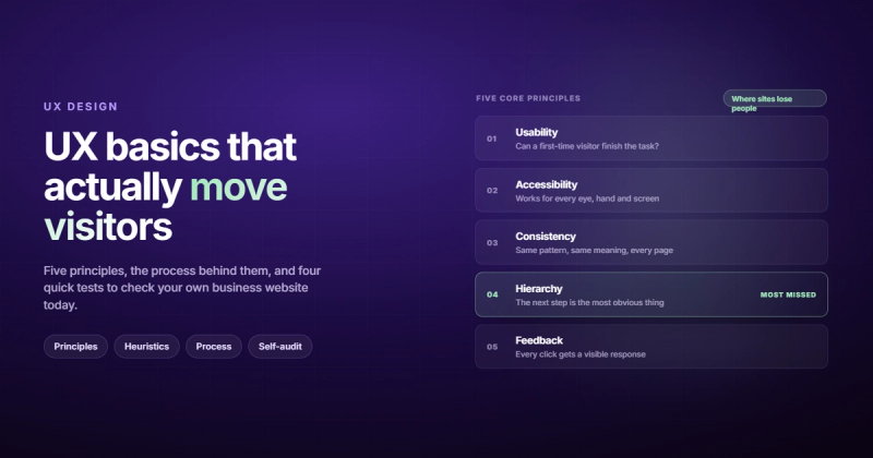
The five principles behind all good UX
Every UX decision you make traces back to a small set of principles. Not rules, exactly. Principles: things that explain why a design choice works or doesn't work.
1. Usability
Usability is the foundation. It asks: can people actually do what they're trying to do? Not technically possible in theory, but achievable by a real person under normal conditions, without reading documentation or asking for help.
Usability breaks down into a few sub-questions. Is it easy to learn the first time? Is it efficient once someone knows how it works? Are mistakes recoverable? Does it feel familiar enough that someone doesn't have to figure it out from scratch?
Most sites fail on usability in specific, measurable ways. Navigation labels that make sense internally but confuse visitors. Forms that don't explain what format a field expects. Buttons that look like decorative text. These aren't matters of design taste. They're failures with measurable impact on whether users complete what they came to do.
2. Accessibility
Accessibility means designing for all users, including people with visual impairments, motor limitations, cognitive differences, or situational constraints , using a phone one-handed, reading outdoors in bright sunlight, on a slow connection.
The W3C Web Accessibility Initiative estimates over a billion people worldwide have some form of disability. That's not an edge case. That's a substantial portion of your audience, and it grows when you factor in temporary and situational impairments.
Accessible design also tends to be cleaner design. High contrast, descriptive link text, keyboard navigation, and clear labels improve the experience for everyone, not just users who specifically need those features.
3. Consistency
Consistency is what lets people transfer what they've already learned. If a button looks one way on one page and differently on another, users have to re-evaluate every button they encounter. That's mental load you're adding for no reason.
Consistency operates at multiple levels: visual (the interface looks and behaves the same way throughout the product), interaction (the same action always produces the same result), and language (terms in the UI match what users actually call things).
This is partly why design systems exist. When multiple people are building different parts of a product, consistency doesn't happen by accident. It requires deliberate documentation and shared components.
4. Information hierarchy
Hierarchy answers one question: what should a user notice first? What's the primary action? What's supporting detail, and what can be de-emphasized?
Poor hierarchy puts everything at equal visual weight, forcing users to read the entire page to figure out what to do next. Strong hierarchy guides the eye naturally toward the thing that matters most, then layers in the supporting detail for people who want it.
Size, contrast, spacing, and placement all contribute to hierarchy. You don't have to make everything dramatic. You just have to make the important things clearly more important than everything else.
5. Feedback and system state
Users need to know what's happening. When they click a button, did it register? When they submit a form, did it succeed? When something takes a few seconds, is the system loading or did it break?
Feedback closes the gap between action and understanding. A loading indicator, a success confirmation, an error message, a disabled submit button after clicking , these aren't cosmetic additions. They're how the system communicates with the user. When feedback is absent, users fill the silence with confusion and doubt. Sometimes they submit twice. Sometimes they leave entirely.
Nielsen's 10 usability heuristics, decoded
Jakob Nielsen published his 10 usability heuristics in 1994. They've been tested against more products and interfaces than almost any other framework in the field, and they still hold up three decades later.
Here they are without the academic language:
- Show users where they are and what's happening. If something is loading, show it. If an action worked, confirm it. Never leave someone wondering whether anything happened.
- Speak the user's language. Use words and concepts that match how the user thinks about the world, not how your internal team describes it. "Submit inquiry" means less than "Send message."
- Give users a way out. Undo, cancel, go back. People make mistakes and explore without commitment. Make it safe to do so, or they'll stop exploring altogether.
- Be consistent and follow conventions. The back button goes left. The logo links to the homepage. Forms have labels above fields. Don't reinvent these without a very good reason.
- Prevent errors rather than catching them. A confirmation step before a destructive action is better than a recovery option after someone has deleted six months of work.
- Make things recognizable, not memorized. Users shouldn't need to remember what they saw two pages back to complete what they're doing now. Put the relevant information in front of them.
- Support both beginners and experts. Keyboard shortcuts, filters, and power-user options serve experienced users without getting in the way of first-timers.
- Strip out the clutter. Every element that isn't helping a user complete a task is making it harder. Decorative content, redundant information, excessive text: all friction.
- Write error messages that actually help. "Error 403" tells no one anything. "You don't have permission to view this page , try logging in first" tells them exactly what to do next.
- Provide help, but don't require it. Good design shouldn't need a manual. But when edge cases happen, documentation and support should be easy to find, not buried three clicks deep.
These heuristics work as a lightweight audit tool. Go through your own site and ask whether each page satisfies these ten criteria. The ones that fail are where you start.
The Interaction Design Foundation's UX resources cover each heuristic in depth, with examples and research behind each one, if you want to go further.
The UX design process: four steps
UX design isn't a single deliverable. It's a process, and the process repeats. Here's how it actually works:
Step 1: Research
Before designing anything, you need to understand the people who'll use it. Who are they? What are they trying to accomplish? What do they know going in? What vocabulary do they use?
Research methods include user interviews, contextual observation, surveys, usability testing of existing products, and behavioral data analysis , where do users drop off? what do they search for on-site? what pages do they visit before converting?
This step gets skipped more than any other. Teams assume they know their users because they've been working in the space for years. They're usually wrong in specific, surprising ways. I ran a car accessories e-commerce store for a while and assumed the customer base skewed heavily male. The actual data told a completely different story. You stop making those assumptions when you look at real behavior instead of what you expect to see.
Data beats deliberation. Test your assumptions before you design around them.
Step 2: Ideation
With research in hand, you start generating ideas. This doesn't mean jumping straight to wireframes. It means defining the problem clearly, exploring multiple approaches, and evaluating them against what you found in research.
Good ideation is divergent before it's convergent: you want many ideas before narrowing down. The first idea is rarely the best one. The constraint that seems obvious at the start often turns out to be a false constraint once you understand the problem more deeply.
A useful question at this stage: are you solving the right problem? Sometimes what looks like a navigation problem is actually a messaging problem. What looks like a conversion problem is actually a trust problem. Getting the problem definition right before designing saves a lot of rework later.
Step 3: Prototype and test
A prototype is any version of the design you can put in front of a user to get feedback. It can be paper sketches, a clickable wireframe built in Figma, or something close to the finished product. The fidelity should match your question: if you're testing whether a flow makes sense, a low-fidelity prototype is fine. If you're testing whether the copy is compelling, you need something that looks closer to the real thing.
Testing doesn't require a lab or a full research team. Five users uncovering the same problems tells you more than a hundred users in a survey. Watch someone try to use your design. Where do they hesitate? What do they click that doesn't do what they expected? What do they look for that isn't there?
Those moments, the hesitations and misclicks, are the design problems. Write them down.
Step 4: Iterate
What you learn from testing informs the next version. Then you test again. This isn't a sign that the first version was bad. It's how UX design is supposed to work.
The assumption that you can design something once, ship it, and walk away is how companies end up with navigation systems that made perfect sense to the team during the project and confused everyone else after launch. Iteration keeps the design grounded in how users actually behave, not how you hoped they would.
Good products don't get there through a single brilliant design decision. They get there through dozens of small improvements driven by honest testing.
UX for business websites, specifically
Most UX writing assumes you're building an app. But if you run a service business, a professional services firm, or any company where the website's job is generating leads and building trust, the specifics look a bit different.
Business websites have a clearer success metric than most digital products: did this visitor take the action we wanted? Book a call, fill out a form, request a quote. UX for business websites is largely about removing every obstacle between a visitor's arrival and that action.
Some places where business websites consistently fail this:
- No clear primary action. The page asks five different things of the visitor, none with visual priority. The result: the visitor does none of them. Every page should have one primary ask.
- Decision-critical information is buried or missing. Pricing, process, timeline, what's included. If someone has to email to find out whether you're in their budget, they're already gone. Make the information they need to say yes easy to find.
- Navigation built around the company structure, not the visitor's questions. "Services > Offerings > Packages > Enterprise" is how your internal team thinks. Your visitors are thinking "I need help with X, can these people do it, and what will it cost me?"
- Forms that ask for too much, too early. Name, company, phone, job title, company size, how did you hear about us, describe your project , before you've given the visitor a single reason to trust you with all that. Start with less.
If you want a structured look at how well your site performs against these dimensions, a UX audit maps your specific pages against usability principles and identifies exactly where the experience breaks down.
The conversion-focused version of the same analysis is the CRO audit , that one focuses more on business metrics, but the underlying UX principles overlap heavily. Good UX and good conversion rate optimization are pointing at the same thing from different angles.
How to spot bad UX on your own site
You can do a quick, informal UX review without any special tools. These four checks catch most of the common problems:
The five-second test: Show your homepage to someone who hasn't seen it before, for exactly five seconds, then cover it and ask them what the site does. If they can't answer confidently, you have a clarity problem. Most sites fail this.
The squint test: Squint at your page until the text blurs. What stands out visually? If it's a stock photo and three competing buttons at the same size, your hierarchy needs work. The most important element should be obviously the most important.
The new tab test: Open your site in a private browser window, as if you've never seen it before. Where does your eye land first? Can you find the thing a first-time visitor would be looking for? Navigate through the main conversion path start to finish. Where do you feel friction?
The mobile test: Do everything on your site on a phone. Not a quick scroll , actually try to complete the primary conversion path. Where do your thumbs fight the interface? What takes more taps than it should? What's too small to read comfortably?
The worst UX problems are usually visible with these simple checks. You don't need eye-tracking software to know that a form field with no label is going to cause problems.
For specific examples of what bad UX looks like across different website types and what to replace each pattern with, the bad UX guide covers the most common failures in detail.
And if you want to understand how UX connects directly to business results, the website conversion guide breaks down the relationship between UX decisions and conversion rates across different page types.
Frequently asked questions
What are the basics of UX design?
User experience design basics cover four connected areas: understanding users through research, structuring information so it makes sense, designing interactions that feel intuitive, and testing your assumptions against how real people actually behave. The principles running through all of it are usability, accessibility, consistency, hierarchy, and feedback. Get those five right and most UX problems solve themselves.
What's the difference between UX and UI design?
UX covers the overall experience: can users complete what they came to do? UI covers the visual interface: does it look right and communicate correctly? A UX designer maps user journeys, runs usability tests, and creates wireframes. A UI designer works with typography, color, spacing, and component design. Both matter. They're solving different problems, and treating them as the same thing tends to mean you do neither properly.
What does a user experience designer actually do?
A UX designer's job is to close the gap between what users need and what the product delivers. Day to day, that means user research, wireframing, building prototypes, running usability tests, writing user flows, and working with developers and product managers to make sure the final product reflects the intended experience. The deliverables vary by company and project. The core question doesn't change: can people do what they need to do?
How long does it take to learn UX design basics?
The fundamentals, the principles and process covered in this guide, take a few weeks to absorb. Developing good design judgment takes years of practice, iteration, and watching real users struggle with things you thought were obvious. The most valuable investment early on is running usability tests. Five sessions where you watch someone use something you designed will teach you more than six months of reading about UX theory.
Do you need to know how to code to work in UX design?
No. Understanding how development works is useful, and knowing what's technically feasible helps you make better design decisions, but coding is not a UX skill requirement. UX designers use tools like Figma, Maze, and Hotjar. The skill gap that actually holds most UX designers back isn't coding , it's research. The ability to find out what users actually need, rather than designing based on assumptions, is harder to develop than any technical skill.
What's the most common UX mistake on business websites?
Designing for the internal team's understanding instead of the visitor's questions. This shows up as navigation labels that make perfect sense to everyone who works at the company and confuse everyone who doesn't. It shows up in service descriptions written in industry jargon that assumes context the visitor doesn't have. And it shows up in calls-to-action positioned where the team thought they made structural sense, rather than where the visitor's attention actually is when they're ready to act.
User experience design basics aren't a checklist you tick off once. They're a way of thinking: start with the person using the thing, not the thing itself. Understand what they're trying to do before you decide how to help them do it. Test whether you got it right.
The companies that think this way, even at a basic level, consistently outperform the ones building websites based on what looked good in a conference room presentation.
If you want a professional review of how your site currently measures up, our web design service includes UX analysis as a core part of every project.
Comments