
What Is Landing Page Experience (And Why Google Cares)
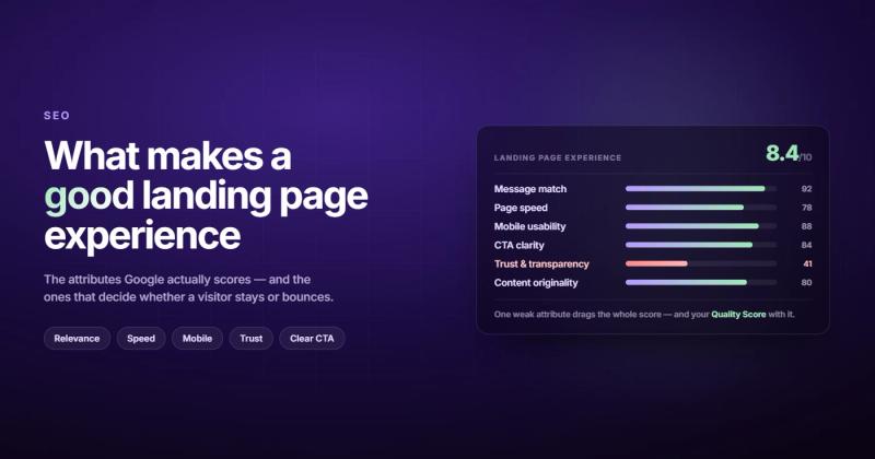
Which attributes describe a good landing page experience? The short answer: relevant content that matches the ad or search query, fast load times, mobile-friendly design, clear calls to action, easy navigation, and trust signals like contact info and privacy policies. Google uses these factors to rate your landing page as "above average," "average," or "below average" in Google Ads.
That's the textbook answer. Here's what it actually means in practice.
Landing page experience is Google's way of measuring whether people who click your ad actually find what they were looking for. It feeds directly into your Quality Score, which determines how much you pay per click and where your ad shows up. A bad landing page experience means you pay more for worse positions. A good one means you pay less for better ones.
Think of it like a restaurant review system. Google is the food critic. Your ad is the menu description. Your landing page is the actual meal. If someone orders the grilled salmon based on a great menu description and gets microwaved fish sticks, that restaurant gets a bad review. Same principle applies to your ads and landing pages.
I once ran a Google Ads campaign for a client where the ad promised "custom web design pricing." The landing page was their generic homepage. No pricing. No mention of custom design. We were paying $14 per click for traffic that bounced in under 5 seconds. We built a dedicated landing page with actual pricing tiers and the cost per conversion dropped by 60%. The ad copy didn't change. The landing page did.
The rest of this post breaks down each attribute that makes or breaks your landing page experience, with specifics you can actually use.
Relevance and Message Match
This is the single most important attribute, and the one most advertisers get wrong.
Your landing page needs to deliver exactly what your ad promised. Not roughly. Not eventually, after scrolling. Immediately. If your ad says "free SEO audit," the landing page headline should say "Get Your Free SEO Audit." Not "Welcome to Our Digital Marketing Agency." Not "Our Services." The exact thing you promised.
Google calls this "relevance." People in the industry call it "message match." Both terms mean the same thing: the words on your ad and the words on your landing page should feel like they were written by the same person, about the same thing, for the same audience.
Here's what strong message match looks like:
| Ad Headline | Bad Landing Page | Good Landing Page |
|---|---|---|
| "Free Website Audit" | Generic homepage | Page with audit form and "Get Your Free Audit" headline |
| "B2B Web Design Pricing" | Services overview page | Page with pricing tiers for B2B web design |
| "Webflow Development Agency" | "We Do Everything" page | Dedicated Webflow portfolio and process page |
The fix is straightforward but tedious: build dedicated landing pages for each ad group. Yes, that means more pages. Yes, it's more work. But sending every ad to your homepage is like handing every customer the same menu regardless of whether they asked for breakfast or dinner.
Page Speed and Technical Performance
Google has said publicly that page speed is a ranking factor. For landing pages specifically, it's even more critical because paid traffic has zero patience. You paid for that click. If your page takes 4 seconds to load, roughly half your visitors will leave before they see anything.
The numbers are brutal. A page that loads in 1 second converts at roughly 3x the rate of a page that loads in 5 seconds. Every additional second of load time increases bounce rate by about 20%.
What actually slows pages down:
- Uncompressed images (the most common offender by far)
- Too many third-party scripts (analytics, chat widgets, heatmaps, remarketing pixels all stacked on top of each other)
- Render-blocking CSS and JavaScript
- No caching headers
- Hosting on a slow server because it was cheap
Run your landing page through Google PageSpeed Insights. If your Largest Contentful Paint (LCP) is above 2.5 seconds, you have a problem. If it's above 4 seconds, you're actively burning ad spend.
The fix usually isn't complicated. Compress your images to WebP. Defer non-critical JavaScript. Use a CDN. These three changes alone fix 80% of speed problems I see on client landing pages. If you're on a platform like Webflow, a lot of this is handled automatically. If you're on WordPress with 47 plugins, well... that's a different conversation. We've written about the Webflow vs WordPress tradeoffs before.
Mobile Optimization
Over 60% of Google Ads clicks happen on mobile devices. For some industries, it's closer to 80%. If your landing page doesn't work well on a phone, you're losing the majority of your paid traffic.
"Works on mobile" doesn't mean "technically loads on a phone." It means:
- Text is readable without zooming (16px minimum font size)
- Buttons and links are big enough to tap with a thumb (at least 48x48 pixels)
- No horizontal scrolling at any point
- Forms are short and fields are appropriately sized for touch input
- The CTA is visible without scrolling three screens down
Here's the part most people miss: mobile landing page experience isn't just about responsive design. It's about understanding how people use phones. They're usually doing something else. They have 30 seconds, not 3 minutes. They're on a spotty connection. Your desktop landing page with a 2-minute video hero and an 8-field form might convert well on desktop and fail completely on mobile.
Test your landing pages on an actual phone. Not Chrome DevTools with a mobile viewport. An actual phone on a 4G connection. You'll see problems you never noticed in a desktop preview.
Clear and Focused Calls to Action
A landing page should have one job. One action you want the visitor to take. Every element on the page should push toward that single action.
The most common mistake is giving visitors too many choices. A nav bar with 7 links. A sidebar with blog posts. Social media icons. A footer with 30 links. Every additional link is an exit ramp away from your conversion goal.
Good landing page CTAs share these traits:
- They use specific language ("Get Your Free Audit" not "Submit")
- They're visually obvious without being obnoxious
- They appear above the fold and again after key selling points
- They tell people exactly what happens next ("We'll email your report within 24 hours")
Here's a pattern I've seen work consistently: state the offer, handle the objection, then present the CTA. "Get a custom website quote in 24 hours. No commitment, no credit card. Just tell us what you need." That sequence answers the three questions every visitor has: what do I get, what does it cost me, and what happens after I click.
If your landing page has multiple CTAs competing for attention, pick the one that matters most and remove or de-emphasize the rest. A page that tries to get you to book a call AND download an ebook AND subscribe to a newsletter will convert worse than a page that does one of those things well. We covered this in detail in our landing page checklist.
Trust Signals and Transparency
Google explicitly lists transparency as a landing page experience factor. This means clearly stating who you are, what you're offering, and how you'll use the visitor's information.
But trust signals go beyond compliance. They're the difference between a visitor who fills out your form and one who hits the back button. People are naturally skeptical of pages that ask for their information, especially on a first visit from an ad.
What builds trust on a landing page:
- Real testimonials with full names (not "J.D. from New York")
- Client logos that visitors recognize
- Specific numbers ("We've helped 340+ companies" not "We've helped many companies")
- A visible phone number or contact option
- Privacy policy link near any form
- Security badges if you're collecting payment information
- A real physical address
One thing that gets overlooked: your "About" or credibility section doesn't need to be at the bottom. If trust is a barrier to conversion (and it almost always is for paid traffic), move your strongest proof points closer to the CTA. A testimonial right next to the submit button can lift conversions more than any headline change.
Navigation, Layout, and Visual Hierarchy
Google wants landing pages that are "easy to navigate." For most landing pages, this actually means less navigation, not more.
A standard website nav bar gives visitors 6-8 places to go. That's fine for a homepage. On a landing page, every one of those links is a leak in your funnel. The visitor came from an ad for a specific thing. Give them that thing. Don't give them a tour of your entire website.
That said, "easy to navigate" also means the page itself flows logically. Visitors should be able to scan the page and understand the structure in seconds. This comes down to visual hierarchy:
- Headline that matches the ad (biggest text on the page)
- Supporting subheadline that adds specifics
- Key benefits or features (scannable, not buried in paragraphs)
- Social proof (testimonials, logos, numbers)
- CTA (clearly the thing you want them to do)
The layout should guide the eye from top to bottom like a slide, not scatter attention like a pinball machine. If a visitor has to figure out what to look at first, you've already lost them.
For longer landing pages with multiple sections, an anchor-linked sticky nav that jumps to sections can actually help. It keeps people oriented without sending them away from the page. But keep it to 4-5 items at most.
Content Quality and Originality
Google wants "useful and original content" on your landing pages. This doesn't mean you need 2,000 words of blog-quality writing. It means your content should exist for the visitor's benefit, not as keyword padding.
What "original content" actually means for landing pages:
- Don't copy your competitors' pages word for word (you'd be surprised how often this happens)
- Your value proposition should reflect what's genuinely different about your offer
- Feature descriptions should be specific to your product or service, not generic industry copy
- If you're making claims ("fastest," "cheapest," "most popular"), back them up with evidence
Content quality also means readability. Short paragraphs. Clear headings. No jargon unless your audience expects it. Write at an 8th-grade reading level. Not because your audience is unsophisticated, but because everyone prefers content that's easy to process. Nobody has ever complained that something was too clear.
One pattern I've seen work well: write the page like you're explaining your offer to someone at a coffee shop. If you wouldn't say "we provide end-to-end solutions for digital transformation" in a conversation, don't put it on your landing page. That kind of writing is a bad UX signal that visitors pick up on immediately, even if they can't articulate why.
How Landing Page Experience Connects to Quality Score
This is the part most articles about landing page experience skip over, but it's the part that actually affects your wallet.
In Google Ads, your Quality Score is made up of three components: expected click-through rate, ad relevance, and landing page experience. Each one gets rated as "above average," "average," or "below average." Quality Score then influences two things: your ad rank (where your ad appears) and your actual cost per click.
Here's why this matters in real terms. Two advertisers bidding on the same keyword:
| Factor | Advertiser A | Advertiser B |
|---|---|---|
| Max bid | $5.00 | $3.00 |
| Quality Score | 4/10 | 8/10 |
| Ad Rank (bid x QS) | 20 | 24 |
| Result | Position 2, pays more | Position 1, pays less |
Advertiser B wins the better position while paying less per click, purely because their landing page (and other Quality Score factors) are better. Over a month of ad spend, this difference compounds into thousands of dollars.
Google doesn't share the exact algorithm for calculating landing page experience scores, but they've published enough guidance to make the formula clear: make your page relevant, fast, mobile-friendly, and trustworthy. That's it. There's no secret hack. The attributes listed in this post are the attributes that matter.
Testing and Iteration (What Most Pages Are Missing)
Here's a topic the top-ranking articles on this subject barely mention: you can't know if your landing page experience is good without testing it.
Not A/B testing your landing pages is like cooking a meal without tasting it. You might get lucky. You probably won't.
What to test first (in order of likely impact):
- Headline and message match with your ad copy
- CTA text and placement
- Form length (fewer fields almost always wins)
- Social proof placement and type
- Page length (short vs. long-form)
A quick note on form fields specifically: reducing form fields from 7 to 4 has been shown to increase conversions by over 100% in multiple studies. Every field you add is friction. Every field you remove is a gift to your conversion rate. Ask yourself: do you really need the company name, job title, AND phone number before you can have a conversation with this person?
The companies I've seen get the best results from their landing pages aren't the ones with the fanciest designs. They're the ones running 2-3 tests per month and making small improvements based on actual data. After six months of that, their pages convert circles around competitors who built one "perfect" page and never touched it again. If you're thinking about your broader website conversion strategy, this same principle applies.
Common Mistakes That Tank Landing Page Experience
I've audited enough landing pages to see the same mistakes repeat. Here are the most frequent ones:
Sending all ad traffic to your homepage. Your homepage serves everyone. A landing page serves one specific audience with one specific intent. These are different jobs.
Slow pages loaded with tracking scripts. I've seen landing pages with 15+ third-party scripts. Google Analytics, Hotjar, Facebook Pixel, LinkedIn Insight, Intercom, Drift, HubSpot tracking, Google Tag Manager loading 8 more tags. Each one adds latency. Audit your scripts and ask: is each one earning its load time?
Pop-ups that fire immediately. Nothing says "I don't respect your time" like a pop-up that covers the content before you've read a single word. Google specifically penalizes intrusive interstitials on mobile. If you must use a pop-up, trigger it on exit intent or after 30 seconds, not on load.
Forms that ask for everything upfront. Name, email, phone, company, job title, company size, annual revenue, favorite color. Front-load the ask and you'll front-load the bounce. Get the email first. Ask everything else later.
No mobile testing. "It's responsive" and "it works well on mobile" are two very different statements. A responsive page can still have tiny buttons, unreadable text, and forms that are painful to fill out on a phone. Test on a real device.
Most of these are fixable in an afternoon. The ROI of fixing them is immediate and measurable in your Google Ads account. If your SEO and ad performance are suffering, the landing page is usually the first place to look.
Frequently Asked Questions
What is landing page experience in Google Ads?
Landing page experience is one of three factors that make up your Google Ads Quality Score. Google evaluates whether your landing page provides useful, relevant content that matches the ad, loads quickly, is mobile-friendly, and is easy to navigate. It's rated as "above average," "average," or "below average" in your Google Ads account.
How does landing page experience affect Quality Score?
Landing page experience is one-third of your Quality Score calculation, alongside expected click-through rate and ad relevance. A higher Quality Score means you pay less per click and get better ad positions. Improving your landing page experience from "below average" to "above average" can reduce your cost per click by 16-50%, depending on competition.
What are the three landing page experience ratings Google gives?
Google rates landing page experience as "above average," "average," or "below average." You can check your rating in Google Ads by adding the "Landing page exp." column to your keywords report. "Above average" means Google considers your page better than most other advertisers for the same keywords.
How fast should a landing page load?
Google recommends a Largest Contentful Paint (LCP) of under 2.5 seconds. For landing pages specifically, faster is always better because paid traffic has low patience. Pages that load in 1-2 seconds convert at significantly higher rates than pages that take 3+ seconds. Test yours at Google PageSpeed Insights.
Does landing page experience affect organic SEO?
Landing page experience is a Google Ads metric, not a direct organic ranking factor. However, the attributes Google evaluates (page speed, mobile-friendliness, content quality, user experience) are also Core Web Vitals and UX signals that influence organic rankings. Building a good landing page experience helps both paid and organic performance.
Can I use my homepage as a landing page?
Technically yes, but it almost always performs worse than a dedicated landing page. Homepages serve multiple audiences with multiple goals. Landing pages serve one audience with one goal. The more focused your page, the higher your conversion rate and the better your landing page experience rating. Build dedicated pages for your highest-spend ad groups first.
Comments