
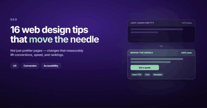
The Real Problem With Most Websites Isn't Design
Web design tips are everywhere. Every blog post gives you the same 10 things: use white space, pick a good font, make it responsive. Fine. But here's what nobody mentions: most websites don't fail because they're ugly. They fail because they don't say anything worth reading in the first two seconds.
I've been building websites for over 10 years, and the pattern is always the same. A business owner says "our website looks dated." They hire a designer. The designer makes it look modern. Traffic doesn't change. Conversions don't change. Nothing changes, except the invoice.
The tips in this post are different. Some of them are standard (because the standards exist for good reasons). But I'm also going to tell you the stuff that actually moves the needle, the things that the "top 10 web design tips" listicles tend to skip because they're harder to screenshot.

1. Start With Messaging, Not Layout
This is the tip that should be number one on every list but almost never is. Before you pick colors, before you choose fonts, before you even open your design tool, you need to answer one question: what does this website say?
Most companies have a messaging problem disguised as a design problem. They think their website looks bad when the real issue is that it doesn't communicate anything specific. "We deliver innovative solutions" tells your visitor nothing. "We build Webflow sites for B2B companies in 4 weeks" tells them everything they need.
Nobody has ever hired my agency because we use Webflow instead of WordPress. They hired us because we promised to solve a specific problem. Stop leading with your tech stack and start leading with the outcome.
Write your homepage headline, your value proposition, and your CTAs before you design a single pixel. If the words don't work in a Google Doc, they won't work on a beautiful website either. I've watched clients spend $15,000 on a redesign that flopped because the messaging was identical to what they had before. The paint was new. The house was still empty.
2. Visual Hierarchy Guides the Eye
Your visitors don't read your website. They scan it. Eye-tracking research from the Nielsen Norman Group consistently shows that people follow an F-shaped pattern: they read the headline, scan down the left side, and occasionally dart right when something catches their attention.
Visual hierarchy is how you control where that attention goes. Size, color, contrast, and spacing all work together to create a reading order. The most important element on any screen should be the largest, the highest-contrast, or both.
Here's the practical version: your H1 should be bigger than your H2. Your CTA button should be a different color from everything else on the page. Your navigation shouldn't compete with your headline for attention. If everything on the page is "important," nothing is.
A quick test: squint at your homepage. Whatever you notice first is what your visitors notice first. If it's not your value proposition or your primary CTA, your hierarchy is broken.
3. Use Standard Layouts (Creativity Is Overrated Here)
There's a reason most websites look similar. It's not laziness. It's because Jakob's Law says users spend most of their time on other websites, so they expect yours to work the same way.
Logo in the top left. Navigation across the top. Search in the top right if you have one. Main content in the center. Footer at the bottom with secondary links. This isn't a template problem. It's a usability pattern that's been validated by billions of page views.
I know that's not exciting. You want your site to be different. But "different" in navigation means "confusing" to your visitors. Save your creativity for the content, the messaging, and the way you solve problems. The layout should be invisible. The moment someone has to think about how to use your site, you've already lost them.
A study by Google found that visually complex websites are consistently rated as less beautiful than simpler ones, and sites that look "prototypical" (familiar) are rated highest. Standard layouts win. Every time.
4. Make It Responsive (But Actually Test It)
Yes, your website needs to work on mobile. You already know this. Over 60% of web traffic comes from phones. Google uses mobile-first indexing. This tip appears on every list for a reason.
But here's what the lists don't say: responsive doesn't just mean "shrinks down." A mobile site that's a shrunken desktop site is still a bad mobile site. Touch targets need to be at least 48 pixels. Font size needs to be at least 16px so your visitors aren't pinching and zooming. Forms need to be short because nobody wants to fill out 12 fields with their thumbs.
The tip that actually matters: test your site on a real phone. Not a browser resize. Not Chrome DevTools. Pick up your actual phone, load the page, and try to do the thing you want your visitors to do. Tap the CTA. Fill out the form. Read the content. You'll find problems in 30 seconds that no emulator catches.
5. Speed Is a Design Decision
A three-second load delay drives away nearly 40% of your visitors. That's not a performance problem. That's a design problem. Every hero video, every uncompressed image, every third-party script you add is a design decision that trades speed for aesthetics.
I once spent two weeks building a custom animation system for a client's homepage. Silky smooth. Perfectly timed. The client's actual customers were on 4G connections in rural areas. Nobody ever saw the animations. They bounced before the page finished loading. That's when I stopped designing for my own internet connection.
The fixes aren't glamorous: compress images to WebP format and keep them under 200KB. Lazy-load everything below the fold. Cut third-party scripts you're not actually using (that analytics widget nobody checks, that chatbot nobody talks to). If your website needs to feel fast, the design needs to be lightweight. Those are the same requirement.
6. Typography Is Half Your Design
You can have zero images, zero illustrations, and zero custom graphics, and still have a website that looks professional if your typography is right. The reverse isn't true. The most beautiful imagery in the world won't save a site where the text is hard to read.
The rules are straightforward. Use two fonts maximum: one for headings, one for body text. Set your body text to at least 16px (18px is better for long-form content). Keep line lengths between 50 and 75 characters. Set line height to 1.5 for body copy. And please, pick fonts that are actually readable on screens, not whatever looked cool on a poster.
One mistake I see constantly: using light gray text on a white background. It looks clean and minimalist in Figma. It's unreadable for anyone over 40, anyone in sunlight, and anyone on a cheap monitor. Contrast matters. WCAG AA requires a 4.5:1 ratio for body text. That's not just an accessibility checkbox. It's a readability requirement.
7. Navigation Should Be Boring
If someone asks "where's the contact page?" your navigation has failed. Good nav is so obvious it disappears. Bad nav is the hamburger menu on a desktop site, the dropdown with 47 items, the creative labels nobody understands.
Keep your main navigation to 5-7 items. Use descriptive labels ("Services" is better than "Solutions," and both are better than "What We Do"). Put the most important pages first and last (serial position effect: people remember the first and last items in a list best). And for the love of usability, keep the navigation consistent across every page.
One specific thing: don't put social media icons in your header. They're exit signs. You just spent money getting someone to your website. Why would the first thing they see be a link to leave? Put social icons in the footer where they belong.
8. Images That Work vs. Images That Fill Space
Stock photos of people in suits shaking hands do nothing for your website. Your visitors know they're fake. The image doesn't communicate anything specific about your business. It's decoration that slows down your page.
Images that work are images that prove something. A screenshot of your product actually working. A photo of your actual team (even if it's just you at a desk). A diagram that explains a process. A before-and-after comparison. These build credibility because they're specific. Generic stock photos destroy credibility because they're obviously generic.
If you can't afford custom photography, at least use stock photos that show real situations, not posed ones. And always compress them. Every image should be WebP format, under 200KB, with proper width and height attributes to prevent layout shift. Those attributes aren't optional. Without them, your page literally jumps around as images load, which feels broken.
9. Write for Scanners, Not Readers
Nobody reads web pages word by word. They scan. This means your writing needs to be structured for scanning: short paragraphs (1-4 sentences), descriptive subheadings every 200-300 words, and bold text on the phrases that carry the most weight.
Here's what this looks like in practice. Instead of a 200-word paragraph explaining your service, break it into a headline that states the benefit, two sentences of context, and a CTA. If someone only reads the headings and bold text on your page, they should still understand what you do and why it matters.
The reading level matters too. Aim for 8th to 10th grade. Not because your audience isn't smart, but because people reading on screens process information differently. They're distracted, they're multitasking, and they're probably on their phone. Simple language isn't dumbed down. It's respectful of your reader's time and attention.
10. CTAs Need to Be Specific
A "Submit" button is not a CTA. Neither is "Learn More." These are default labels that tell your visitor nothing about what happens next.
Good CTAs describe the outcome: "Get Your Free Audit," "See Pricing," "Start Your Project." They set expectations. When someone clicks "Get Your Free Audit," they know what's coming. When they click "Submit," they have no idea.
Placement matters too. Don't hide your primary CTA below a wall of text. Put it above the fold (yes, the fold still matters, no matter what contrarians say). Then repeat it at natural decision points throughout the page, after you've made a compelling argument. A visitor who reads your entire services page and reaches the bottom without seeing a CTA? That's a design failure.
11. White Space Is Not Wasted Space
Clients say it all the time: "There's too much empty space. Can we fill it with something?" No. The empty space is doing a job. It's giving your content room to breathe, creating visual grouping, and reducing cognitive load.
White space (or negative space) separates sections so visitors can process one idea before moving to the next. It draws attention to what's important by removing what's not. Apple's website is famously minimal, not because they lack content, but because they understand that less visual noise means more attention on the product.
The practical rule: if you're wondering whether a section needs more padding, it probably does. Generous spacing between sections (80-120px) makes a page feel premium. Cramped spacing makes it feel desperate, like everything is screaming for attention at the same time.
12. Accessibility Is Not Optional
Accessible websites rank better, convert better, and serve more people. It's not a charity project. It's good engineering.
The basics: every image needs alt text. Every interactive element needs a visible focus indicator. Color can't be the only way to communicate information (color-blind users exist). Form fields need labels, not just placeholder text (placeholders disappear when you start typing, which leaves users wondering what the field was for).
Use semantic HTML. <nav> for navigation, <main> for main content, <button> for buttons (not styled divs with click handlers). This isn't extra work. It's how HTML was designed to be used. Screen readers, search engine crawlers, and keyboard users all benefit from proper semantics. And since Google's crawlers are basically screen readers, accessible sites often perform better in search too.
13. Test With Real People, Not Assumptions
You are not your user. Your design team is not your user. Your CEO is definitely not your user. The only way to know if your website works is to watch real people try to use it.
You don't need a $50,000 usability study. Grab five people who've never seen your site. Give them a task: "Find the pricing page" or "Sign up for a demo." Watch where they click, where they hesitate, and where they give up. Five users will uncover 85% of usability problems. That's not my number. That's from Jakob Nielsen's research.
After launch, your analytics are your usability lab. If people are clicking your hero image (which isn't a link), that's a signal. If 70% of visitors leave your pricing page without taking action, that's a signal. If nobody scrolls past the first fold, your content above the fold isn't compelling enough. Design isn't a one-time project. It's an ongoing conversation with your data.
14. Ethical Design Builds Long-Term Trust
Dark patterns might boost your conversion rate this quarter. They'll kill your brand next quarter.
You know the tricks: pre-checked newsletter boxes, confirmation shaming ("No thanks, I don't want to grow my business"), artificially inflated urgency timers, hiding the unsubscribe link. These work in the short term because they exploit cognitive biases. They fail in the long term because people remember feeling manipulated.
Ethical design is straightforward: make the opt-out as easy as the opt-in. Be honest about pricing. Don't hide fees. Don't make the "decline" button harder to find than the "accept" button. Your website's UX should feel like a conversation with someone you'd actually want to work with, not a used car lot.
15. Your Footer Is a Second Homepage
People who scroll to your footer are interested. They've consumed your content and they want more. A footer with nothing but a copyright notice is a missed opportunity.
Your footer should include: key service pages, contact information (real address, real phone number, real email), social proof (a rating badge, a certification), a newsletter signup or a CTA, and your social media links. This is where social icons belong, not the header.
Think of the footer as a sitemap for humans. The people who reach it are either looking for something specific they couldn't find in the nav, or they're doing due diligence before contacting you. Give them everything they need to take the next step.
16. Design for Your Actual Audience, Not for Dribbble
The most dangerous thing a designer can do is design for other designers. Dribbble portfolios are full of beautiful websites that would confuse real users. Glassmorphism, complex animations, experimental navigation, custom cursors. They win design awards and lose visitors.
I run a car accessories store, and the data surprised me. Women were actually the majority of our buyers. It was a reminder to never assume you know your audience without looking at the numbers.
Your audience probably isn't designers. They're business owners, shoppers, patients, or students. They want to find information, compare options, and take action. Design for that. Check your analytics to see what devices they use, what screen sizes they browse on, and where they drop off. That data is worth more than any design trend.
If your site is targeting small business owners in their 40s and 50s, a parallax scrolling extravaganza with micro-interactions is the wrong call. Clean text, obvious navigation, and a phone number they can tap is the right call. Know your audience before you design for them.
Frequently Asked Questions
What are the most important web design tips for beginners?
Start with messaging before layout. Figure out what your website says before you worry about how it looks. Then focus on visual hierarchy, standard layouts, responsive design, and fast page speed. These five things will get you 80% of the way to a good website without any advanced design skills.
How many pages should a small business website have?
At minimum: a homepage, an about page, a services or products page, and a contact page. That's four pages. Most small businesses don't need more than 5-8 pages total. Adding pages for the sake of "looking bigger" just dilutes your content and confuses navigation. Every page should exist to answer a question your visitor is actually asking.
Does web design affect SEO?
Yes, directly. Page speed, mobile responsiveness, semantic HTML, image optimization, and internal linking structure are all design decisions that impact how Google indexes and ranks your site. A slow, unresponsive site with no heading structure will struggle to rank regardless of how good your content is. Design and SEO work together, not separately.
How often should you redesign your website?
Only when data says you need to. Not because it "looks dated." Not because your competitor launched a new one. If your conversion rate is declining, your bounce rate is climbing, or your site genuinely can't support new business requirements, then consider a redesign. A site that's converting well doesn't need to be touched just because it's been three years. Check out our guide on website redesign without losing SEO if you do decide to rebuild.
What's more important, design or content?
Content. Always content. Good content on a mediocre design will outperform bad content on a gorgeous design every single time. That doesn't mean design doesn't matter. It means design is the delivery vehicle for content, not the other way around. Get the message right first, then package it well.
Should I use a website builder or custom code?
For most small businesses, a builder like Webflow gives you more than enough control without needing a developer for every change. Custom code makes sense when you have complex application logic, need features that builders can't handle, or have a development team to maintain it. For a marketing site, a good no-code builder is the right call for most businesses.
Comments