
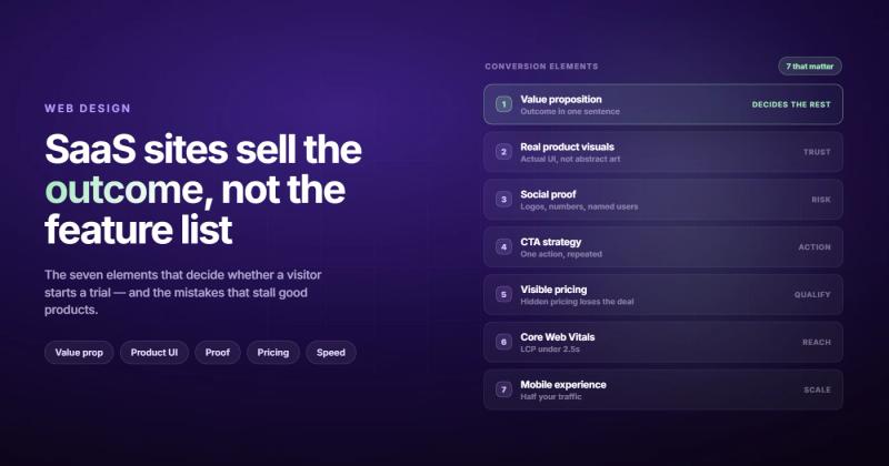
Most SaaS websites say the same thing. "The intelligent platform for modern teams to streamline their workflows." Then a hero image of people smiling at a laptop. Then a row of company logos. Then a pricing table nobody reads past the free tier.
I've looked at hundreds of SaaS websites over the years, from early-stage startups to Series B companies, and the structure is almost identical across all of them. The difference between the ones that convert at 3% and the ones that convert at 11% isn't the visual design. It's whether the website actually does the job of selling the product.
SaaS website design is the process of building a website that turns visitors into signups, trial starts, or demo requests. Design, copy, and structure all need to pull in the same direction. It's not about looking polished. It's about making the product's value obvious within the first ten seconds a visitor spends on your page.
Here's what that actually requires, and where most SaaS companies fall apart trying to get there.
Why SaaS website design is a different problem entirely
Regular websites mostly need to communicate. A restaurant needs photos and a menu. A law firm needs credentials and a contact form. The product is already understood: people know what restaurants and lawyers do.
SaaS is different. You're selling something intangible, often technical, often replacing a workflow the buyer has been comfortable with for years. Your website isn't a brochure. For early-stage companies, it's the entire sales team. For later-stage companies, it's responsible for a significant chunk of qualified pipeline.
This is why generic "beautiful website" thinking doesn't work here. A SaaS website that wins a design award but doesn't get visitors to start a trial has failed at its actual job.
There's also a specific problem SaaS companies have that almost no other industry deals with: the product is invisible. You can't photograph software the way you photograph a car or a restaurant dish. So the website has to do what a showroom does: create enough understanding and trust that the visitor is willing to find out more.
Every element of a SaaS website should answer one of three questions before the visitor has to ask them:
- What does this do?
- Is it for me?
- Why should I trust it?
If your homepage doesn't answer all three within roughly ten seconds, the visitor is already on their way to a competitor who does.
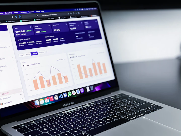
The 7 elements that separate good SaaS sites from great ones
These aren't design opinions. They're patterns that show up consistently across the best-converting SaaS websites. Miss one or two and you'll still have a functional site. Miss three or four and you're wondering why the traffic isn't converting.
1. A value proposition the visitor can repeat back
Here's a quick test: read your hero headline to someone who doesn't know your product. Ask them what the product does. If they can't tell you, the headline failed.
"The intelligent platform for modern teams" fails this test. "Automate your sales follow-up so reps can focus on closing" passes it. The difference isn't creativity. It's specificity.
Your value proposition needs three things: who it's for, what it does, and a hint at the outcome. Not a clever tagline. A clear claim. Subheadlines can add nuance, but the headline should stand on its own.
One more thing: write it at a reading level that doesn't require a LinkedIn profile to decode. "Leverage AI-powered insights to optimize cross-functional revenue workflows" means nothing to the ops manager who has a spreadsheet problem they need solved.
2. Show the actual product, not illustrations of it
This is the most common mistake in SaaS website design, and it's getting corrected across the industry, slowly. Generic 3D shapes, abstract motion graphics, and floating UI elements that don't look like any real screen look expensive and communicate nothing.
The best SaaS websites show real UI. A screenshot of the dashboard the user will actually see. A short product walkthrough video. An interactive prototype where visitors can click around without creating an account.
The logic is simple: your product is the best argument for your product. If you can show someone exactly what they'll get, you've removed the biggest source of uncertainty stopping them from signing up. Hiding behind generic visuals creates uncertainty. Real screenshots resolve it.
Interactive demos have become one of the highest-converting elements on SaaS websites. Tools that let visitors experience core workflows without committing to a full signup remove the fear of "I don't want to give them my email until I know if it's worth it." That fear is real, and it kills trial rates.
3. Social proof that speaks to the buyer's actual fear
The standard approach is logo soup. "As used by Apple, Google, Shopify." But logos alone don't convert, because the visitor's question isn't "do big companies use this?" It's "will this work for a company like mine, with a team like mine, facing a problem like mine?"
Social proof that converts is specific:
- Testimonials that name the exact problem solved ("We replaced 4 spreadsheets and cut reporting time from 3 hours to 20 minutes")
- Case studies with numbers the target buyer recognizes as relevant to their situation
- Review badges from G2 or Capterra if the ratings are strong (above 4.5 with real volume)
Place proof close to the claim it supports. If you're saying your tool is fast, show a testimonial about speed right there, not on page 3 of a case studies section nobody navigates to. Most visitors read top to bottom once, if that.
4. A CTA strategy that matches where the visitor is
"Start free trial" vs "Book a demo" is one of the most debated decisions in SaaS. The data leans toward free trials for product-led growth tools where time-to-value is short, and toward demos for enterprise or complex products where a conversation is genuinely needed to scope the deal.
The deeper question is: what does the visitor need to believe before they'll click? If your product takes five minutes to deliver value, push the trial. If it takes a 30-minute call to understand the ROI, push the demo. Don't pick based on what you want. Pick based on what the visitor needs to feel confident enough to act.
On placement: put the primary CTA in the persistent header, in the hero, and at the bottom of the page. Three appearances isn't aggressive. It's accessible. People scroll to the bottom of pages they're interested in, and they expect to find a way to take action when they get there.
5. Navigation that guides, not overwhelms
B2B SaaS websites have a habit of building navigation that mirrors the internal org chart rather than the buyer's journey. "Product," "Solutions," "Platform," "Features," and "Resources" all in the top nav. The buyer wants to know if this solves their problem. They didn't come for a site tour.
The best SaaS navigation has five items or fewer. Secondary navigation (use cases, industries, integrations) lives in a mega menu or on the product pages themselves, not competing for attention in the top bar.
The navigation also needs to be consistent with the messaging. If your hero says you help "sales teams close faster," the navigation shouldn't route them to a generic "Solutions" page that covers six different departments. Take them to the sales use case. Match what they clicked on to what they land on.
6. Speed and Core Web Vitals
This sounds like an engineering problem. It's also a design problem. Hero videos, heavy animations, and large unoptimized images are the most common causes of poor Core Web Vitals scores, and those decisions come from design, not development.
A 1-second delay in load time reduces conversions by around 7%. For a SaaS website generating $50,000/month in new business, that's roughly $3,500/month in lost revenue from a performance problem that often costs a fraction of that to fix.
Check your site at Google PageSpeed Insights. Anything below 90 on mobile is worth investigating. If it's failing Core Web Vitals, look at the hero section first: that's where most of the damage happens.
7. Mobile that's actually designed, not just "responsive"
Responsive design means the layout reflows on small screens. That's the baseline, not the goal. Good mobile SaaS website design means the mobile experience is specifically considered: tap targets sized correctly, hero sections that communicate the value prop in two lines instead of seven, CTAs visible without scrolling past a product screenshot that takes up half the screen.
Most SaaS decision-makers do initial research on mobile before they ever open a laptop. If the mobile hero section cuts off your subheadline or pushes the CTA below the fold, you've lost those visitors before the conversation started.
A fast way to test this: open your site on your phone, fresh, without knowing what you're looking for. Can you tell in five seconds what the product does and who it's for? If you have to scroll first, that's the problem.
Mistakes that quietly kill your conversion rate
The seven elements above get missed by omission. But there are also active decisions that destroy otherwise functional websites.
Feature-first messaging. "Track, analyze, and report on all your marketing data in one place" is features. "Know which campaigns are actually driving revenue, not just clicks" is an outcome. Buyers purchase outcomes. They justify with features after they've already decided. If your homepage leads with the feature list, you're starting the sales conversation at step three.
Burying the pricing is the second mistake. SaaS buyers check pricing early, usually within the first two pages they visit. If you hide pricing behind a "contact us" form or require a demo booking just to find out what tier they need, you're adding friction at exactly the moment buyers want certainty. Show pricing, or at minimum show ranges with a clear path to getting exact numbers.
The third mistake is harder to spot: letting visual design outrun clarity. I've seen six-figure redesigns that scored worse on basic readability tests than the Wix site they replaced. Beautiful gradients, white text over busy backgrounds, hero headlines in 96px font that says nothing. Design should serve the message. When it becomes the message, conversion rates drop.
Nobody has ever hired my agency because we use Webflow instead of WordPress. They hired us because we promised to solve a specific problem. The same logic applies to SaaS websites: stop leading with your tech and start leading with the outcome your product delivers.
The fourth mistake is redesigning without a baseline. If you don't know your current visitor-to-signup rate, which pages have the highest exit rates, or where visitors stop scrolling, a redesign is just an expensive guess. Before any design changes, get the numbers. Even a week of heatmap data from Hotjar or Microsoft Clarity gives you more signal than a month of opinions about button colors.
If your conversion rate is the problem, a CRO audit will tell you more than a redesign brief will. Know what's broken before you rebuild.
Which platform to build on
For most SaaS marketing websites, the answer is Webflow.
Webflow gives marketing teams the ability to update copy, spin up landing pages, run campaign experiments, and launch product announcements without waiting for an engineering sprint. For SaaS companies where the website is a GTM channel, that speed is genuinely valuable. The cost of a two-week development queue when you need to A/B test a hero message is real.
WordPress works if you already have it and a developer who knows it. For new builds, you're adding plugin overhead, security update maintenance, and an ongoing dev dependency for anything that isn't a blog post. Over 18-24 months, that's a meaningful operational cost.
Custom code (React, Next.js) makes sense for SaaS companies with strong engineering resources and genuinely complex requirements: logged-in user portals, dynamic pricing calculators, deep third-party integrations. But most SaaS marketing websites don't need custom code. They need a fast, editable site that marketing can actually control.
The platform decision should follow one question: who will own and update this website after launch? If it's the marketing team, Webflow. If it's an engineering team that will rebuild it in two years anyway, almost anything works.
Our Webflow development service includes a full handoff session so your team can actually use the site after we build it, not just maintain it through us.
How much SaaS website design actually costs
The range is wide enough that quoting a single number is almost useless. But here's a realistic breakdown.
| Build type | Cost range | What you get |
|---|---|---|
| Template + freelancer | $2,000–$10,000 | A clean, functional site. Will look like a template. Good for pre-revenue validation. |
| Boutique SaaS agency | $20,000–$60,000 | Strategy, messaging, design, and build. Where most funded startups land for a proper website. |
| Top-tier brand agency | $80,000–$200,000+ | Positioning work, full brand system, enterprise-grade production. Post-Series B territory. |
The single biggest cost driver isn't scope. It's how clearly your positioning is defined before the project starts. Agencies spend significant time helping clients figure out what they're trying to say, and that time shows up in the invoice. Arrive with a clear value proposition and a defined target buyer and the project runs faster and cheaper.
Also worth saying: be skeptical of fixed prices given without understanding your conversion goals. A SaaS website that converts at 8% instead of 3% is worth many times the cost difference between a good agency and a cheap one. The question isn't "what does the website cost?" It's "what does a 1% improvement in trial rate mean for our annual revenue?"
If you're evaluating SaaS website design options, the conversation should start with what you're trying to fix, not with a feature list or a portfolio review.
Frequently asked questions
What is SaaS website design?
SaaS website design is the process of designing and building a website that converts visitors into product signups, free trial starts, or demo requests. It combines visual design, messaging strategy, information architecture, and technical performance. Unlike general web design, SaaS website design treats the website as a sales and marketing channel, not just a digital presence.
What makes a good SaaS website?
A good SaaS website does five things well: it communicates clearly what the product does and who it's for, it shows the actual product rather than abstract visuals, it builds credibility through specific social proof, it makes the next step obvious with clear CTAs, and it loads fast. Most SaaS websites fail on at least two of these.
How much does SaaS website design cost?
Costs range from $2,000 for a template-based freelancer build to $200,000+ for a top-tier brand agency engagement. Most funded startups working with a specialist SaaS web design agency spend between $20,000 and $60,000. The biggest variable is how clearly your positioning is defined before the project starts.
What platform is best for a SaaS website?
Webflow is the best choice for most SaaS marketing websites. It gives marketing teams direct control over copy, landing pages, and campaigns without engineering involvement. Custom React or Next.js builds make sense for companies with strong dev teams and complex technical requirements, but most marketing websites don't need that level of customization.
Should a SaaS website have a free trial or demo CTA?
Free trials work best for product-led growth tools where visitors can experience value within minutes. Demo CTAs work better for complex or enterprise products where the buyer needs a conversation to understand scope and pricing. The decision should be based on your time-to-value, not on what you prefer. If your product takes more than 30 minutes to deliver a meaningful outcome, demos will convert better.
How is SaaS website design different from B2B web design?
SaaS website design is a subset of B2B web design, but with specific constraints: the product is intangible and needs to be demonstrated rather than described, pricing transparency matters more, and the website often functions as the primary sales channel rather than a support tool for a sales team. The stakes on conversion rate are usually higher in SaaS because traffic is paid or earned, and each visitor has a real acquisition cost.
Do I need to redesign my SaaS website to improve conversions?
Not always. A full redesign is often the most expensive and slowest way to improve conversion rates. Before redesigning, run a proper conversion-focused audit to identify exactly what's underperforming. Often, changes to the hero messaging, CTA placement, or page speed fix 80% of the problem at 20% of the cost of a full redesign.
How long does it take to design and build a SaaS website?
A well-scoped SaaS website project with a specialist agency typically takes 8–14 weeks from kickoff to launch. That includes strategy, design, development, content, and QA. Rushed timelines under 6 weeks usually mean compromises in strategy or testing that show up in conversion rates later. The fastest-converting websites are almost never the fastest-built ones.
Comments