A healthcare website design is a website built specifically for medical practices, clinics, hospitals, and health organizations that prioritizes patient trust, accessibility, regulatory compliance, and clear pathways to booking appointments. It's not a regular business website with a stethoscope icon slapped on it.
That distinction matters more than most people realize. I spent months building software for healthcare practices in Ireland, and the single biggest lesson was this: healthcare isn't an industry where "good enough" design works. A confusing navigation menu on an e-commerce site loses you a sale. A confusing navigation menu on a medical website loses you a patient who needed help and couldn't figure out how to get it.
Most medical website design advice boils down to "make it clean and professional." That's like telling a chef to "make the food taste good." True, but not useful. What you actually need is a set of specific principles that account for the fact that your visitors are often stressed, confused, or in pain, and your site needs to work for them in that state.
Here's what actually matters when designing a website for a medical practice, and what the best healthcare websites get right that everyone else misses.
Why Healthcare Websites Are Different From Every Other Industry
Every industry thinks its websites are special. Most of them are wrong. Healthcare is one of the few where the claim holds up.
Nearly 80% of internet users have searched for health information online. That's not a marketing stat you can ignore. Your website isn't a brochure. For many patients, it's the first point of contact with your practice, and they're forming opinions about your competence based on how the site looks and works before they ever meet a doctor.
Healthcare websites face four constraints that other industries don't deal with simultaneously:
- Regulatory compliance. HIPAA in the US, GDPR in Europe, and various local regulations dictate how you handle patient data. Your contact forms, patient portals, and appointment systems all need to comply. This isn't optional.
- Emotional state of visitors. People searching for medical information are often anxious, scared, or in pain. The design needs to reduce stress, not add to it. Flashy animations and clever layouts are the wrong move here.
- Content volume. A medical practice might offer 30+ services across multiple specialties. Organizing that information so patients find what they need without a medical degree is a genuine design challenge.
- Trust threshold. Choosing a doctor isn't like choosing a restaurant. The stakes are higher. Your website needs to earn trust faster and more completely than almost any other type of business site.
Working on a healthcare SaaS product taught me that the most complex UI challenges aren't in flashy consumer apps. They're in enterprise software where a single misplaced checkbox in a prescription form could have real consequences.
That experience shaped how I think about web design for healthcare. Every pixel carries more weight.
Clean Design That Reduces Cognitive Load
You've heard "clean and simple" so many times it's meaningless. Here's what it actually means for medical website design: reduce cognitive load for people who are already overwhelmed.
Look at athenahealth's website. Minimal top-level navigation items. A prominent search function. No competing CTAs fighting for attention. The design isn't "clean" because someone liked whitespace. It's clean because every unnecessary element was removed so the important ones could breathe.
What this looks like in practice:
- Limit your main navigation to 5-7 items. If you have more, you have an information architecture problem, not a menu problem.
- Use a single primary color consistently. Healthcare website examples that work best use one strong accent color (usually blue or green) against a neutral background.
- Give content room. Tight margins and cramped text make medical content feel more intimidating than it already is.
- Remove carousels. The Linked Immunisation Action Network saw performance improvements after replacing carousels with static content. Carousels are where content goes to not be read.
The design question isn't "does this look modern?" It's "can a 65-year-old with reading glasses find the phone number in three seconds?"
Navigation and Information Architecture
This is where most healthcare websites fall apart. A practice offers primary care, cardiology, orthopedics, pediatrics, and six other specialties. Each has sub-services. Each sub-service has providers. Each provider has locations and availability.
That's not a website. That's a database wearing a trench coat pretending to be a website.
The best healthcare websites solve this by thinking about navigation from the patient's perspective, not the org chart. Mayo Clinic does this well. Their search isn't an afterthought tucked in a corner. It's a primary navigation tool with autocomplete, alphabetical filtering, and categorized results. They treat search as content architecture, not a backup plan.
| Navigation Approach | Works For | Breaks When |
|---|---|---|
| Specialty-based menus | Multi-specialty hospitals | Patients don't know their specialty |
| Symptom-based navigation | Urgent care, primary care | Too many symptoms to list |
| Robust search with autocomplete | Large health systems | Poor search implementation |
| Single-service focused | Niche practices (dental, dermatology) | Practice expands services |
For a website design for medical practice with fewer than 10 services, a clear specialty-based menu works fine. For larger health systems, invest in search. Really invest in it. The kind of search that suggests "Did you mean cardiology?" when someone types "heart doctor."
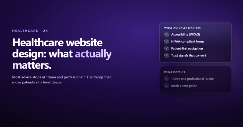
Accessibility Is Not Optional (It's Also the Law)
Here's what bothers me about how most agencies handle accessibility on healthcare websites: they treat it like a checkbox. "WCAG compliant" appears in the proposal, and then the actual site has grey text on a white background and no alt text on any image.
Healthcare websites serve populations that disproportionately need accessibility features. Older adults. People with chronic conditions that affect vision or motor control. People using screen readers. If your site isn't accessible, you're turning away the patients who need you most.
What real accessibility looks like (not the checkbox version):
- Color contrast ratios of at least 4.5:1 for body text (WCAG AA standard)
- All images have descriptive alt text, not "image1.jpg"
- Keyboard navigation works on every interactive element
- Touch targets are at least 48x48 pixels (critical for patients with motor control issues)
- Forms have proper labels, not just placeholder text that disappears when you click
- Video content has captions
Rest Assured, a healthcare company, built their entire site around WCAG 2.2 AA compliance. High-contrast fonts. Large button targets. Screen-reader-optimized alt text. It's not fancy. It's respectful. And it ranks well, because accessibility and SEO share the same foundation: good HTML structure.
Mobile-First, Not Mobile-Also
More than half of healthcare searches happen on mobile devices. That's someone sitting in a waiting room, googling symptoms on a bus, or trying to find your phone number while driving (please don't). Your site needs to work on a phone first, desktop second.
"Responsive design" isn't enough. Responsive means it doesn't break on mobile. Mobile-first means it was designed for mobile and then expanded to desktop. The difference:
- Click-to-call phone numbers that actually work on mobile (you'd be shocked how many medical sites use an image of their phone number)
- Appointment booking that doesn't require zooming and pinching through a form designed for a 27-inch monitor
- Maps and directions that open in the phone's native maps app
- Body text at 16px minimum. Anything smaller is unreadable on mobile.
Google uses mobile-first indexing, which means it ranks your site based on the mobile version. If your mobile experience is bad, your rankings will be too, regardless of how nice your desktop site looks.
Building Trust Without Looking Like You're Trying
There's a paradox in the best healthcare websites: the ones that try hardest to look trustworthy often look the least trustworthy. Stock photos of smiling doctors with crossed arms. Giant "Trusted by 10,000+ Patients" banners. It's the design equivalent of someone saying "trust me" unprompted.
What actually builds trust:
- Real photography. Maven Clinic uses original photography instead of stock photos. You can tell the difference instantly. Real photos of your actual office, staff, and equipment beat any stock photo library.
- Provider profiles with personality. The Global Brain Health Institute spotlights their personnel with actual bios, not just credentials. Patients want to know who they're seeing.
- Patient testimonials with specifics. Boston Children's Hospital uses real patient stories. "Dr. Smith helped my son" hits harder than a five-star rating with no context.
- Transparent pricing information. One of the top questions patients have is "how much will this cost?" Most healthcare websites dodge it entirely. You don't need a price list, but addressing insurance, payment plans, and financial policies removes a major anxiety barrier.
- Published dates on content. Medical information from 2019 feels outdated. Date your content and update it regularly.

CTAs and Appointment Booking: The Actual Point
Your healthcare website exists to do one thing: connect patients with care. Everything else is supporting material. If someone can't figure out how to book an appointment within 10 seconds of landing on any page, the rest of the design doesn't matter.
The Cleveland Clinic does this well. Prominent "Make an Appointment" and "Find a Location" buttons are visible on every page. They're not buried in a footer or hidden behind a hamburger menu.
What good CTAs look like for medical website design:
- A persistent "Book Appointment" button visible on every page (sticky header or floating button on mobile)
- Phone number with click-to-call functionality, not just displayed text
- Online scheduling that shows real availability, not a "request an appointment" form that someone might check next Tuesday
- Location-specific CTAs for multi-location practices
- Emergency information prominently displayed when relevant
HealthMatch takes a different approach worth studying. They serve multiple audiences (patients, clinicians, researchers) from a single homepage using a single clear CTA per audience segment. The design is uncluttered because they made a choice about what matters most. Most healthcare sites try to say everything at once and end up saying nothing.
Content That Patients Actually Read
Here's the uncomfortable truth about healthcare content: most of it is written for other healthcare professionals, not patients. Jargon-heavy service descriptions, walls of clinical text, conditions explained using terminology patients don't know.
BetterHelp gets this right. Their content is written at a reading level that matches their audience, uses warm color palettes, and breaks up text with varied page sections. Healthline pairs expert-reviewed articles with engaging multimedia. The content is medically accurate and humanly readable. Those aren't competing goals.
Content principles for web design for healthcare:
- Write service descriptions in patient language. "We treat broken bones" not "We provide comprehensive orthopedic fracture management."
- Answer the three questions every patient has: What do you treat? How does treatment work? What will it cost?
- Create condition-specific pages that explain symptoms, treatment options, and what to expect during a visit. These pages rank well for informational searches.
- Use video where it makes sense. Hartford HealthCare uses facility tour videos and provider introductions. Video builds trust faster than text, but don't autoplay anything. Ever.
- Keep blog content updated. Outdated medical content isn't just an SEO problem. It's a liability.
Security and HIPAA Compliance
If your healthcare website collects any patient information (and it does, even through a basic contact form), security isn't a feature. It's a requirement.
I learned this the hard way working on healthcare software. The difference between a regular web form and a healthcare web form isn't the HTML. It's everything behind it: encrypted data transmission, secure storage, access controls, audit logs. A single misplaced checkbox in a prescription form could have real consequences. A data breach could end a practice.
What HIPAA compliance means for your website:
- SSL certificates on every page (this should be standard everywhere, but it's legally required in healthcare)
- Patient portal systems that meet HIPAA security requirements
- Contact forms that don't store PHI (Protected Health Information) in plain text
- Business Associate Agreements with every vendor that touches patient data (your hosting provider, your CMS, your email service)
- Regular security audits. Not once at launch. Ongoing.
This is one area where "just good enough" genuinely isn't. If you're building a website for a medical practice, work with developers who understand healthcare compliance. This isn't something to figure out after launch.
Page Speed: When Slow Actually Costs You Patients
Healthcare websites are often slower than they should be because they're loaded with high-resolution images, embedded patient portal widgets, and third-party scheduling tools. Each one adds weight.
The Linked Immunisation Action Network serves regions with poor internet connectivity. They stripped their site down, eliminated carousels, compressed images aggressively, and focused on fast initial load. Their audience literally can't wait for a heavy page to load.
Your audience probably has better internet, but their patience isn't any greater. Performance targets for healthcare website examples that rank well:
- Largest Contentful Paint under 2.5 seconds
- First Input Delay under 100 milliseconds
- Cumulative Layout Shift under 0.1
- Total page weight under 3MB (including images)
Every third-party widget you embed (chat tools, review widgets, scheduling iframes) adds JavaScript that fights for resources. Audit them. If a tool adds 500KB of JavaScript and 200ms of load time, make sure it's earning its place.
Healthcare SEO: Why E-E-A-T Matters More Here Than Anywhere
This is the topic most healthcare website design articles skip, and it's one of the most important.
Google classifies healthcare content as YMYL: Your Money or Your Life. Content that could impact someone's health, safety, or financial stability gets held to a higher standard. A blog post about "best coffee shops" can rank with decent backlinks. A blog post about "symptoms of heart disease" needs to demonstrate genuine expertise, experience, authority, and trust.
What this means for your medical website design:
- Author bylines with credentials. Every piece of medical content should show who wrote it, their qualifications, and link to an author page. "Written by Dr. Sarah Chen, MD, Board-Certified Cardiologist" isn't vanity. It's an SEO signal.
- Published and updated dates. Google wants to know if your content is current. Medical information ages faster than most content.
- Cite sources. Link to peer-reviewed research, medical associations, and government health agencies (.gov, .edu). It builds authority in Google's eyes and trust in patients' eyes.
- Local SEO. Claim and optimize your Google Business Profile. Ensure NAP (Name, Address, Phone) consistency across all directories. Add LocalBusiness schema markup with the most specific subtype (Dentist, Physician, Hospital).
- Schema markup. Implement MedicalOrganization, Physician, and MedicalCondition schemas. FAQ schema on service pages. These won't guarantee rich snippets, but they help Google understand your content.
I once had emails silently bouncing for days because SPF and DKIM weren't set up on the domain. Gmail just blocks you with a cryptic error. Email deliverability is one of those things nobody thinks about until everything breaks.
The same principle applies to healthcare SEO. Technical foundations (schema, site speed, mobile usability) are invisible until they're broken. By then you've lost months of ranking potential.
What the Best Healthcare Websites Get Right
After analyzing dozens of healthcare website examples, the patterns are clear. The sites that work aren't the flashiest. They're the ones that made deliberate choices about what to prioritize.
| Practice Type | Top Priority | Secondary Focus |
|---|---|---|
| Single-specialty clinic | Clear service explanation + booking | Provider profiles, patient stories |
| Multi-specialty hospital | Search + navigation architecture | Location finder, emergency info |
| Telehealth / mental health | Trust building + low-friction signup | Privacy messaging, therapist matching |
| Health information portal | Content organization + E-E-A-T | Search, multimedia content |
The CDC incorporates visitor feedback into their design process. Colorado Health Foundation scored 95/100 on accessibility audits. Eye Recommend built a job marketplace for their professional community. Each made choices based on what their specific audience needed, not what a generic "healthcare website template" suggested.
That's the real lesson. Web design for healthcare isn't about following a template. It's about understanding your specific patients, their specific anxieties, and designing for that reality.
Frequently Asked Questions
What makes a good healthcare website?
A good healthcare website loads fast, works on mobile, is accessible to people with disabilities, makes booking an appointment easy from any page, and presents medical information in patient-friendly language. It also needs to be HIPAA-compliant if it handles any patient data, and it needs to build trust through real photography, provider profiles, and transparent information about services and costs.
How much does healthcare website design cost?
A basic medical practice website typically costs between $5,000 and $15,000. A custom healthcare website with patient portal integration, HIPAA-compliant forms, and multi-location support can run $20,000 to $75,000 or more. The biggest variable is complexity: a single-location dermatology clinic has very different needs than a multi-specialty health system. Budget for ongoing maintenance too. Healthcare sites need regular content updates and security patches.
What should a medical practice website include?
At minimum: service descriptions in plain language, provider profiles with photos and credentials, location and contact information with maps, online appointment booking, accepted insurance information, patient testimonials, an about page that establishes credibility, and an accessible design that meets WCAG AA standards. For larger practices, add a robust search function, patient portal access, and condition-specific content pages.
How do I make my healthcare website HIPAA compliant?
Start with SSL encryption on every page. Use HIPAA-compliant hosting and form processors. Never store Protected Health Information in plain text. Sign Business Associate Agreements with every vendor that touches patient data (hosting, CMS, email, scheduling tools). Implement access controls and audit logging. Run regular security assessments. HIPAA compliance isn't a one-time setup. It's an ongoing practice.
Why is website design important for healthcare organizations?
Because 80% of internet users search for health information online, and 60% choose a provider based on web presence. Your website is often the first interaction a patient has with your practice. Poor design, slow load times, confusing navigation, or missing information will drive patients to a competitor. A well-designed healthcare website builds trust, reduces phone call volume, enables self-service appointment booking, and improves patient satisfaction before they ever walk through your door.
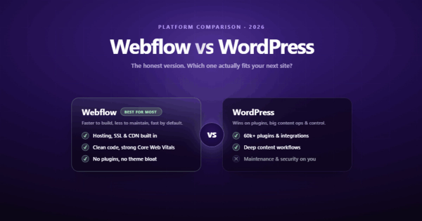
What platform is best for building a healthcare website?
It depends on your practice size and technical needs. WordPress with HIPAA-compliant hosting works for many practices but requires ongoing maintenance and security updates. Webflow offers better design flexibility with less maintenance overhead. Custom builds (Next.js, etc.) make sense for large health systems with complex integration needs. Whatever you choose, make sure the platform supports SSL, responsive design, accessibility features, and integrates with your scheduling and patient portal systems.